4 Big Design Changes In iOS 7 Every App Developer Should Know
Almost every part of iOS received a new coat of paint in iOS 7, but the changes go deeper than just the visuals. Apple’s latest update to iOS marks the biggest overall change it has undergone since its launch in 2007. That means, if you want to keep supporting your iOS app, you’d better bring it up to speed as soon as you can. Below are some of the big changes you’ll want to keep in mind.
Flattened Icons
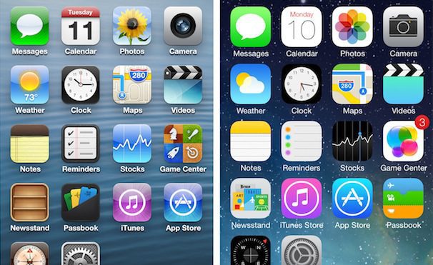
![]() Before we even get into how the apps themselves look, let’s talk about the icons. The icons for first-party apps have received a general flattening. Gone is the glossy shine Apple used to use to make the icons look like buttons you’d want to press. The new app icons are flatter, more colorful and symbolic images.
Before we even get into how the apps themselves look, let’s talk about the icons. The icons for first-party apps have received a general flattening. Gone is the glossy shine Apple used to use to make the icons look like buttons you’d want to press. The new app icons are flatter, more colorful and symbolic images.
So if your app has a glossy shine or looks three dimensional, you should consider flattening it out. Many people have criticized the new first party icons for being ugly, but the fact remains that three-dimensional icons now look out of place on a home screen populated with flat icons.
Goodbye Skeumorphism
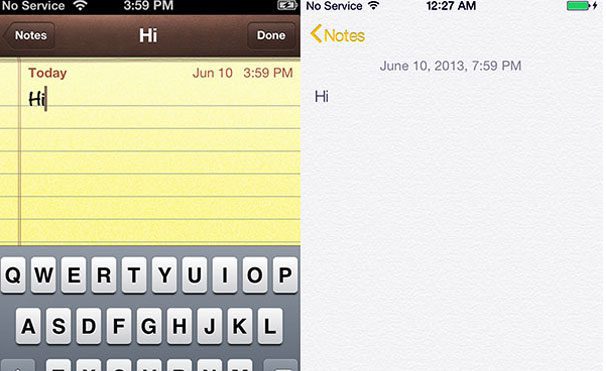 Once you open up Apple’s first-party apps, you’ll notice that the new design aesthetic clashes in big and obvious ways with the previous look and feel of the system. Nearly all traces of skeuomorphism have been swept away, which means that the Notes app no longer looks like a yellow notepad and the calendar has lost its torn paper edges. Even most buttons have been nixed and replaced with text. The design is simpler and more elegant.
iOS 7 just came out, and already the apps that use skeuomorphic designs have started to look dated. Just imagine what they’ll look like months from now. If your app sports a skeuomophic metaphor, it’s time to consider a redesign.
Blended Status and Navigation Bars

Anther visual change Apple has made in their apps is to combine the status and navigation bars at the top of the screen. Before, most of these bars were dark and “heavy,” noticeably taking away a sizable chunk of screen space. Now, the bars are generally lighter colors (if not white) and blend in better. Also, the status bar, which shows the time and battery life, is now also the same color as the navigation bar. Check out the iOS 7 Facebook app, and you’ll see that the whole top of the app is blue.
Gestures
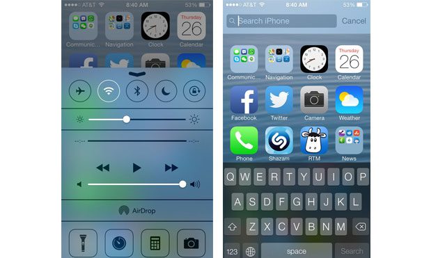 Swiping up on the home screen reveals the new Control Center, a swipe down from the top unveils the Search bar.
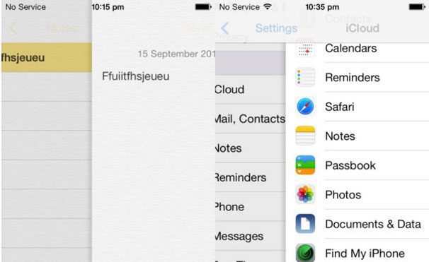 Another thing Apple has expanded on in their apps is gestures. In Safari, you can now swipe from either edge of the screen to go backward or forward in your internet history. In Mail, Settings, Notes, and Messages, a left-to-right swipe shoves what you’re looking at aside and reveals a sidebar displaying the next level up in the hierarchy. In Mail, if you swipe right to left in your message list, you get the option to trash or archive the message.
If your app offers a hierarchy view or a back button, you should probably add a similar gesture function to the app.
Wrapping Up
iOS 7 has brought a big change to the look and feel of iOS and Apple’s first-party apps. The changes are so obvious that any developer who’s serious about making money on the App Store should update their apps as soon as possible. If you don’t, it’s going to look dated.
Thankfully, Apple is leading the way with their app redesigns. You don’t have to copy their designs exactly, but you should at least use them as a starting point for the new direction of your app. Every app developer should check out Apple’s thoroughly detailed iOS 7 Transition Guide, it’s the first step in making sure you are keeping up with the visual changes that have come with iOS 7.
