5 Aspects Of A Kickass App Screenshot
Is your brand new app ready for the app store and you’re crossing your fingers for a strong opening?
You checked the bugs, tested repeatedly, ran through the marketing literature and even accumulated some nice beta reviews, but is there something in your app store profile that could convince most people to casually swipe past your app in search of a different one?
If I type the word “printer” into my iPhone app store search bar it reveals over 1,300 results. How do you plan on differentiating yourself from all of this competition? Sure, printers might not be your market, but every app competes with their niche, along with the entire app store, filled with millions of apps.
Is it possible that a kickass app screenshot could capture user attention more than anything else on your app profile? Did you even put much thought into your screenshots?
Let’s take a look at five aspects that make your app screenshots into something that calls out to people for downloads.
Show People What They Want and Nothing Else
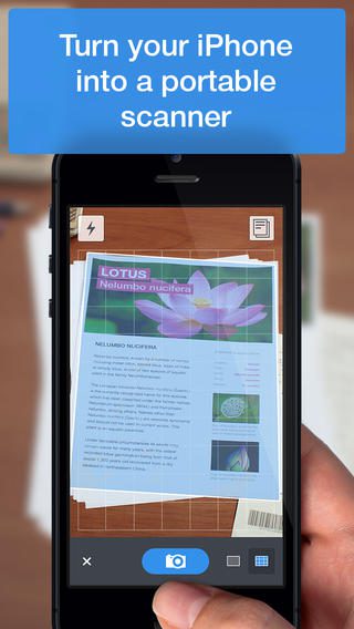
Every app in the app store includes long lists of features that typically go unnoticed. As a developer you probably want every user to learn about those features so they receive the full app experience. Unfortunately, no one cares. People download apps to perform one or two simple tasks.
Your app screenshot needs to feature this in a way that’s simple and elegant. If you open a document scanner app, the screenshot better show the app scanning a document, not a list of saved document files or detailed editing tools.
Create Emotional Connection with Candid Photos
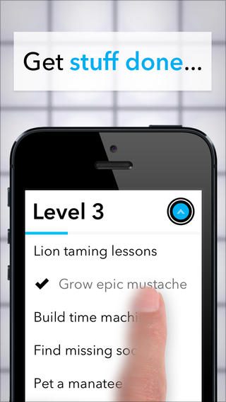
A screenshot of just what’s in the app is pretty boring, since it doesn’t connect with the user and show them how they can use the app in their own life. Connect with your potential users on an emotional level by including the actual device in your screenshots. Show a hand controlling the device and completing the app’s primary task.
Explain Images With Overlaying Text

When you spice up your screenshot with a candid photo of your app on a device you leave room surrounding the device for additional marketing. Consider making the background into a blurred scene–so maybe a coffee shop that you can’t see quite clearly. This gives you an opportunity to overlay text that explains the task. This is a great way to connect for a second time with your users. First you need to show people what the app does, then you should tell them.
Think of Your End User

A large part of making your app screenshot useful is thinking about how your customers will view the screenshots while in the Google Play Store or iTunes App Store. It’s quite annoying to view an app screenshot that forces you to turn your phone into the landscape mode. Try to create portrait style screenshots whenever possible to avoid frustration.
When you upload your first screenshot in the iTunes App Store it automatically makes this the default image. If this image sucks then your app is in trouble. Start with your most effective screenshot then work your way towards more detailed features that people don’t care about as much. You might think a cool little niche feature is amazing, but chances are the masses don’t share you enthusiasm.
Brag About Your Key Milestones
Your screenshots give you a chance to share why other people love your app. Many app developers put awards, praise and key milestones in the description area, but why not put this social credibility right in front of your potential users? If you received over 300 million downloads, let people know. If your app is the most downloaded or highly rated app in a category share the good news.
Now it’s your turn to share with everyone in the comments section. Let us know if you implement any of these kickass techniques in your own mobile app screenshots. Do you have any other suggestions that make apps look awesome on the app store?
