6 Website Trends to Expect in 2021
Each year, everything from little to big changes surface in website trends that businesses are urged to incorporate into their sites. These changes can be anything from small nuances that slyly add to the UX to much more elaborate schemes intended to improve functionality through design.
In addition to pure design elements, there are features that users are being groomed to expect which work to improve the value of a site. Understanding how design and functionality come together to create an experience is key to creating the best possible site, regardless of its purpose. So today, we’re going to cover how to make the most impact on your users by creating a modern site, starting with a discussion on why design is important.
Why is design important?
Features and design go hand-in-hand to create your UX – the quality of this experience is responsible for determining a user’s actions, whether it’s buying a product or using a digital service. Like emerging mobile design trends for apps, pulling everything together into one cohesive solution yields the best possible results.
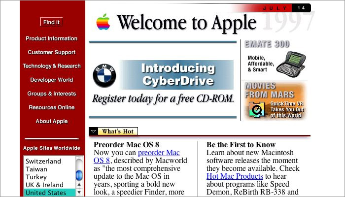
In one dramatic example, think about how it feels when you visit a site that looks like it fell out of 2002, complete with a skinny, low-fi banner across the top of the page and a lengthy menu running down the left side of every page.
Today, if most of us were to look at a site like this, we would (or should) feel a sense of apprehension as the appearance is not even on par with the kind of work we see from most amateurs. Everything is so static that the few elements with CTAs barely stand out. It’s also clearly so far out of date that it should raise a red flag to anyone looking to complete a secure action like log in or make a purchase.
In the past, website design was something that mostly related to fonts, colors, and simple graphics but today it is so much more. Good modern design elements coincide with user action by informing, directing, and ultimately helping users accomplishing tasks.
6 website trends to consider for your site in 2021
Website trends will parallel mobile app trends that we’re expecting to see become mainstream but with a few differences. Let’s take a look at some of the most notable website trends we expect to see across the web.
1. Chatbots powered by ML
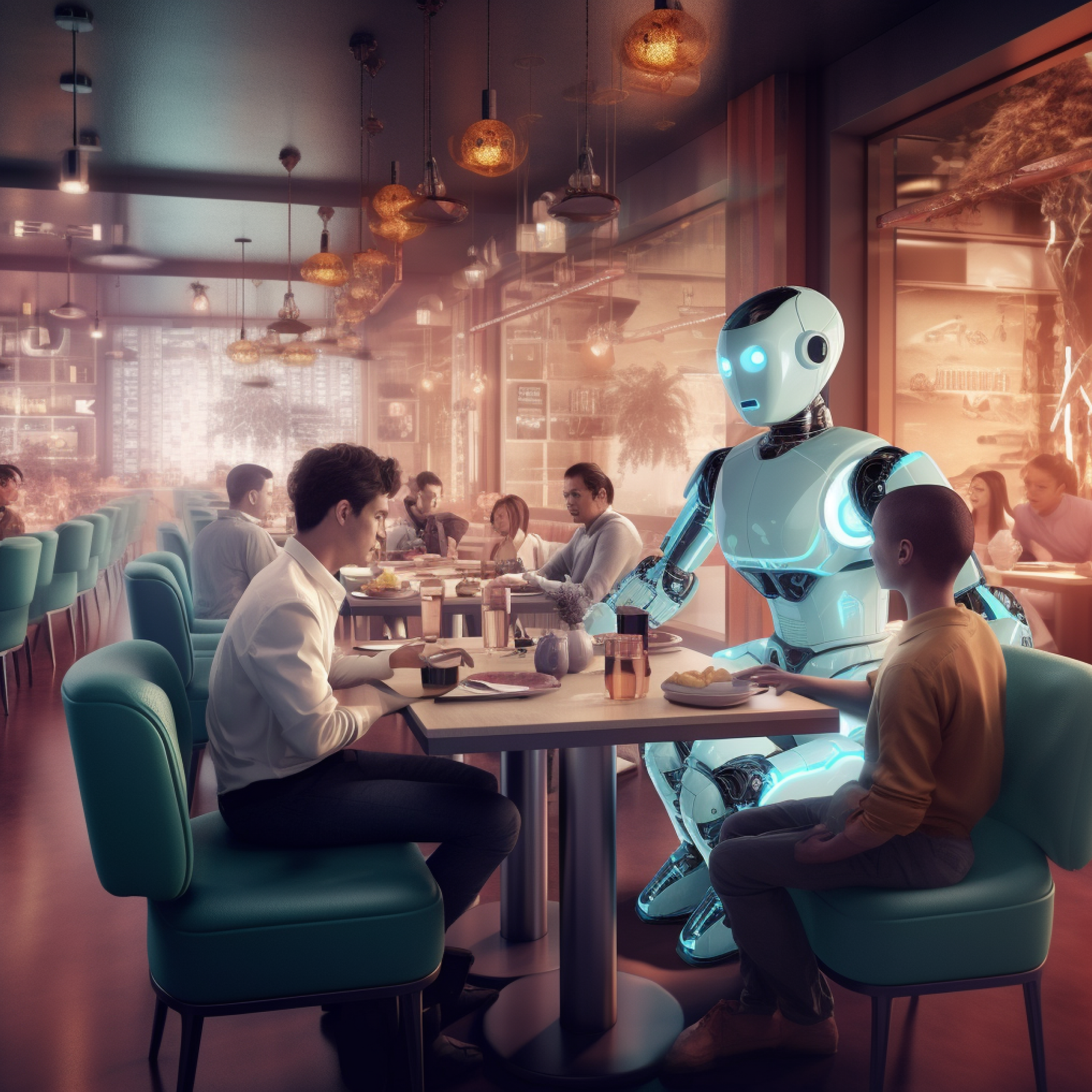
Many sites are implementing chatbot functions to assist customers with everything from answering questions on products and services to helping them complete actions. Powerful solutions built using NLP technology can parse conversations in real-time to assist visitors by helping them complete tasks – like ordering a pizza – as if they were having a conversation with a real person.
One good example is the Domino’s pizza bot, Dom, which users can take advantage of to order items from any Domino’s location. They cleverly include a list of options along with each question asked during the chat, paralleling what an employee would ask a customer placing an order.
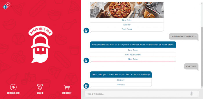
Chatbots can be tailored to handle a vast number of tasks, whether placing an order for a product or resolving a customer service issue. By including a well-designed chatbot, you give customers additional autonomy by furnishing a mechanism that can understand them, thus saving them time when compared to other communication options.
2. Fast load times and navigation
When a website consistently fails to load pages, it shakes a user’s confidence in the site. When connectivity issues aren’t to blame, slow response times stemming from poor programming or insufficient infrastructure that prevent users from taking action can lead to lost revenue. For example, if you’re offering an eCommerce platform that struggles to populate content like text, images, and video then expect users to go elsewhere.
Businesses need to work closely with their development teams to understand a couple of key factors when building a site: investing in your code and backend are crucial to your site’s performance. Using third-party plugins to quickly build out certain features still requires programming to properly “fit” everything together for a custom site. It’s best to give developers the time they need to either refine third-party tools or the components they build themselves to ensure their operation is consistent with a site’s expected behavior. Too, don’t’ skimp on infrastructure – if your backend support tells that you need an additional server and a load balancer to accommodate your traffic, then spend to scale your product.
3. Continuous scrolling
For sites that host a lot of content, continuous scrolling is a great website trend that give users the ability to wander through your content when they’re not looking for anything in particular, much like most social media platforms. This is ideal when your users are aware of your site or brand but aren’t necessarily sure what they’re looking for. In this sense, it’s similar to the experience of walking through some retail outlet, looking for an excuse to spend.
Continuous scrolling is useful when you have both users with time to kill and a substantial amount of content to offer. There is also an application for this design in eCommerce – when used in conjunction with AI that categorizes your items with similar items and those often purchased together, you can deliver a more engaging shopping experience.
Despite their reputation for selling everything from obtuse knockoffs to the downright weird, this is a design that Wish incorporates into both their site and app. Several factors work together to contribute to the success of Wish – on the tech side, they have successfully combined continuous scrolling with AI that makes product recommendations that combine to keep users around for long usage sessions which often translates to conversion.
4. Motion graphics and video
Motion, when used as a tool, proves useful in directing a user’s eye to an area of a page that requires their focus. Through motion graphics, you can engage users by using something we’re biologically predisposed to notice: movement.
As movement inherently captures our attention, motion graphics should be used to lead the viewer’s eyes to focus points like CTAs or other valuable bits of information, depending on the goal of the page. In addition, movement proves highly useful in visual selling where it can be used to not only keep the attention of a user but also break down complex thoughts. When you’re selling something hard to describe through text alone, you should consider going with a motion graphic or beyond by developing a short video like the one we from SAP below.
SAP: One-Stop-Shop for Business Management Solutions
Eliminate the challenges of managing multiple disparate systems from different vendors with SAP. SAP offers a full portfolio of integrated solutions that are…
One thing SAP does great in the video is include several segments that use different motion graphics to demonstrate how their product solves a problem. It’s much the same as how a movie trailer serves to sell a movie. It’s far more exciting to watch a well-constructed preview of a movie where you can see it in action versus simply reading about it.
5. Storytelling
People have relied on storytelling to engage with audiences since the days our ancestors were still figuring out how to make fire. Today, we can accomplish digital storytelling through written content, graphics, video, and even interactive programs.
Establishing an emotional connection with your prospective customers through story pulls them in when selling more elaborate products and services or conveying complex ideas. A great example of a company that uses storytelling is GE which uses a combination of well-written content, motion graphics, and sometimes video to paint of picture of the big ideas that their products work together to solve. For example, this page on Bloomberg put together by GE combines these elements and links to correlating stories that, when combined, teach viewers how many individual elements work together to contribute to efficiency in business.
6. Full page headers and embedded videos
This is more of a modern design trend that integrates several of the above ideas into one highly-noticeable component of a webpage: your header. Here, we can take a lesson from our effective header on the Blue Label Labs main landing page. As you can see, we incorporate a simple message that describes a business along with an eye-catching motion graphic that keeps the eye centered on the focus text of the header which summarizes what our business accomplishes for our clients.
Another popular website trend that we will be seeing more of is the embedded video which is often used in the header. One great example you can check out is the site for the engineering company, Faraday Future, which does an excellent job of using quick clips of the products they support in action. In doing so they, prime their storytelling by immediately presenting what their efforts accomplish which entices viewers to dive deeper.
Blue Label Labs builds websites for the modern era
We keep up with shifting market dynamics like meteorologists monitoring the weather – insight into complex marketplaces enables us to design and build around current and future developments for the lifecycle of a digital product. Blue Label Labs keeps on the cutting edge of website trends to ensure the products we build hit the market with everything they need for our customers to succeed. Get in touch with us today to learn more about we can develop your site with modern, engaging features.
