App Rundown: Rolling Stone Magazine App Review
We appreciate a good app when we see one and the Rolling Stone Magazine app is a strong product that supplements their long-standing printed publication. Around this time last year, the company began a push to gain subscribers old and new to their digital subscription which provides access to both the online edition and full monthly magazine. Now that the newest version has had time to settle on the market, we’re going to take a look in this App Rundown.
Platforms where the app is available:
iOS, Android, Web (we reviewed all, but the following will be based on the Android version unless otherwise noted)
Our User Journey | Rolling Stone App
After downloading the app, the first thing you’ll encounter is a welcome message – after tapping the “Continue” button, you get right into configuring the app. The first step is simply to pick your interests from a broad category of topics like politics, movies, culture, music, and more.
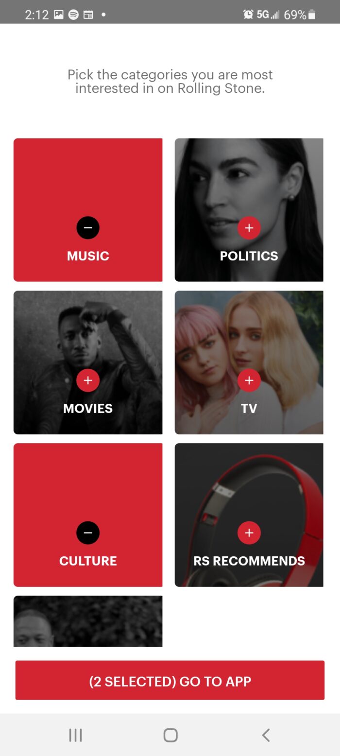
Once you’ve either selected your interests or skipped the process, you’ll be taken to the home screen of the app. Everything you can do is pretty well laid out by the different items in the app bar along the bottom. At first, I tried to explore the app but you can’t get too far into anything without first being presented with their different subscription options. For Android, you’re presented with the options below.
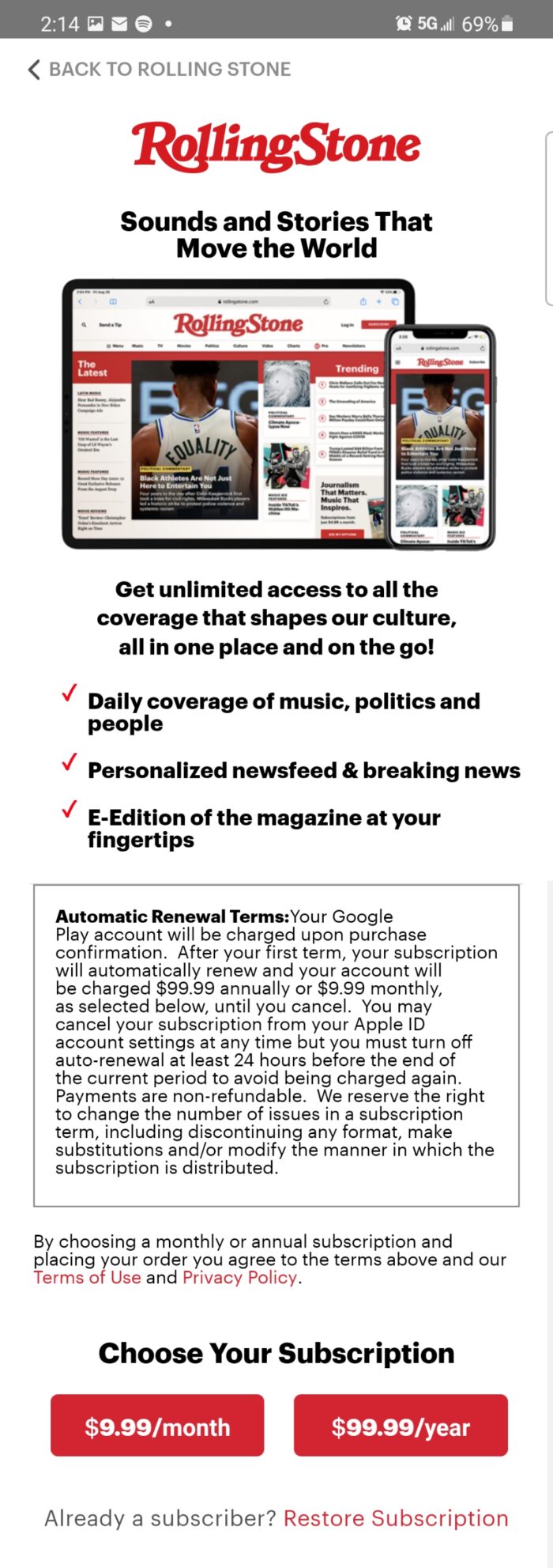
Interestingly, if you’re to sign up on either iOS or the web, you’re presented with different options that also include options to order the printed edition. By signing up in Android, it will automatically connect with Google Play which it will use for billing after the 7-day trial period which wasn’t offered at the time on either iOS or the web. Once you’re signed up, the app (and site) opens up by allowing free reign over content found throughout the app.
Now, the various areas you see in the app bar will open up. For the most part, each section provides a different interface for finding content. The first of which is the default home screen where you can easily browse the app for content using the menu at the top to discover an appealing category.
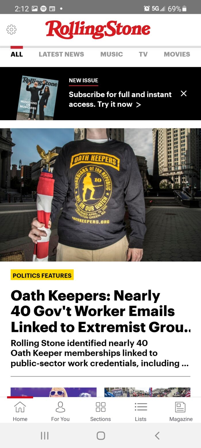
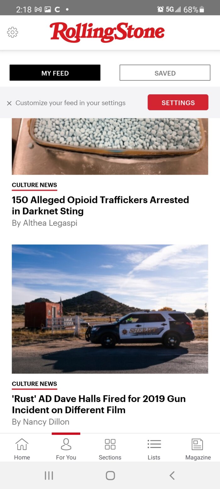
The middle item called “Sections” is essentially a refined version of the home page, purely providing a menu-style list of the same categories you’ll see spanning the top of the main area. However, in the “For You” area, you’ll be able to find a curated list of content based on your preferences. Any saved articles will also appear by tapping the “Saved” button to find content organized in the order they were saved.
The “Lists” area compiles an assortment of lists from a handful of categories that currently include everything from Taylor Swift’s best songs and 50 movies to watch this fall however, there are few in the politics or culture category despite having sections for them. In some respect, it’s kind of refreshing as this style of content can be click-baity in nature so it’s nice to see they avoid this style of content for said categories.
Finally, is the “Magazine” section which includes a high-quality scan of the printed magazine that currently seems to go back to mid-2019. Right now, you can browse through the latest issue to read an interview with Foo Fighter’s frontman, Dave Grohl, and some input from a few other parties like drummer, Taylor Hawkins.
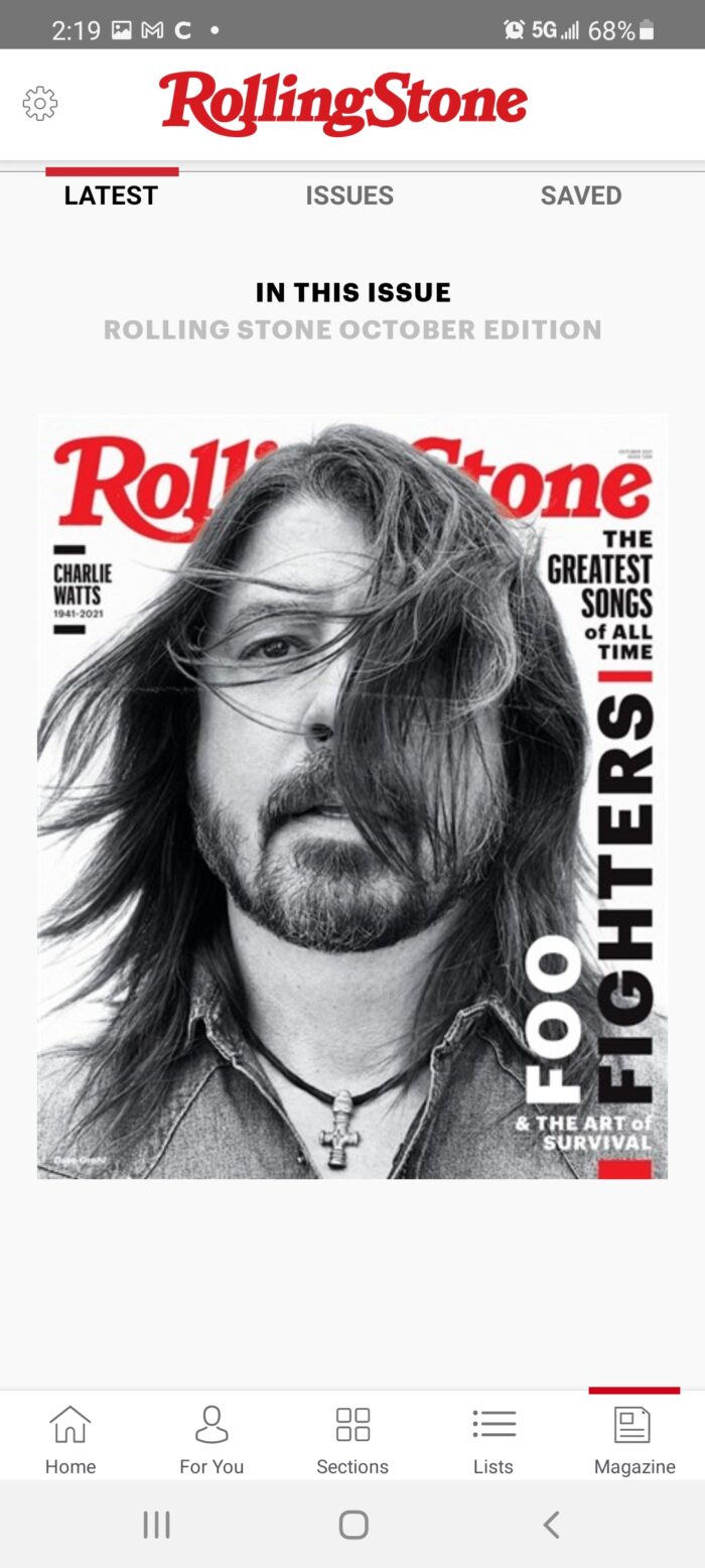
With minimal hassle, you can select the “Issues” link to navigate through past issues. Note that you can also save issues which makes them easy to come back to later.
What we would consider doing differently
Structure, presentation, and responsiveness: all are on point. When looking at the overall quality of the different Rolling Stone Magazine app across the three biggest platforms, it’s exactly as you would expect from a world-class publication.
With that said, there are a few different issues that make the experience not quite as enjoyable as it could be. I also signed up on iOS as “flipping” through the digital version of the printed magazines is way better – one thing I noticed while deleting and creating accounts is that anything you “save” in the app is all local. As such, don’t expect these things to sync across devices or return if you happen to delete the apps from your device, at least for the moment.
Another thing I feel that would help the experience is with the print magazine would be a bit more depth to the navigation. For example, if I want to read something on page 65, I can’t just jump there – you have to slide each page after it loads until you reach your destination. It reminds me of an older version of HBO Max (which is still hot garbage, aside from its stellar content) where a slow seek that covered just over an hour per minute was the only way to skip forward in a movie.
The other thing that would be of great benefit is something like an OCR (Optical Character Recognition, which is a function of computer vision) that would make it easy for publishers to easily add links to the table of contents so users can just tap to go to the story they want to read. It would also be nice to be able to save just the stories or a range of pages in addition to the entire magazine.
Lastly, there’s only one real accessibility option which is to enlarge the text. It would be much better if there were audio options to listen to each story in the print magazine as well as the web as this would be ideal for people with severe visual acuity issues, it would allow people to listen while they focused on some other tasks, plus it’s just helpful for those of us who are lazy.
What other people are saying about the Rolling Stone Magazine app
“New app is sooo much better! There’s so much more available here. I can choose what topics Im most interested in and save stuff I like or want to read later. It’s not just the magazine too. I can see video and other cool stuff from the website that’s not in the print version. Very cool!” – Stephanie Piper-Shimizu
“Worked great for me – try the updated version. Navigation is smooth and intuitive. I was quickly reading about and watching video clips from some of my favorite artists. Wish it was free but it’s time to accept good journalism is worth paying for!” – 🐺🎧ANIME_KAWAII WOLF🐺🎧
“… I love buying Rolling Stone (among other music publications) when I’m traveling….but purchasing this app makes so much more sense, as I get to enjoy every month’s addition now, and I save money ofc, by not paying stand prices + no magazine to carry around and lose before I’m done with it. Digital magazines just make sense, because I always found myself wishing I could listen to the songs being reviewed as I read. With this app I can do that, watch interview/trailers (just overall get more content) and be directly linked to downloads ect. Everything looks great, navigation is easy, no major technical glitches…not much more to ask for really.” – ksmurfer
Thought on the UI and overall design:
Just to reiterate: if you step back from what it could be and assess it as it is, the app itself is solid. I would prefer if the experience synced across platforms so everything that’s been saved or bookmarked is unified across devices. Other than that, the only part that drags is navigating through the digital version of the print magazine.
How the app makes money
The app makes money the same way the magazine has since it first came to print in the late 60s. Users can either pay $7.99 a month through Google Pay (or whatever credit card you use when setting up an account on either the web or iOS) for a digital subscription or pay $9.99 a month (billed at $119.98 annually) for a subscription that includes both full digital access and a print edition delivered monthly.
What keeps us coming back
I mean, it’s Rolling Stone – while no publication is perfect or without bias, Rolling Stone employs real journalists who do an admiral job at creating engaging stories for every single issue. They’re usually good about ensuring their staff is held to a high degree of journalistic integrity. Of course, there have been some significant mishaps over the years and it’s quite possible it could happen again, as with any publication.
If you’re a reader, one of the best parts is the subscription package with both the digital and monthly print of the magazine. For some of us, the feel of holding a magazine or a newspaper is a whole different experience when enjoying content from a medium that light shines on rather than from. Plus, it’s a great conversation piece for your coffee table.

