Behind the App: An Inside Look At Dani’s List
For anyone with, you know, dreams and aspirations, it’s always inspiring to see what goes on behind the scenes to make things happen. This past week, I sat down with Jordan Gurrieri, the creator of Dani’s List, the “fun to-do list of things you actually want to do,” to talk about his idea for the app and how the final product came to fruition.
So sit back, relax, have some crepes and tea, and read on for an exclusive look at how this app went from Idea to App Store. (See what I did there?)
The Problem:
How many times have you seen someone else having fun and said, “hey, I’ve always wanted to do that”? Now, how many times have you forgotten about that fun thing you’ve “always” wanted to do?
We’re not judging – it happens to all of us.
Sometimes, people need a reminder of the things they’ve always wanted to do. Sometimes, they just need to try something new.
So, Dani’s List was born.
“The idea for Dani’s List started from a need my wife, Danielle, and I had,” Jordan explained. “We needed a place where we could write down and remember ideas for things to do when we had some free time. We also wanted to remember restaurants in the area we wanted to try or liked so it would be easier to decide where to go for dinner some nights.”
To keep track of all these things to do and places to go, the husband and wife wrote their plans everywhere they could – from apps, such as Evernote, to good old journals and random post-it notes on their desks and on their refrigerator. Often times, these fun ideas got mixed with rudimentary to-do lists that included work-related tasks and household chores. “What we needed was an organized way to keep our ideas together. What we needed was a to-do list of things we actually wanted to do. So, Danielle suggested that I make an app for it.”
Researching the Idea
To determine whether or not a what-to-do list was a viable idea for an app, Jordan ran the concept by some friends and colleagues. He realized that so many of them had the same problem. Much like how he and his wife kept lists all over the place, others had their own quirky solutions to keep track of things they wanted to do.
“My research showed that not only do lots of people have this same problem, but they also have great ideas of fun things to do, too,” Jordan said. “One way we could make Dani’s List unique and more than just any other to-do list is to make it a social discovery platform for people to share and discover fun things to do from anyone using the app.”
By asking around, Jordan’s research validated the problem and the need for a simple solution – in this case, one simple app that can remember the things people want to do, enable them to discover new things to try, and help them decide when they can’t decide what to do next.
Sketching it out
Every great idea starts with a rough sketch. To conceptualize the idea, Dani’s List started with hand-drawn sketches. To refine the end-to-end flow, Jordan used Keynote Mockup Templates for the iPhone.
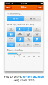
Sketching out an idea for an app, however, refers to more than just its design and UI. It’s also about identifying the different features an app will have and how users will use them. While sketching out Dani’s List, its mockup had four basic features: the user’s saved activities, activities others have shared, a button to randomly suggest an activity, and contextual filters to better cater activities to user preference.
Jordan said, “The idea for filters came about from an idea I’ve been noodling on for a while on how we can categorize and search for things to do based on the context of the situation or our surroundings. We could start with manual filters and then automate these contextual filters over time with machine learning.” These filters include time of day, the weather, indoor or outdoor activities, costs, and more.
First release
 |
 |
 |
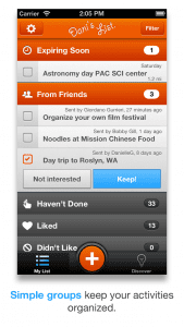
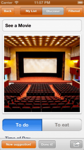
To learn more about the product, the first version of Dani’s List was released as a minimal viable product (MVP) that was very simplistic in its design. Their goal was to see how much interest the app would draw, how users used the app, and what other features or improvements they could implement to make it better.
“We quickly noticed a lot of organic downloads, especially on weekends,” Jordan revealed. “This further validated that people were looking for a solution for this and, not surprisingly, people wanted to have fun on the weekends.”
While the app saw some relative success in terms of download numbers, the big picture showed a different reality that identified a number of problem areas – and showed just how much the app fell short of expectations.
Jordan continued, “We noticed that, although we were getting a lot of downloads, less than 10% of people were signing up and saving activities. Furthermore, of the 10% that signed up, almost half were creating activities that suggested the experience was not as intuitive as we had hoped.”
To address the issues demonstrated by the first release of Dani’s List, a few updates were sent out that included Flurry analytics, UI tweaks, bug fixes, and other improvements. They even added a tutorial onto the app, in hopes of steering users in the right direction as to how the app was intended to be used. The tutorial marginally helped.
The real fix was a much-needed overhaul.
Version 2
Sometimes in life, you need to make a tough choice between figuring out how to fix what’s broken or rebuild from the ground up. For Dani’s List, it meant going back to drawing board.
So, Jordan did something that every app developer should do: suck it up and listen to users – regardless of how bad the feedback can be.
“We talked to friends, family and colleagues using the app, as well as some of our most active users,” Jordan explained.
Here’s what they had to say: Dani’s List is confusing. It needs to be more organized. Adding an activity takes too long. Selecting tags takes too long. There are too many screens. There’s too much text. I want to send activities to my friends. I want friends to send activities to me.
To respond to users’ needs and overcome the challenges Dani’s List faced, a mockup and redesign for Version 2 was in order.
Jordan added, “We realized that we were really onto something here that had so much potential. So we created a mind map to brainstorm and keep us focused.”
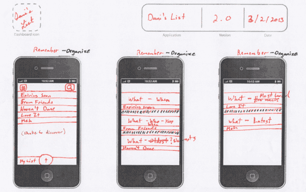 For Version 2, Dani’s List was built based on three pillars – Remember, Discover, and Decide – with three principles of design – simple, relevant, and fast. This model’s goal was to provide solutions to the three main problems users had: organizing activities, finding new suggestions, and sharing ideas.
 |
 |
 |
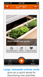
The result? Dani’s List Version 2 delivered a much better user experience. The new “My Lists” section has a simple organization model that requires little maintenance by the user. The new large activity tiles in the Discover section make finding new activities easier. The lengthy list of text tags were replaced by visual tags that are more aesthetically pleasing and make discovery more interesting. Tagging is much faster, and the share feature seamlessly integrates throughout the app so it’s easy to send and suggest activities to friends or add friends to your own activities.
Jordan revealed that daily downloads have increased and they’re seeing that interest is still growing. “In Version 2, we’re even seeing a big increase in users tagging activities than in Version 1. More importantly, though, active users staying with the app have doubled and people are adding activities three times as much as before.”
So where is Dani’s List headed from here?
Dani’s List is far from being a complete, perfect app (if there is such a thing). There are still problems that need to be addressed and many challenges that the boys at Blue Label Labs have to face.
One issue is at the very core of the app.
“A problem we are seeing still in Version 2 is that a lot of users are keeping their activities private,” said Jordan. “There are a lot more activities in our database than what is visible in the Discover list.”
As a social app where sharing is inherent, the immediate goal for Dani’s List is to find out why people aren’t publicizing their activities and what can be done about it. “We are using our built in analytics via Flurry as well as our server data to get some insight into this issue. We’re also talking to users to better understand why they’re keeping activities private and not discoverable, despite everything being anonymous. We’re trying to figure out how we can encourage more sharing and make Dani’s List a real community of people who want to have fun and share that fun with the rest of the world.”
Triva: On Naming the App
If you haven’t guessed already, Dani’s List was named after Jordan’s wife, Danielle. Here’s the [really cute] backstory:
Some days, we had a hard time deciding what to do from our lists of ideas. Danielle had this little game she played as a child where she would write a bunch of ideas on individual pieces of paper and throw them into a hat. We would pick them out one at a time until we got one we both liked. Naturally the Appster in her said, “why don’t you build an app for this?
Thereafter, anytime Danielle had a bright idea of something fun we should do, a place to go, a place to eat, she would say, “See? if I had my list app, I could add it RIGHT NOW!” After a while I took the hint and started to mockup the idea. Hence the name, Dani’s List.
It was our own to-do list for saving the activities and places we wanted to eat, as well as help us by randomly suggesting one like we would do with the hat.
