We Asked 500+ People How Brands Deceive Them Online. This is What We Learned
The world seemingly becomes more consumer-friendly with each generation as businesses take more and more measures to ensure customers are left with a positive experience.
Despite our technological advancement and understanding of human nature, it’s still common to see deception in digital products. To understand digital deception (and better define it), we surveyed 536 people to measure and discuss people’s understanding of this matter.
Key summary of our findings
Here are the most important figures we uncovered in our study.
- 1 out of 4 respondents (24.4%) feels they have encountered a deceptive pattern in digital product design (i.e., website, app, game, etc.)
- Of the 5 examples we asked respondents to rate, examples depicting Delta Airlines and CNN were considered the most deceptive.
- 39.4% reported feeling deceived by a product as a deal-breaker in using the brand moving forward.
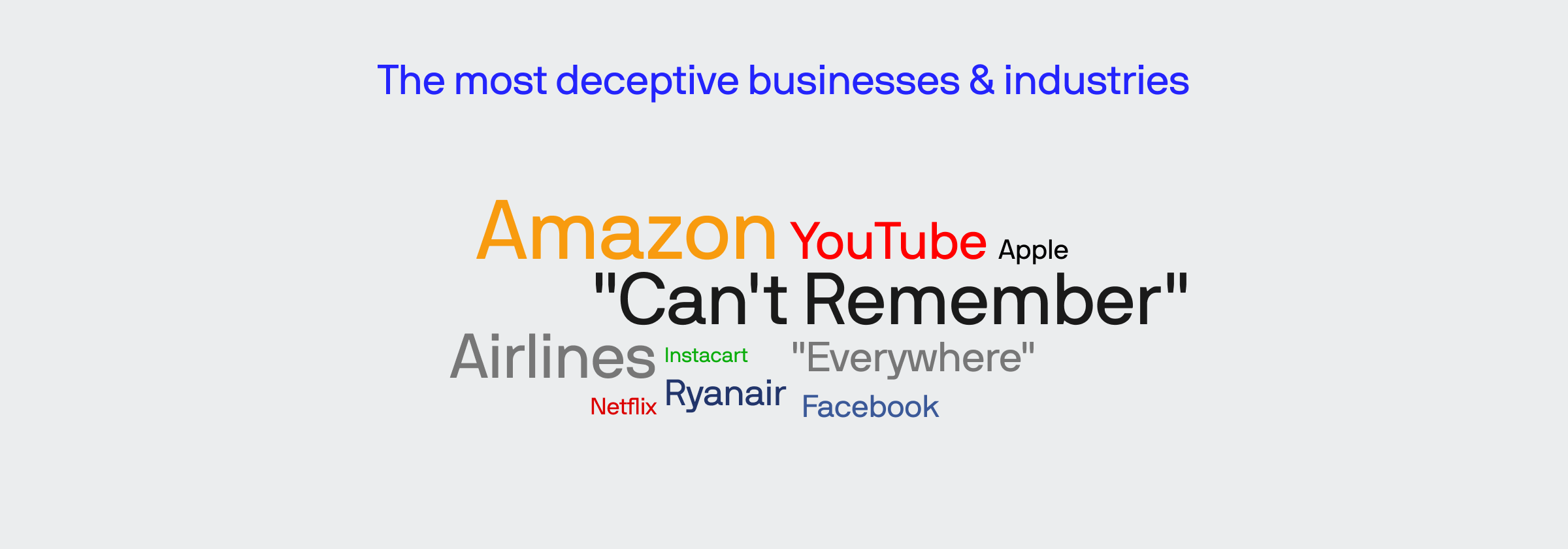
- When we asked respondents to optionally disclose a time they felt deceived by a brand not included in our examples, the 5 most mentioned companies are: Amazon, Ryanair, YouTube, Verizon, and “Everywhere.”
- Millennials are the most “certain” generation when identifying deceptive patterns but accuracy in categorizing examples was about the same for each generation analyzed (i.e., Gen Z, Millenials, Gen X, and all Baby Boomers).
Purpose of our experiment
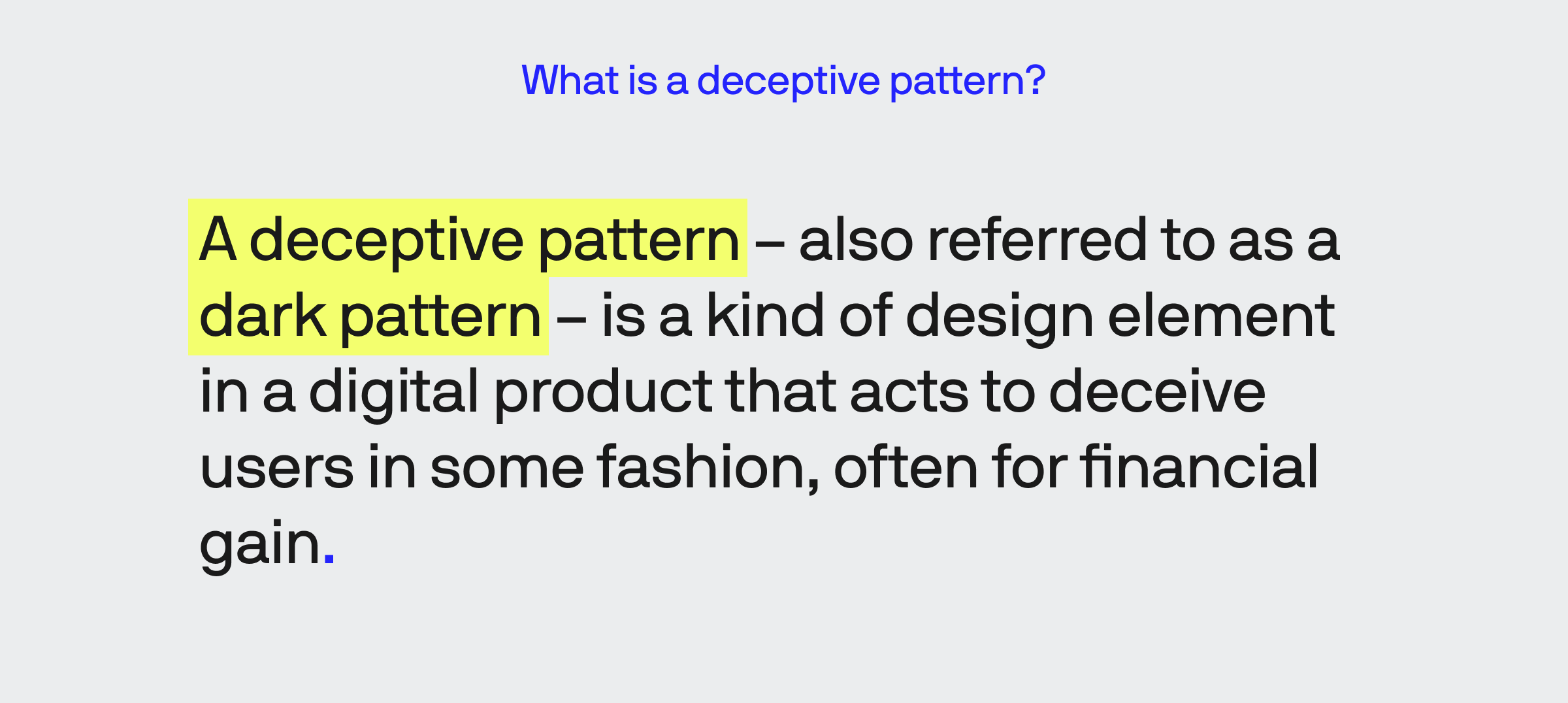
Deceptive patterns are frowned-upon practices, but the definition isn’t widely known, in addition to being subject to individual perceptions and attitudes.
We wanted to see how people would respond with minimal priming to see how they would react to different examples depicting varying degrees of deceptiveness.
In our introduction, we briefly defined a deceptive pattern before asking respondents to select from four choices from our five examples. Following this series of questions, we also asked our respondents to optionally disclose a company and circumstance they felt qualified as a deceptive pattern.
1 out of every 4 people feel deceived by brands online
The concept of “upselling” a product or service has been under scrutiny recently, and rightfully so.
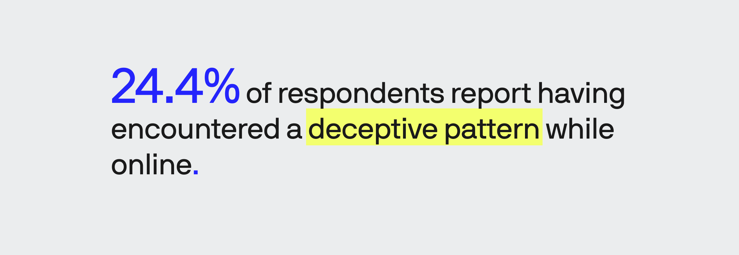
Beneath the matching color palettes, modern designs, and flowery language used by many popular brands, roughly a quarter of people of all people surveyed find themselves misled by marketing, design, or both.
There’s no way to avoid bias or ignore that mistreatment has a powerful, lasting impact. We can see where biases likely affected responses as those who answered this question “Yes” selected “Certainly a deceptive pattern category” between 2% and 9% higher when stacked against all responses.
This is a relatively small deviation, a quality further observed when analyzing different age demographics where the largest discrepancy is observed between Gen Z and Boomers when rating the TurboTax example. There is virtually no difference between how men (48.9% of respondents), women (49.4%), and non-binary individuals (1.7%) answered when looking at answer spreads.
Our respondents named Amazon, Ryanair, YouTube, Verizon, and “Everywhere” as the most deceptive businesses
We asked our respondents if they had encountered a deceptive pattern in a product not included in our example. Those who responded “yes” were then asked three questions to identify the company, indicate whether the occurrence was a deal breaker, and describe the situation.
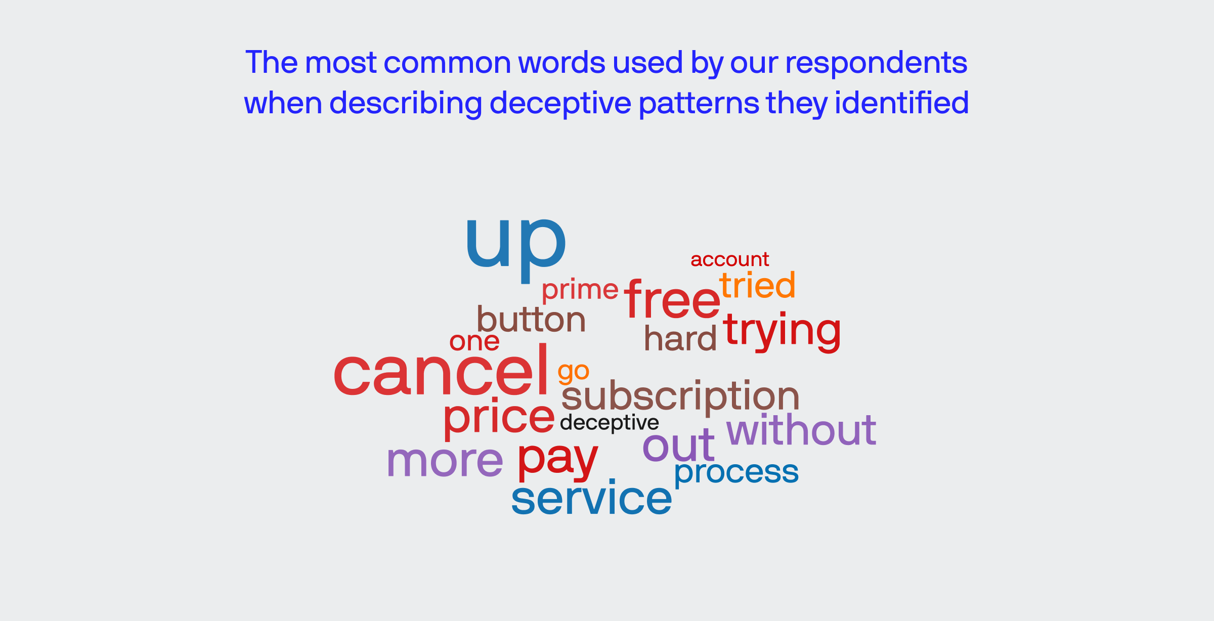
It is important to note that several lengthy answers interfered with various reporting tools.
We used a few different analysis methods, including sentiment analysis with Azure’s Machine Learning to classify and sort data. Additional, manual ways of arranging and grouping answers allowed us to count and de-duplicate different mentions of specific businesses.
This allowed us to analyze “proper” answers and the long-winded responses where respondents either listed multiple businesses or indicated they see deception frequently but can’t recall a specific example.
Amazon is, by far, the most mentioned, with 17 users indicating issues with everything from struggles with the retail side to modifying or canceling a Prime subscription.
Almost every airline you can think of gets a mention for similar reasons paralleling our Delta example. Other honorable mentions in the “deceptive airline category” include Ryanair, Southwest, Spirit, and many people echoing Delta (though we specifically asked for examples we didn’t already include).
Here are a few direct responses from our respondents:
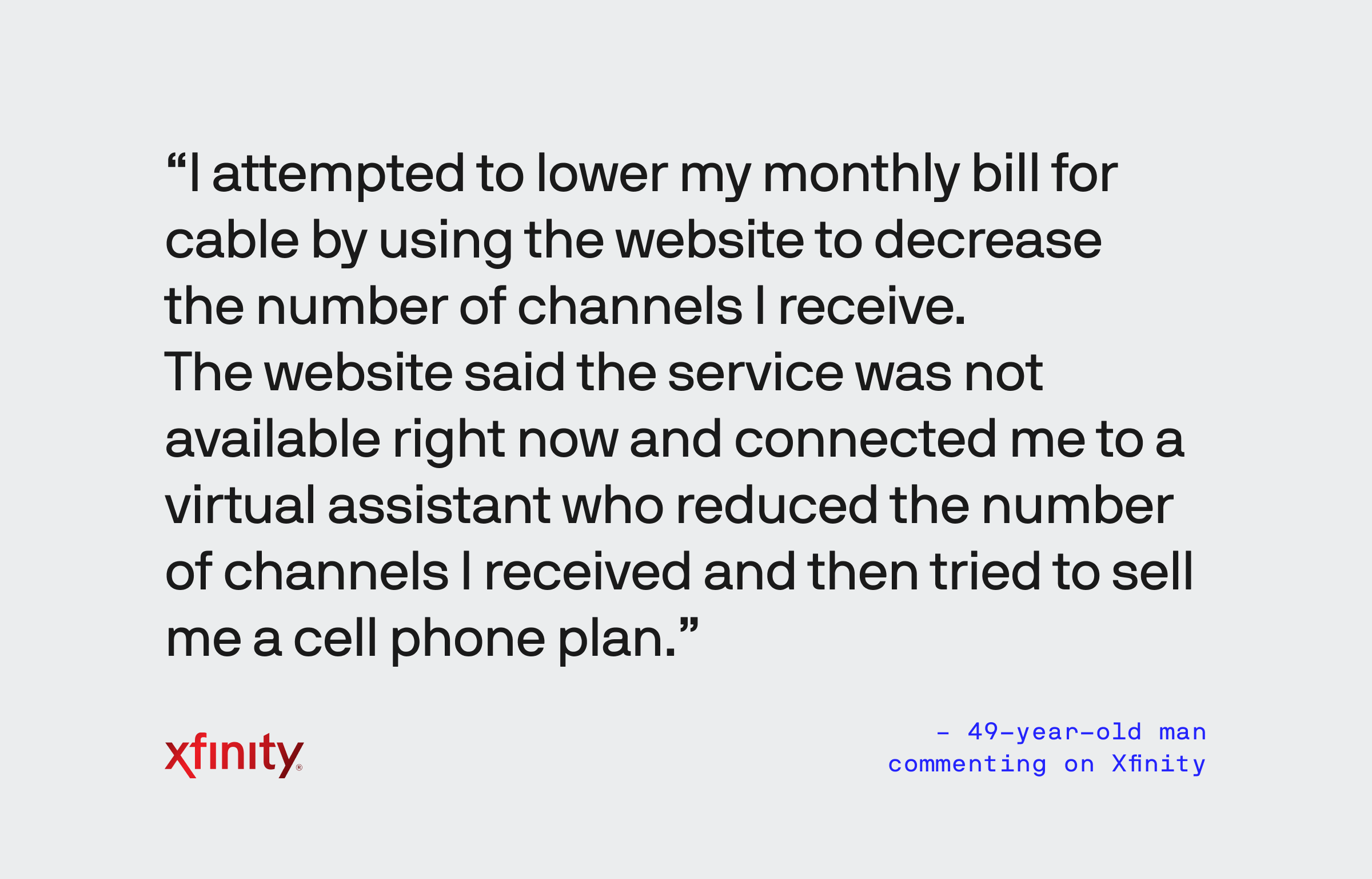
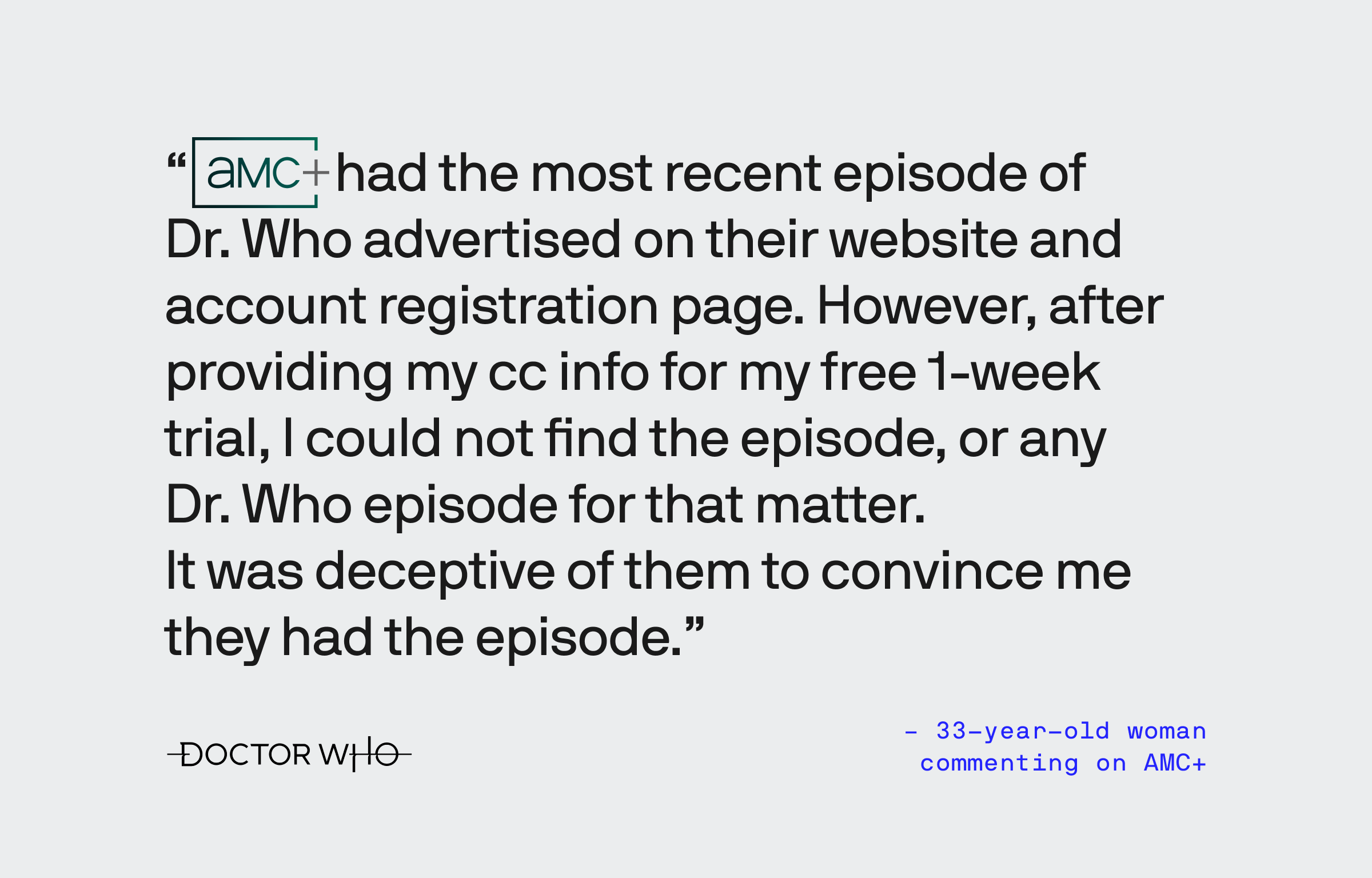
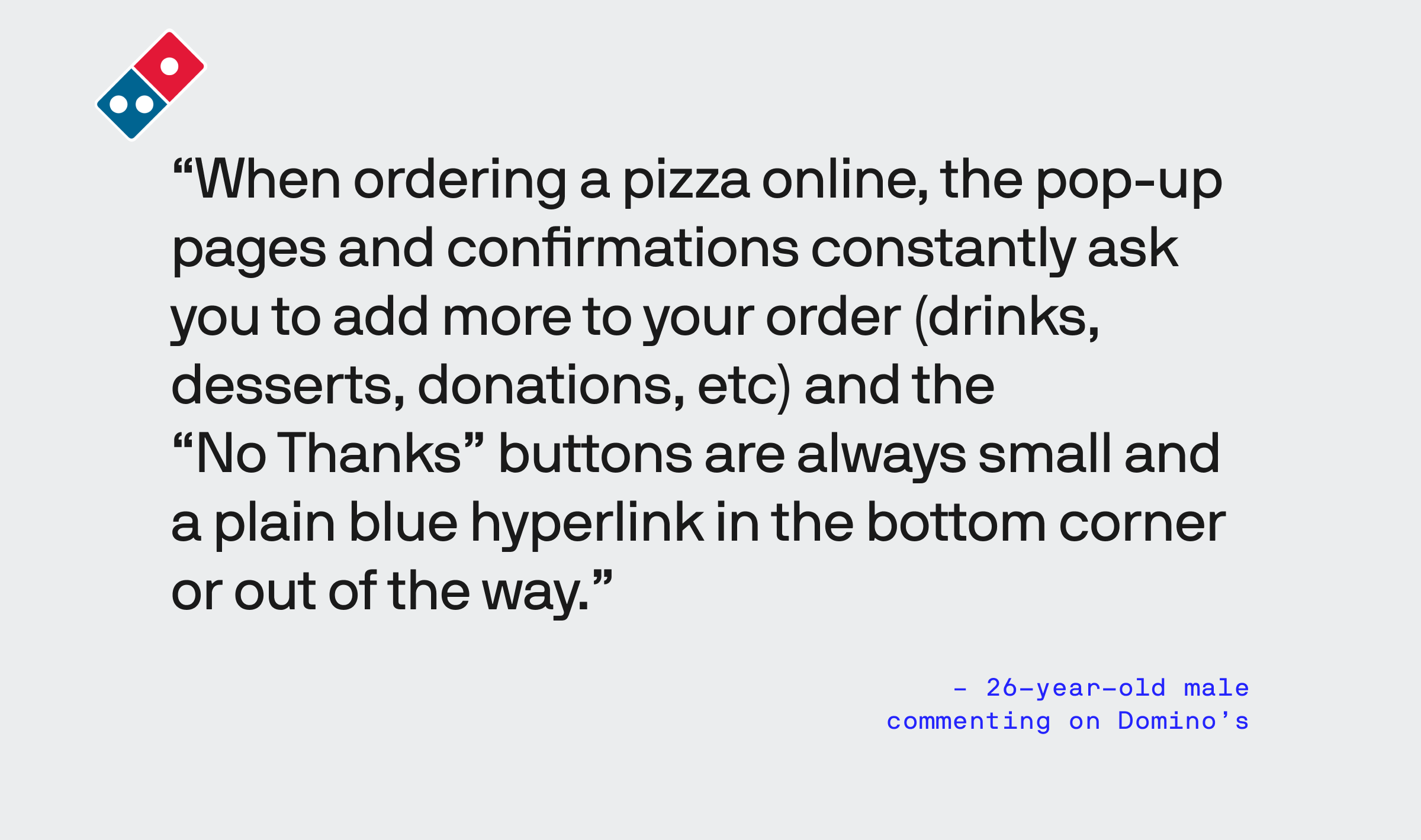
Per our data, the kinds of businesses where these issues are most frequently spotted are cable/TV/ISP providers, popular (and unpopular) streaming services, and banks/credit services.
Though have to take absolute responses that state “deceptive patterns are everywhere,” it’s important to note that almost every business industry has at least one mention.
Almost 2 out of every 5 people report a deceptive pattern as being a deal-breaker
More accurately, 39.4% of people report they will avoid a business in the future if they feel they’ve been deceived.
There are a couple of other observations worth noting:
- Some people list reasons for feeling deceived that aren’t technically deceptive patterns.
- In some cases, people are stuck with a business because they have no other option.
To briefly elaborate, some companies are guilty of poor customer service or following through with specific services that fall outside the scope of a deceptive pattern. For example, PlayStation has been accused of “blacklisting” users for several suspected reasons, at which point the business no longer responds to requests such as warranty repairs for their faulty equipment.
In another example, some users find themselves stuck with certain ISPs like Xfinity or AT&T because it’s the only viable service for their area. Even when the customers feel wronged, they have no other alternatives so they begrudgingly maintain service until another option becomes available.
The story’s moral is that if you deceive someone and they have an alternative, they’ll bounce to a competitor. And if your service is a pain to cancel, that seals the deal.
People feel more deceived by Delta than any other brand
Delta, and many other airlines, use a “modular pricing model,” which is just a sneaky way of trying to sell you things you don’t want or need, as well as a justification for their gratuitous inclusion of junk fees.
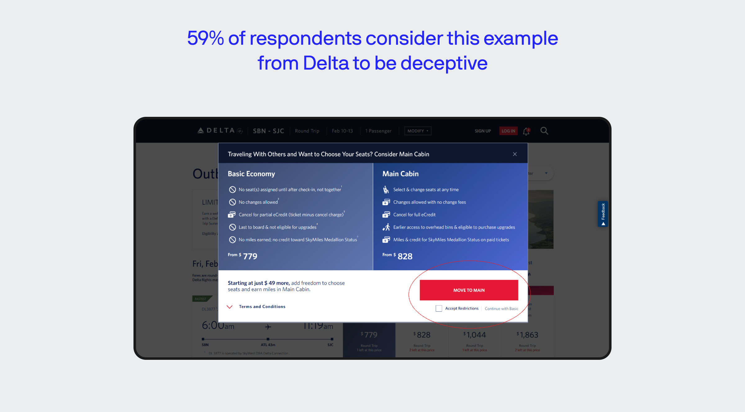
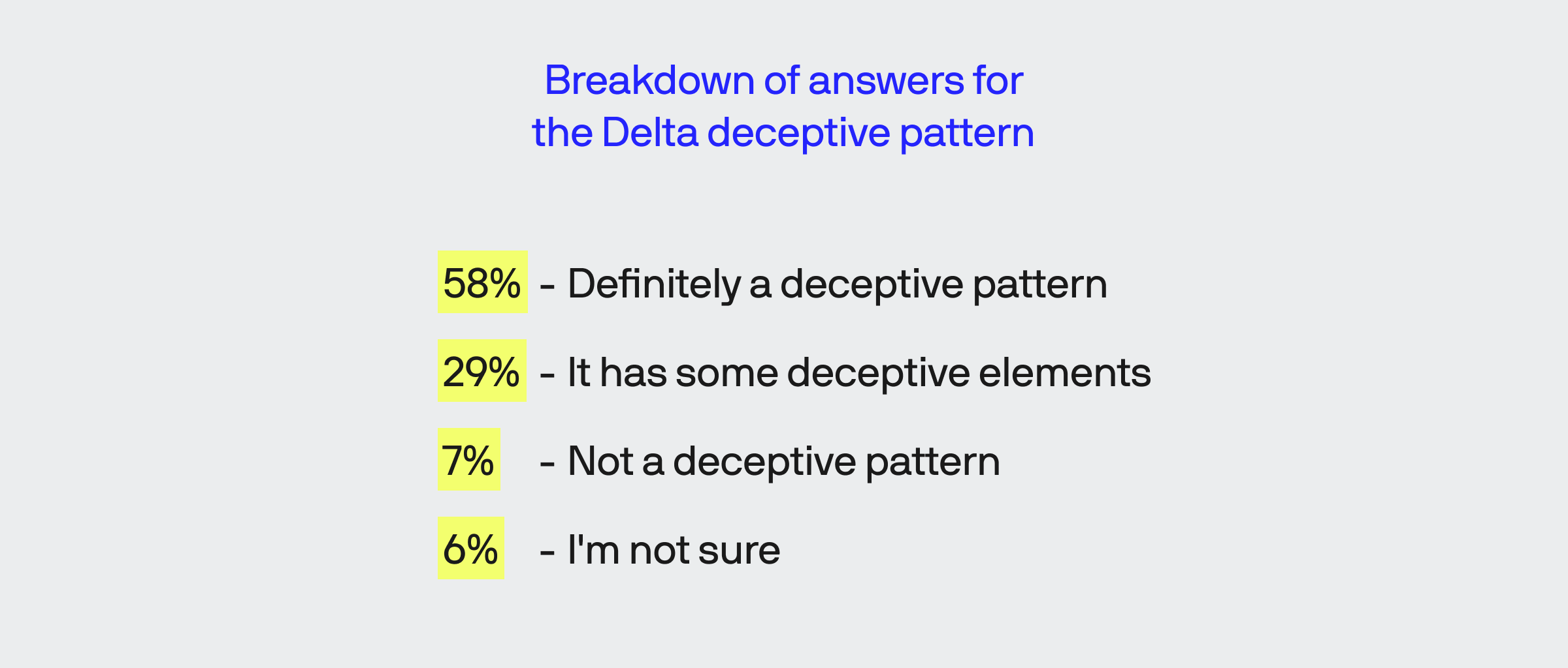
This screenshot was taken while attempting to book a flight from South Bend to San Jose. Upon selecting a flight and seating option, you’re presented with the pop-up seen above where the largest navigation element (i.e., the red button that reads “Move to Main”) upgrades your seating for an additional fee, adding services that should be rightfully included with any flight.
This is one of two examples we feel are firm examples of a deceptive pattern.
CNN was rated as the second most deceptive pattern
After a few tireless moments of searching LinkedIn for posts explicitly calling out “dark patterns,” we found this example.
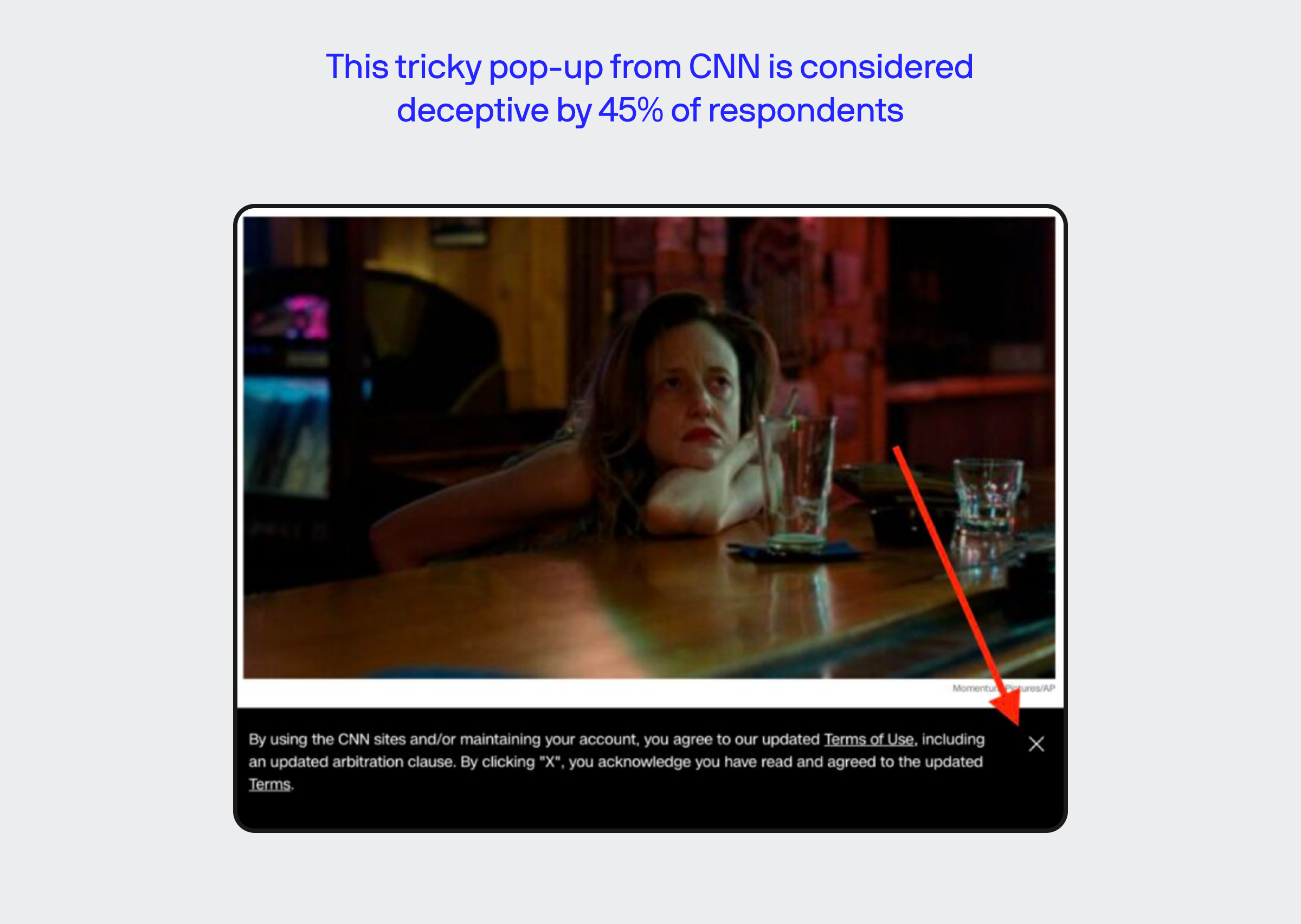

The above shows a tactic that CNN used until recently where the classic “X” UI element that we understand allows us to close something also constituted an agreement to their ToS.
This is the second example we also feel depicts a clear example of deceptive design. With that said, the consequences are arguably less severe than the direct, financial impact that can result from deceptive designs, as with Delta pictured above.
37.5% of respondents feel TurboTax’s constant ads to upgrade are partially deceptive
The most common subset of topics found when searching TurboTax relates to pricing, as the company offers several tiers of paid services for different earning and employment situations.
However, our example focused on one specific, recent instance: their ad for TurboTax MAX that pops up for users multiple times while filing returns.
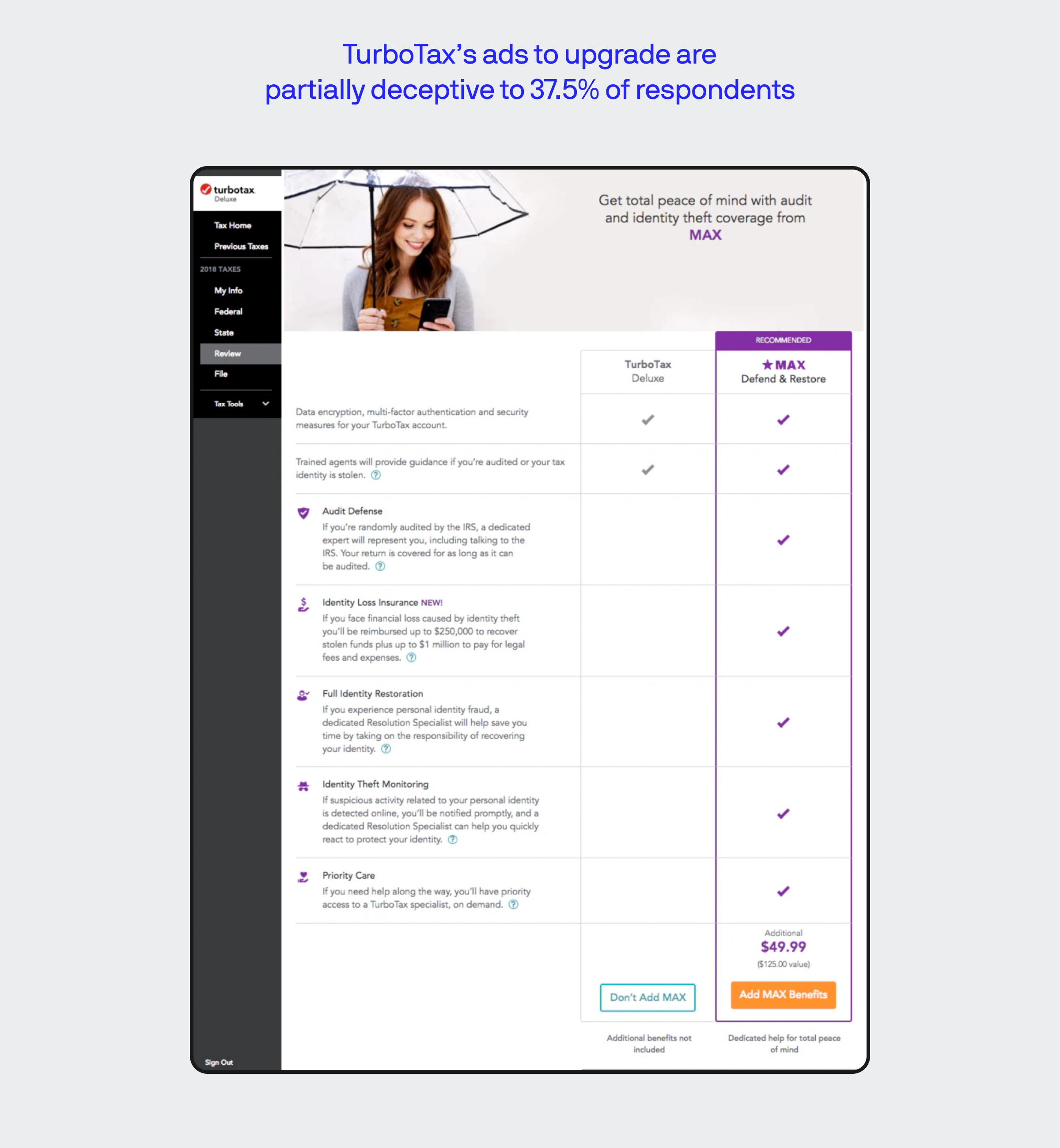
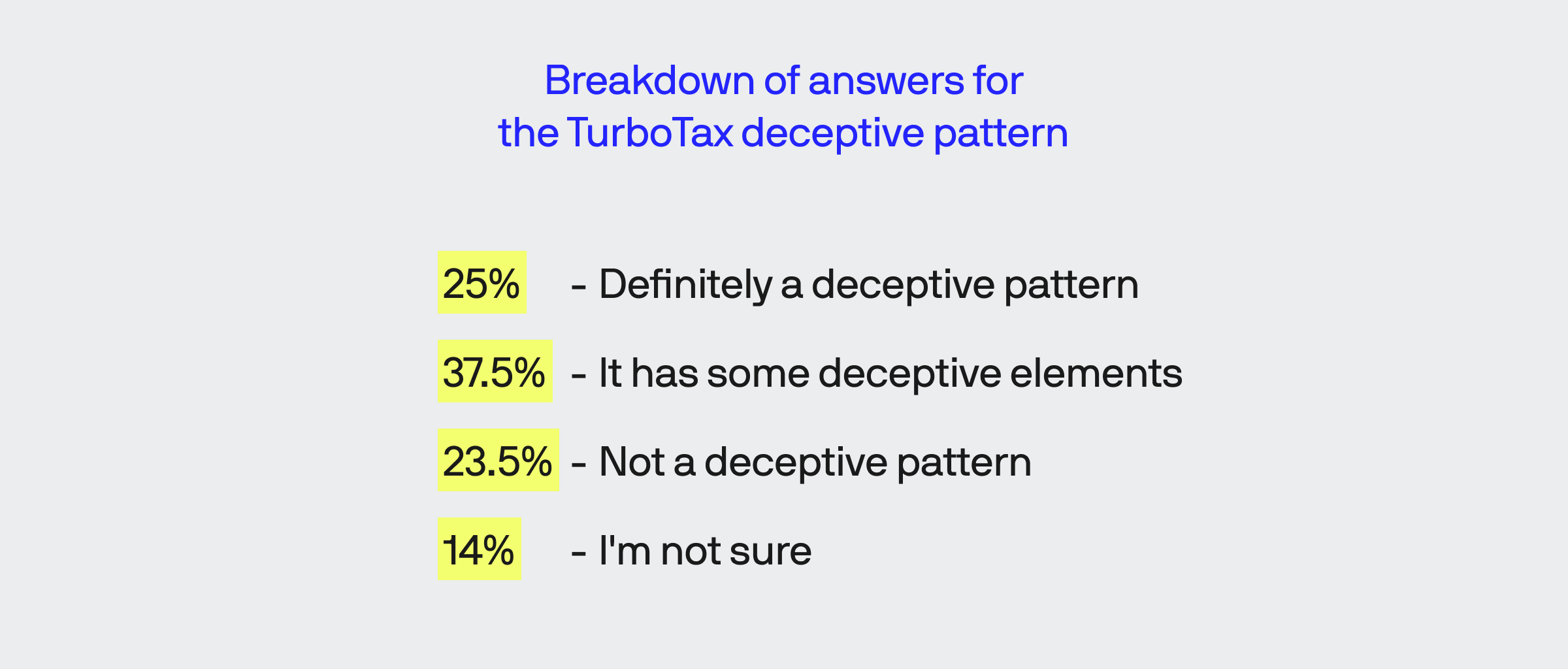
With this example, we firmly believe that this is one of two cases best described as “somewhat deceptive” over the “certainly deceptive” or “not deceptive” options.
The design attempts to frame MAX as a superior offering, with five purple checks more than without. It is easy to decline the offering, but the pop appears frequently.
Assuming the service does as described, it would be a valuable add-on for some users. At the same time, most identity theft services simply monitor for instances when a social security number appears during a credit check or when a new account is opened with that number attached.
The free version of Credit Karma does the same thing for free and mostly in real-time.
32.% don’t feel Dotloop uses deceptive designs; 29.1% feel its partially deceptive
The screenshot we provided from the real estate transaction management platform, Dotloop, shows a simple pop-up that appears after a user signs a document and isn’t logged in with an account.
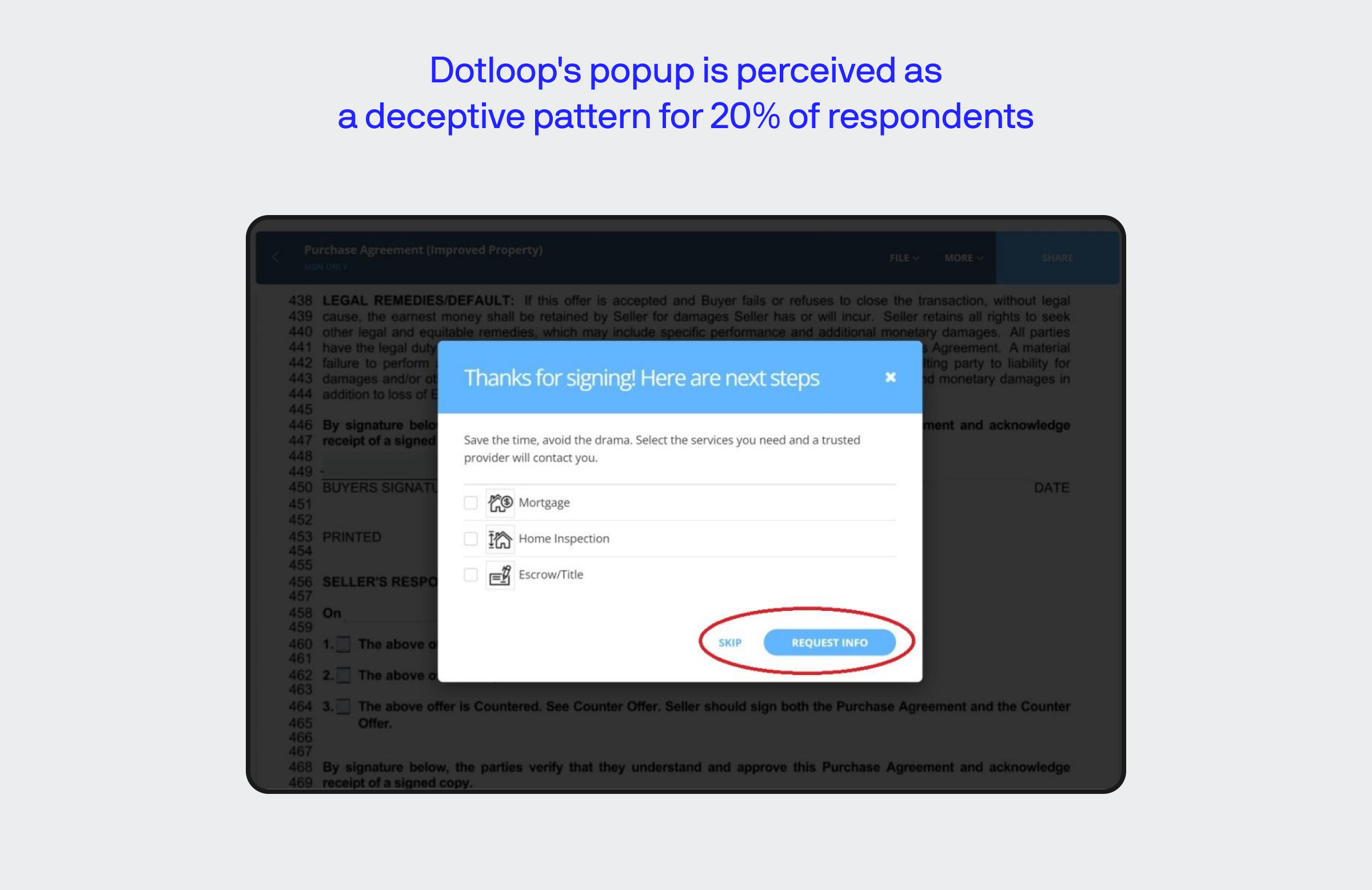
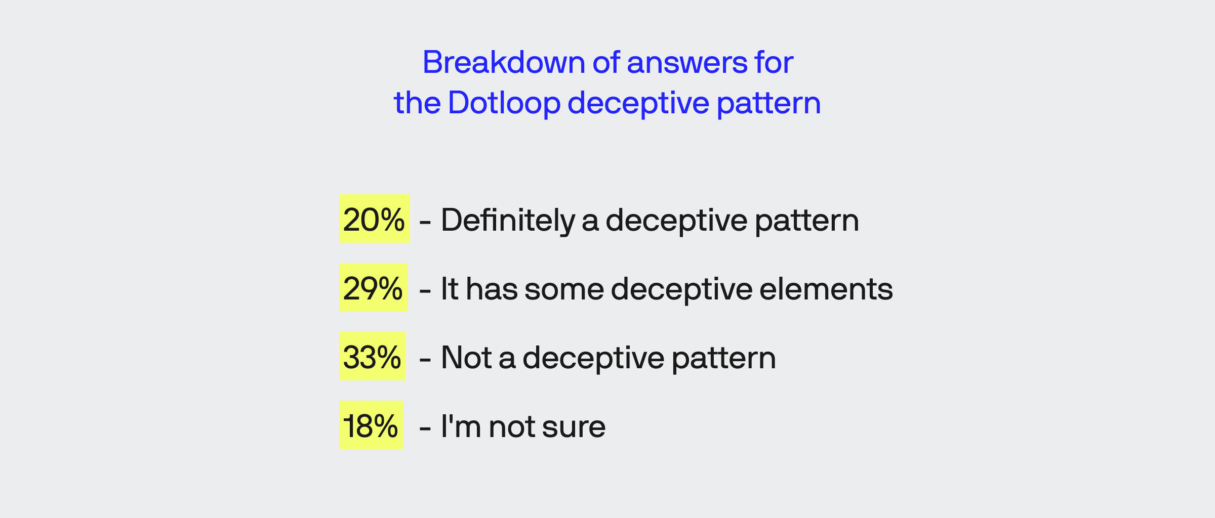
While some of these examples are much clearer when a video is used to demonstrate multiple steps, but here, hitting “Skip” completes the process with no further solicitation.
Though it is a little unclear, selecting any or all of the options presented with put you in contact with a third-party “trusted” by Dotloop. However, these are things that some users may need, so we consider this mostly not deceptive while acknowledging a solid argument could be made for being slightly deceptive.
Unlike TurboTax, they leave you alone once you decline (or skip) – this pop-up may be toggled off indefinitely when a user is logged in with a free account.
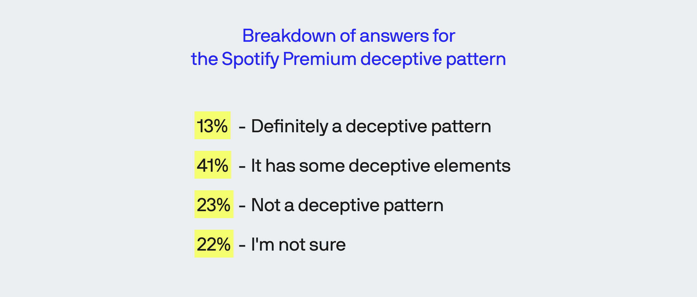
23.5% don’t believe Spotify uses deceptive patterns for users trying to downgrade service; 41.6% feel Spotify’s methods are slightly deceptive
After all these years, Spotify still isn’t perfect, but it has truly set the bar for on-demand music streaming and continues to operate as a well-liked service.
Spotify does require a few layers of steps and scrolling through a portion where it essentially bargains with you, kind of like the start of a bad romantic break-up, but without the theatrics that sometimes follows.
While 41.6% find this example partially deceptive – and 13.3% undoubtedly deceptive – the information is helpful to some, such as those who loathe commercials. Moreover, once you’ve scrolled through the debriefing on how your account will change, the process completes without additional pleading.
We feel Spotify’s downgrade/cancellation process isn’t an example of deceptive design since the process is mostly straightforward and can be completed in less than a minute.
Still, we understand some loathe lengthy cancellation processes the same as those who despise commercials, so we feel it is vital to acknowledge how some perceive these processes.
Methodology
To learn more about the specifics of our methodology and the questions we used, read our methodology document here.
Beating back deception is everyone’s responsibility
Some businesses purposely use these patterns to nickel and dime their customers for their own benefit. We’re not pointing any fingers; instead, we’ll just remind you to scroll up and re-read the mentions of Delta.
Of course, some of these designs aren’t necessarily intentional, as if some product manager behind the scenes is maniacally laughing as they order designers to perform evil acts of deception.
Whether something is genuinely a deceptive pattern or not, perception governs how people react. As such, all businesses need to consider how some will interpret designs, or they may find themselves in a position where they have no users to worry about!
