Avoid Deceptive Design in Your Product! Here are 3 Ethical Ways to Drive Sustainable Growth
Deceptive design – or dark patterns – are everywhere. In fact, a 2022 study done by the EU Commission showed that a staggering 97% of the most popular websites and apps used by EU consumers deployed at least one deceptive pattern.
Let’s be real. Deceptive design is used because it works to get the sale. But it’s also a short-sighted strategy, because consumers have started to protest. In a recent BlueLabel study about deceptive design, almost 40% of the respondents said that they will avoid a business in the future if they feel they’ve been deceived.
The good news is that there are great ethical alternatives to the deceptive patterns that businesses could make use of to make sustainable profits.
There is much talk about deceptive and dark patterns – but what are they?
The simplest definition of deceptive patterns is that they are designed to trick, persuade or manipulate users into doing something they didn’t intend to do – something that was inconsistent with their preferences.
It could be that newsletter that you never remember signing up to, which all of a sudden pops into your inbox.
Or that added cost on a product that you are not presented with until just before clicking the last and final “buy” button in the checkout flow.
Or the way words are shaped in a message, which makes you wonder what you’re really saying yes to.
Deceptive patterns examples
The list of deceptive design patterns is long. In fact, we wrote an entire article dedicated to deceptive pricing (and the ethical alternatives) alone.
But let’s now look at some examples of the most common deceptive patterns that many of us have encountered – and maybe even implemented in the businesses we work in.
Forced action
This pattern forces users to do a certain thing, like in this case, disclosing information. In this example, customers are forced to create an account to be allowed to buy anything from Next.
While this might seem like a great idea from the business side, it actually is not. In a study done by Baymard Institute, over 4000 people were asked for the reason why they had abandoned a checkout process. 24% answered the reason being that the site was forcing them to create an account.
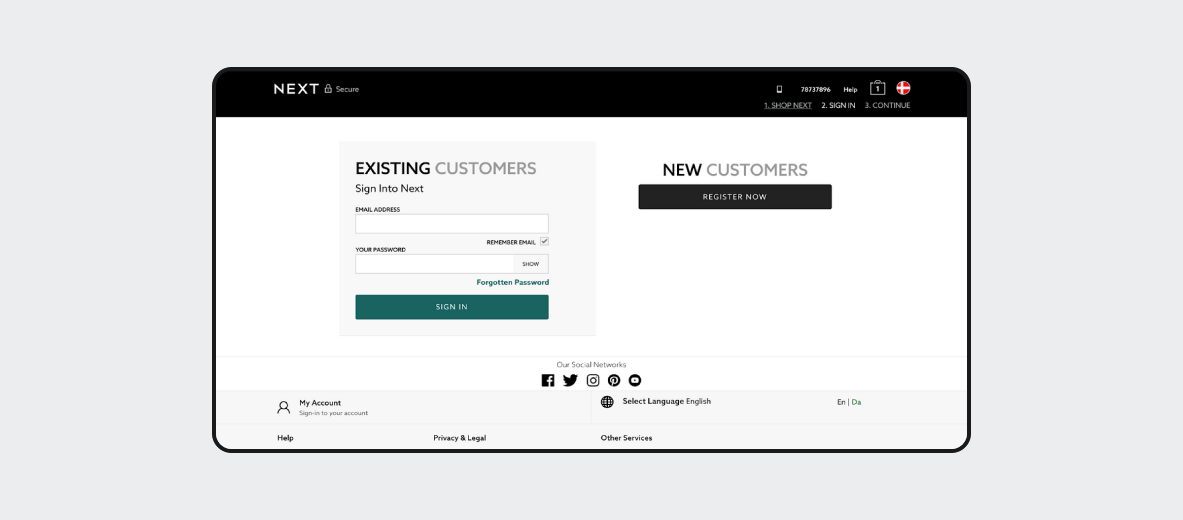
This is an example of the pattern “forced disclosure,” where customers are forced to create an account. According to a Baymard study, as many as a quarter of new potential customers abandon a purchase if they are forced to create an account during checkout.
Fake urgency
When the user is pressured into deciding to buy, sign up etc., fake urgency is often what’s at play. It is sometimes used in the shape of a fake time limitation, as seen in this example from ticket reseller Viagogo.
The challenge with using fake urgency is the risk that users might feel buyer’s remorse after the purchase. And there’s nothing like buyer’s remorse to make people not come back a second time to buy from a business.
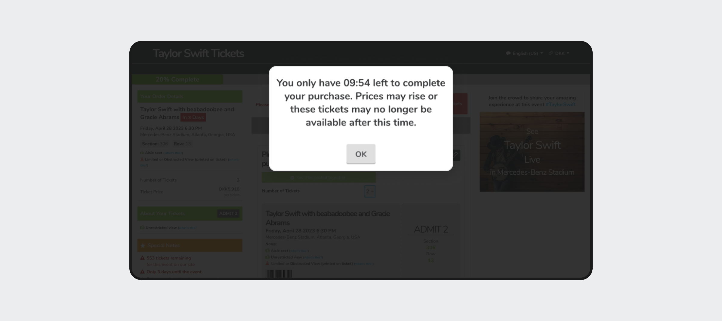
Ticket reseller Viagogo use heavy amounts of deceptive patterns, here, fake urgency is implemented with a countdown timer to stress users into buying.
Confirmshaming
The confirmshaming pattern is a very common one. It is used to trigger negative emotions like shame or guilt to make people decide against their own desires.
Confirmshaming is most often seen in situations with decision making, which could have negative impact on the business, such as if a person turns down the option to receive a newsletter or add an upsell product to their cart (like insurance when buying a plane ticket).
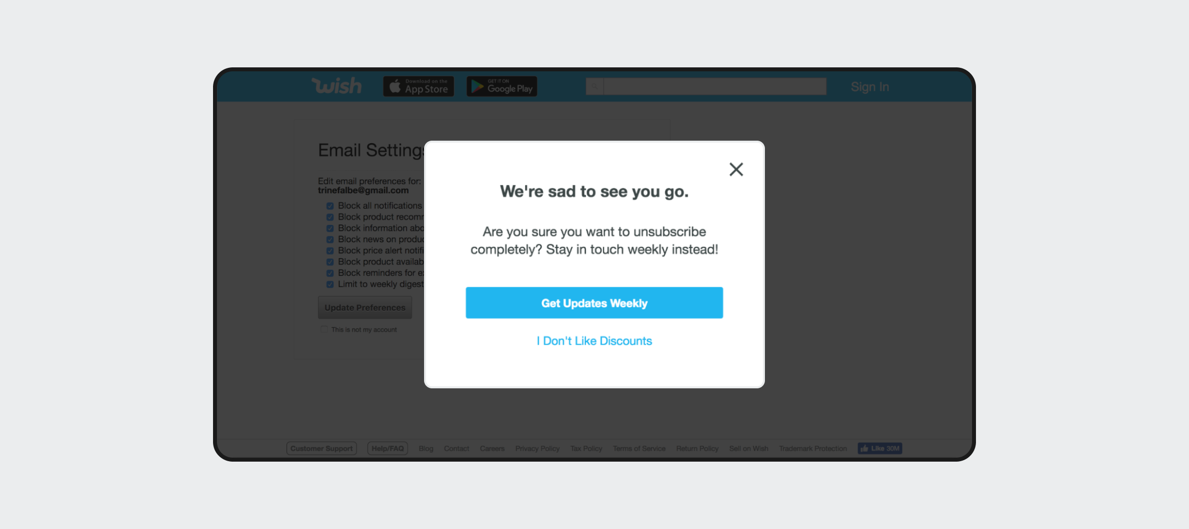
Wish.com is eager to keep users signed up to their newsletter and uses confirmshaming to try to make that happen. Forcing people to click “I don’t like discounts” to unsubscribe is a clear deceptive practice.
Misdirection
When a user interface intentionally makes the user focus on one thing rather than the other with the purpose of nudging their behavior, it’s called misdirection. Examples include making the element of focus much larger than the less desirable options, or like in the example here, intentionally placing the button you want users to click in the most prominent and conventional position.
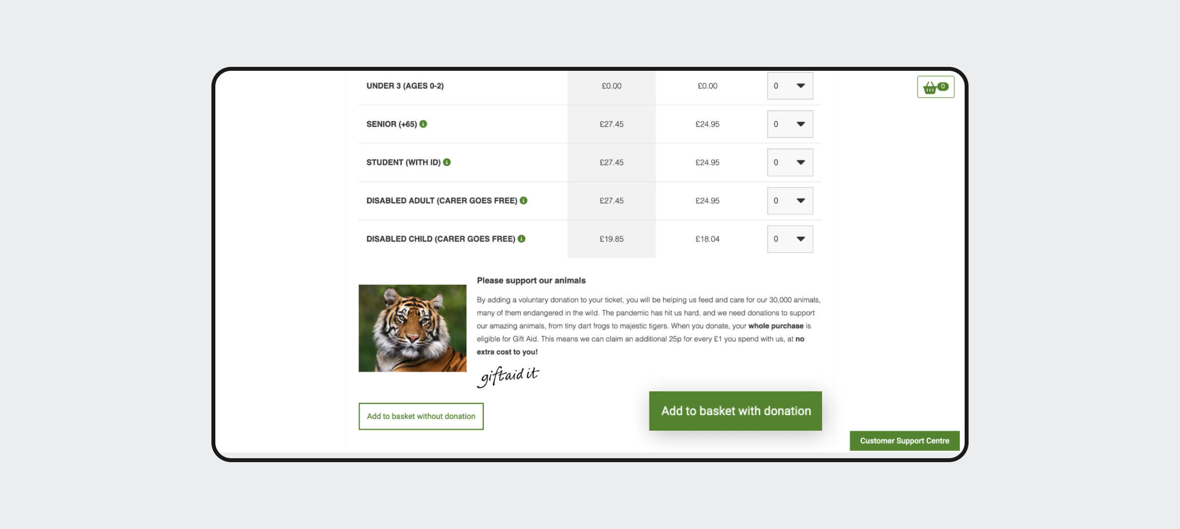
London Zoo uses less visible placement of the button “add to basket without donation” to make users choose the “with donation” option.
There are many other deceptive patterns out there. Check out the Deceptive Design website for a full list.
Ethical alternatives that drive sustainable growth
Thankfully, there are other ways of designing patterns that are a lot less deceptive than the ones we’ve just shown.
And there’s overwhelming evidence that replacing deceptive design practices with more ethical and responsible ones is a great long-term strategy, because it helps build trust and long-term relationships with customers.
Consumer behavior is changing as we speak. There is a significant rise in the Conscious Consumer movement, and consumers increasingly prefer to buy from businesses whose values align with theirs, according to the most recent Salesforce’s State of the connected Customer report. The same report reveals that 65% of consumers have stopped buying from companies they consider distrustful.
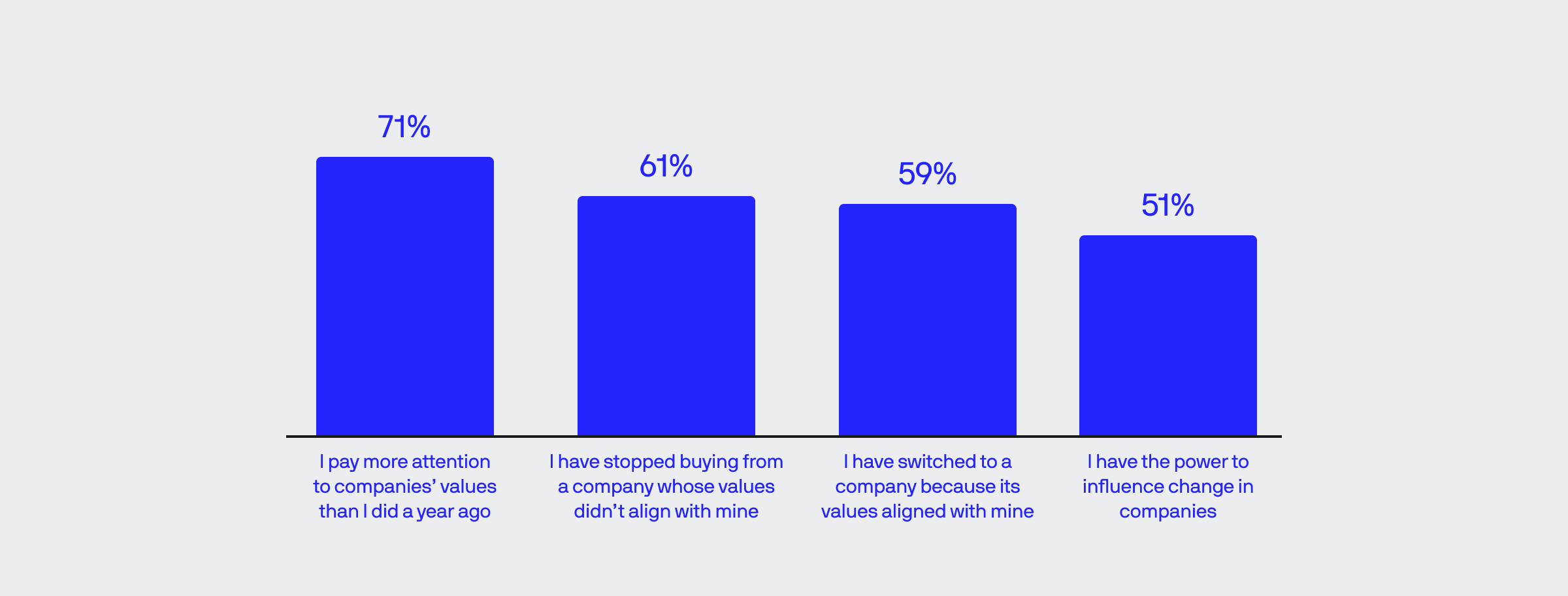
According to Salesforce’s State of the Connected Customer Report 4th edition where the illustration is from, there is significant indication that business values are becoming a competitive factor in the changing consumer landscape.
To gain the competitive edge in this changing landscape, companies could benefit from embracing a much more responsible and ethical approach, because it builds trust and credibility.
Ethical design patterns all have a couple of principles in common: they give user’s freedom of choice and they communicate with transparency – all of which is appreciated by people when they interact with a business (which websites and apps are, at the end of the day).
So let’s look at some ways to replace deceptive design patterns with more ethical ones.
No Strings Attached
If tricking the users backfires, why do it in the first place? If a service comes with a free trial period, there is no need to demand credit card information until the time when a payment has to be made.
So instead of making people create an account or give up their credit card details before they need to (or even if they don’t need to at all) use No Strings Attached. This could be in the shape of a guest checkout or only asking for the minimum.
The rule of thumb here is: Don’t ask for information that’s not needed.
The bonus is that it’s a lot easier to subscribe if the only field in the signup form is the user’s email address.
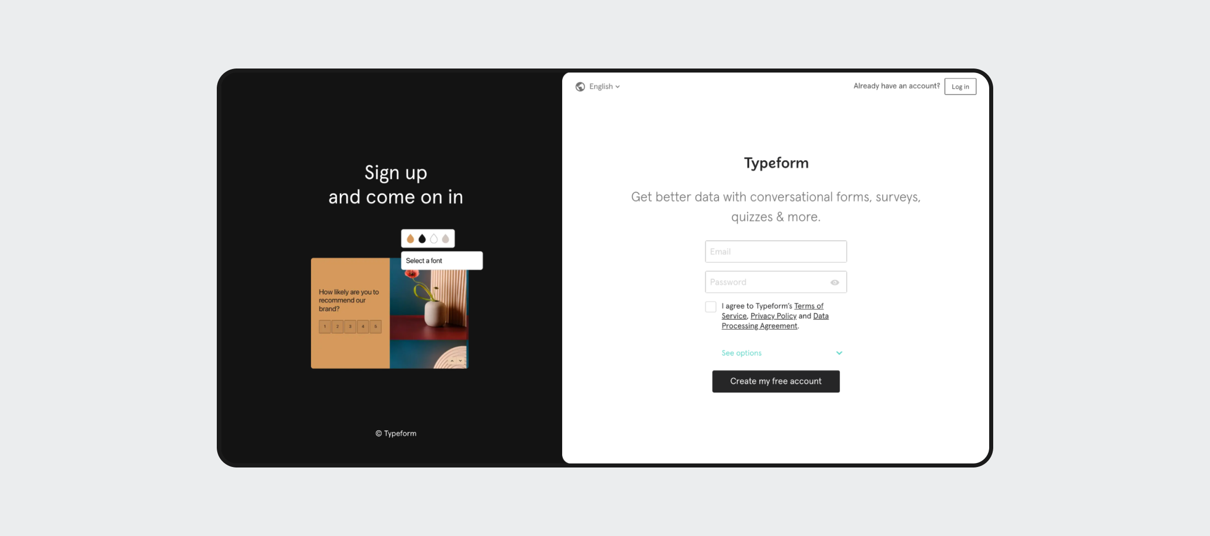
Typeform is a great example of a service that doesn’t ask more of people than what they need, ultimately making it very easy and friction-free to sign up.
Sensible Default
When different versions of a product or subscription are available, the ethical approach is to highlight the version that is the most sensible to the most people. And how is that identified? There are a few ways to find that out. You can look at the data and make a choice of the most sensible default based on the most sold option. Or look at the user needs and make an informed decision based on them.
Remember: not everyone needs a Rolls Royce just because you sell it in your store.
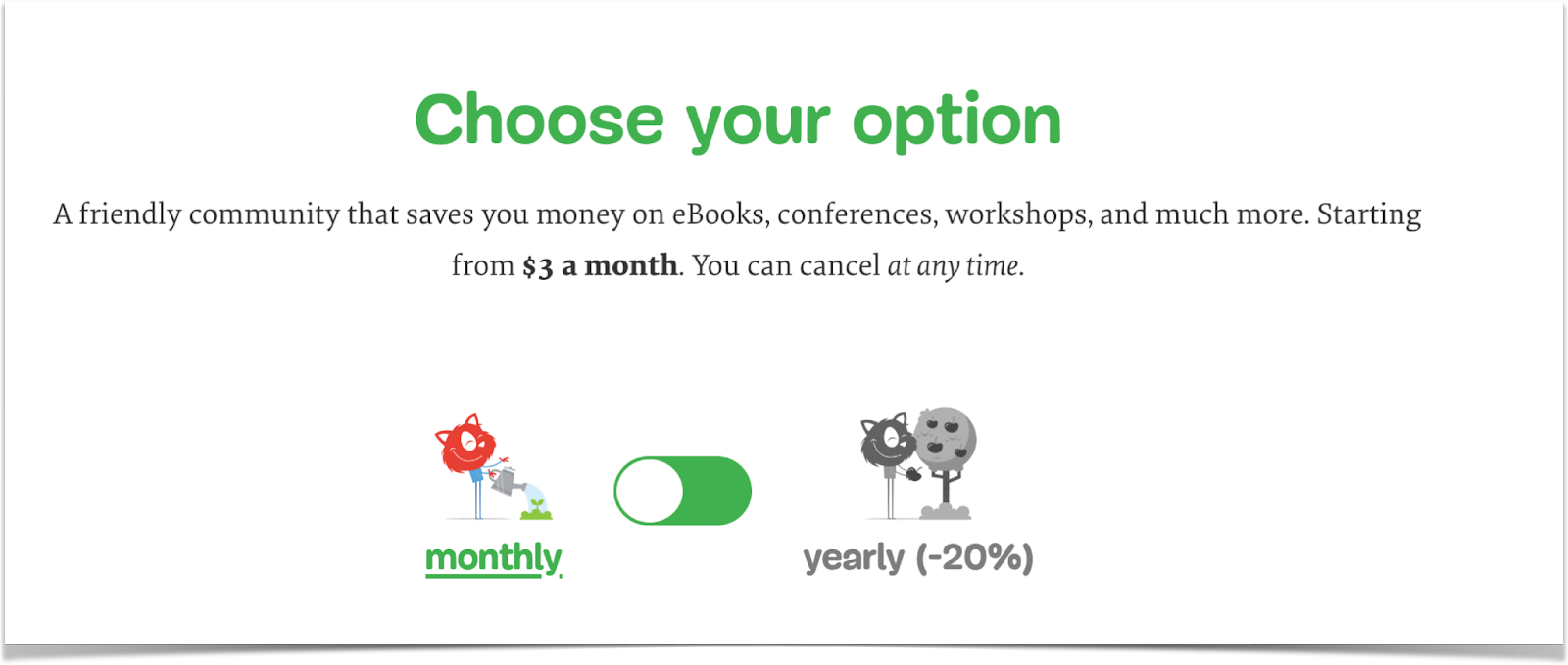
Smashing Magazine’s membership is offered through monthly or yearly subscriptions. Many companies choose to set the default to a yearly subscription, but Smashing Magazine makes the better, ethical choice and sets default to monthly.
“Don’t make me think”
Steve Krug wrote the UX book classic “Don’t Make Me Think”. This is a universal idea that can be applied to most areas, not just interface design.
Bad design makes users stop and wonder, “What happened?”, “How do I proceed from here?” or “I wonder what might happen if I click this button?” Good design does not. Users must be able to navigate and make choices without having to stop and wonder.
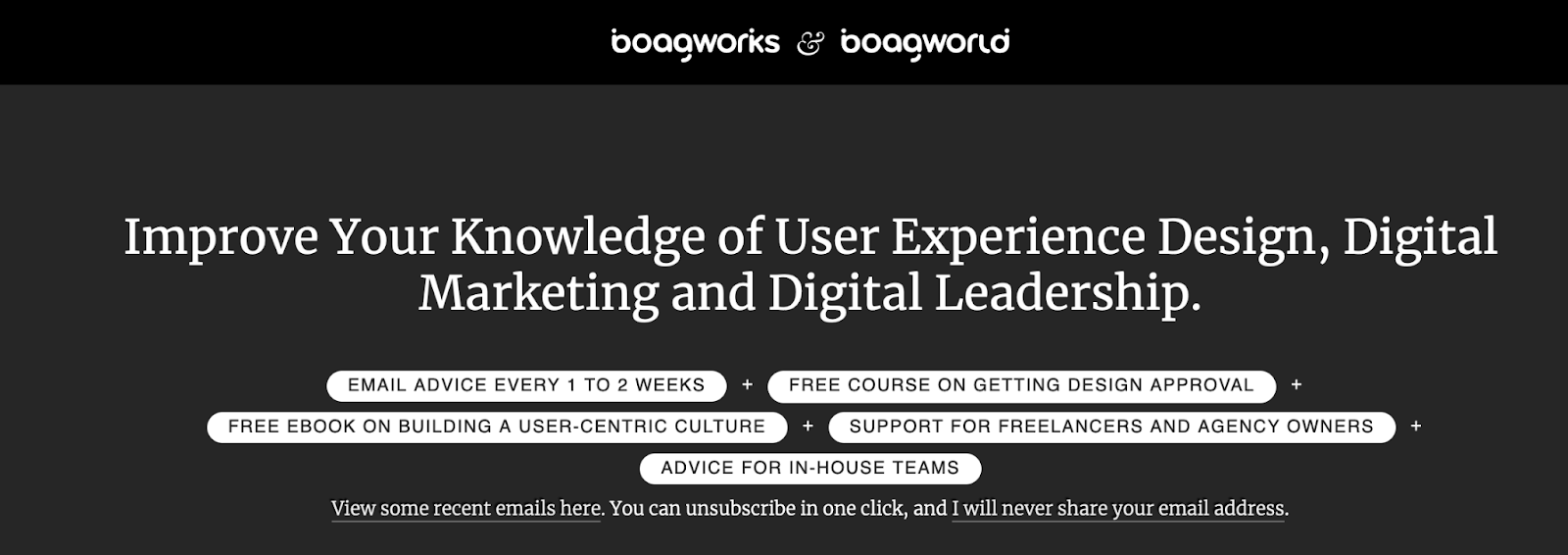
Paul Boag makes sure to let people know exactly what his newsletter looks like, how to unsubscribe and what will (not) happen to their email address. A great example of “Don’t make me think”.
Use design conventions and transparency as a rule of thumb to prevent deceptive design
Deceptive patterns like confirmshaming, misdirection, and fake urgency are not necessarily solvable through UI design. They are prevented by applying transparency in the way product and sales tactics are communicated in the interface.
But some patterns can be prevented by using design best practices, and for instance, avoiding deceptive placement of buttons and information you don’t want the user to spot.
Moving past deceptive design
Ultimately we can’t prevent deceptive design if we only look at the visual design itself. We must apply a systematic approach to analyzing and discussing communication, marketing, sales, AND design processes to effectively prevent deceptive design from happening.
If we succeed in doing so, there is sustainable profit to be made. Profit that’s built through long-lasting relationships with customers who trust us enough to keep coming back, who will forgive us for the small mistakes we make, and who will recommend us to others. All of which is a way to save costs, reduce risk and build brand loyalty.
And that’s the power of ethical design.
If you want to learn more about ethical design, you can pick up “The Ethical Design Handbook” written by the author of this article, Trine Falbe
Bobby Gill
