Hey, you! Kids are users too!
Let’s be frank. A lot of the Ed-Tech software our younger kids are expected to use at school stinks. Well, at least it stinks for studying at home.
Many parents are seeing school software in action for the first time now that schools are closed. With over half US households consisting of full-time dual income working parents, there are a lot of eyeballs on these tools right now.
Why does the software stink? Because they are a nightmare for younger kids (up to age 12) to use independently. They require so much guidance to use that working parents and guardians are feeling the pain and frustration of compensating for products that do not meet their child’s needs. Those needs, now more than ever, are easy to use and easy to understand software that a child can use to do their homework and pass the school year.
Let’s look at one Ed-Tech culprit, since over 30 million school children in the USA are expected to use it right now. It’s often the main tool children are expected to use to communicate with their teachers and submit homework:
Google Classroom
Have you had to help your kids navigate and understand Google Classroom lately? Try on a Chromebook and see if you have any hair left.
The main issues for elementary school children may seem like trivial UX errors, but for a child these errors are incomprehensible and frustrating. For adults who make apps for kids, these UX decisions are simply inexcusable. Let’s look at a few such examples, just to get a taste of what kids are going through.
Getting into a class: Deceitful UI
In Google Classroom, the designers seem to present a friendlier UI than in other Google products. Each of the child’s subject areas are presented in a colorful button-like box with their teacher’s picture on it. Great!
Now the child just needs to enter the Classroom by clicking the box. If only it were that easy. For some reason, only the text subject title on the box is a link to the classroom. Unfortunately, younger children do not yet hold the concept that “text can be html links” which is developed through habitual use of html websites. So, a child will try clicking on that box, or their teacher’s picture, expecting to get to their classroom. Instead, nothing happens. The child will feel frustration and need adult help to proceed. At that moment the child feels like a failure, but it is the product that failed the child.

Faking child-friendly UI doesn’t work.
Visual communication: Iconography is not intuitive and is based on grown up office software
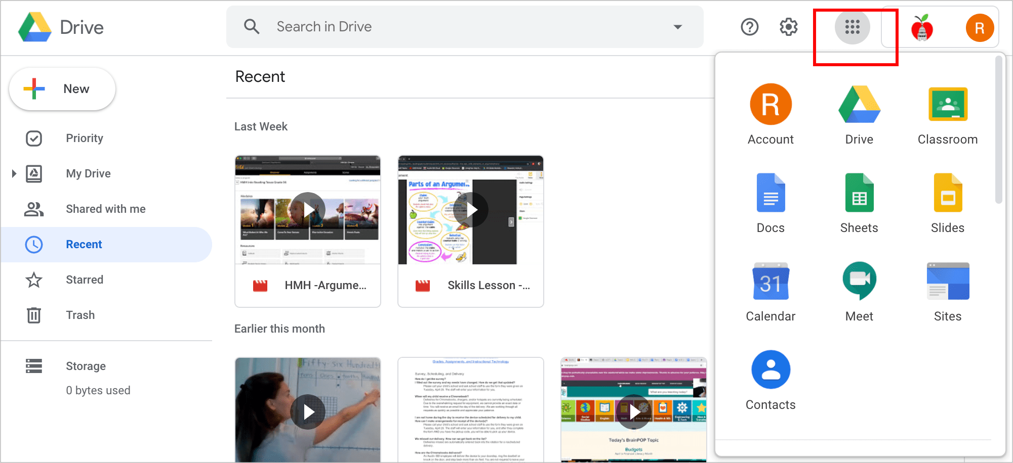
OK, here is a challenge for you. Which icon takes you to Google Classroom from your student Google Drive account?

The elementary student’s Google Drive
If you thought it was the apple, you’d be wrong. That’s actually a user avatar. It’s in the app grid icon. Do your young children have the concept that a 3×3 grid of dots is an app selector yet?
And it’s time to submit some homework. Hmm-where is that “New” button? This task is pretty much an impossible one without adult help.
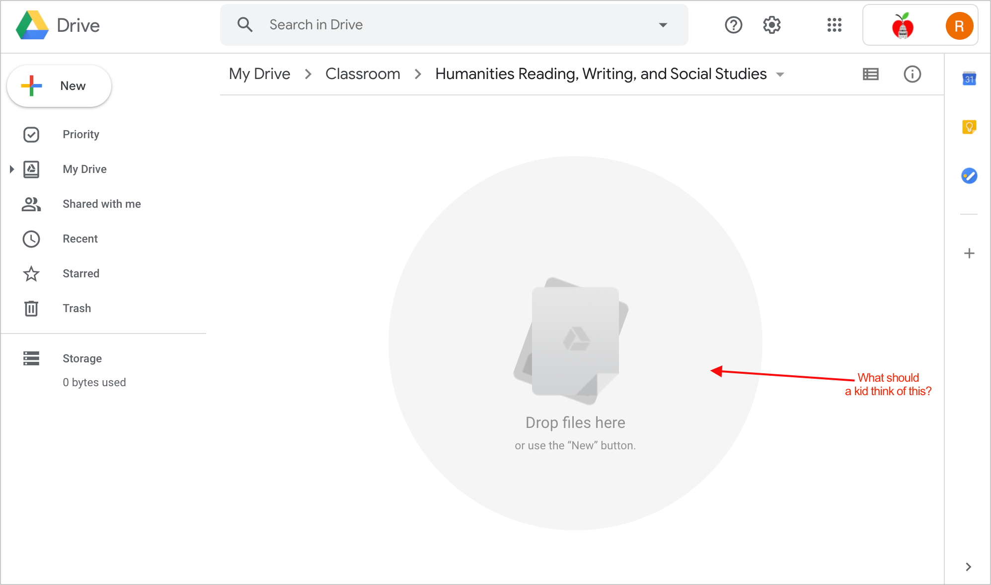
Presenting tasks to children in the same way as to adults is not helpful.
Making it harder: Forcing kids to adapt to an adult oriented UI makes them more dependent on adults.
In addition to a string of navigation and feedback problems (too many for this post), the UX decisions simply don’t make sense if they are intended to help kids perform well without adult help. At the very least the UX should aim to support the ability for a child to be as self-sufficient with Ed-Tech as they are in the physical classroom. Interfaces like those in Google Classroom hobble a child’s ability to be self-sufficient and increase their dependency on adults.

Depiction of pretty much every parent or guardian homeschooling at some point during shelter-in-place.
Kids are critics too, and their expectations are high.

Watch out, Ed-Tech. Kids are the most vocal critics!
But here’s the interesting thing: Children born post 2010 are true digital natives. They have likely been exposed to intuitive mobile applications pretty much since birth, according to this study. So, Ed-Tech companies are starting to be called out by some of their most important critics – children.
When a grade 3 student can shred your product to pieces (yep, Google Classroom is in the hit list) as this one did last week in Fast Company, you know you’ve got a problem. This is because this generation of kids are users too, and they are power users. It’s going to be critical that Ed-Tech products improve in order to meet their expectations.
There are many apps used and loved by millions of children outside of the classroom. Given that fact, there are enough clues in the consumer market on how to design compelling and easy to use apps for kids. Granted, Ed-Tech is a tricky space, as this list of The 100 Worst Ed-Tech Debacles of the Decade illustrates. But here is the good news: Global Ed-Tech expenditure is expected to grow over 12% every year to $342bn by 2025. And the Ed-Tech industry is ready for disruption.
Here are the 5 key areas of improvement in Ed-Tech Blue Label Labs expects (and hopes) to see during and post-Covid 19:
#1 Intuitive Interfaces built to empower kids

Products need to empower kids to accomplish school work independently whenever possible.
Good apps are like a joke, if you need to explain them they are no good.
This is especially true of digital learning tools for young children. If a product requires an elementary student to read a dense page of instructions on how to use the software, it has failed the child terribly.
Extreme examples of highly intuitive interfaces for children can be found in all Toca Boca apps. Based in Sweden, Toca Boca revolutionized children’s mobile applications by mirroring physical play spaces in digital spaces. Just as a play date doesn’t come with an instruction manual, digital play shouldn’t either. Toca Boca’s respect for a child’s mental models of exploration and discovery when approaching play is evident in their approach to product design. When a child launches a Toca Boca app there are no instructions and there is no text (in fact there is no language at all other than Toca Boca’s whimsical pretend talking sounds reminiscent of Peanuts cartoon adults). For a child to engage they must explore the interface independently and learn what the app does as they go, creating their own experience in a self-directed way. There are only simple clues as to how the interface might behave via clear signals like a bold arrow, some animated elements indicating interactivity, and instantaneous feedback on actions. With over 200 Million app downloads, Toca Boca’s mindfulness of children’s needs is paying off.

In this screengrab from Toca Builders you can see that the interface does provide visual clues as to what can be done in the app, but does not give a child written instructions.
It’s important to note that younger children learn and develop more rapidly than older children and adults do. As they age, a child’s ability to navigate an application changes as well. The Google Play store and the Apple app store recognize this by capturing age categories for apps submitted to the Kids app section in distinct small groups: “Ages five and under,” “Ages 6-8,” and “Ages 9-11” “Twelve and up”. Kids develop much faster than adults: an app for a four-year-old will feel too young for a six-year-old.
Products that pay close attention to the developmental stages of children and match those stages with their UI/UX and content will be part of the much needed movement to empower children by enabling more self-directed learning and positive experiences with technology.
#2 Ramped up user testing with kids

Learn to think like a kid to build great products for kids
The secret to creating intuitive interfaces is to learn exactly how children interact with digital tools. This means gaining a deep understanding of how children think about and use digital tools based on their age and the context of use.
Ethnographic study is powerful here, just see how Toca Boca has leveraged user testing with kids to create some of the world’s most downloaded apps. But with social distancing guidelines in place, contextual in-person user testing will be put on hold for a while. Companies who want to get ahead of the competition will use tools for remote user testing in order to gain these insights. With the right planning and facilitation, Ed-Tech companies learning from kids will have the competitive edge.
#3 More Virtual Reality

Ed-Tech will leverage VR to improve how kids learn.
VR will be more widely adopted by schools, so students can discover subject matter through immersive engagement rather than rote learning.
It’s becoming widely understood that kids learn best when they are fully engaged in contextual learning, rather than just memorizing facts and algorithms. In order to deliver this type of education, more and more schools are becoming open to innovative solutions and delivery methods.
With VR, a student can instantly access content and curriculum that is not bound by archaic laptops and pencils on paper. Every subject can be explored in rich, contextual ways previously impossible.
#4 Personalized learning through AI

Photo by Alex Knight from Pexels
Technavio’s “Artificial Intelligence Market in the US Education Sector 2018-2022” report predicts a nearly 48 percent growth rate for AI tools over the next three years.
As enthusiasm for AI in schools increases, the areas of opportunity and the benefits to students of all ages will grow. One of the core benefits of AI in Ed-Tech is the ability to personalize lessons to a degree that has been previously impossible. AI can capture and synthesize student behavior patterns, their preferred method of learning, and unique strengths. This nuanced understanding is often missed by the humans teaching large groups of students as they are unable to give each child adequate focused individual attention.
#5 Game-based Learning instead of Gamification

Game play is actually teaching kids valuable 21st Century skills
Children are used to the concept of “leveling up” and being rewarded for increased accomplishments. Gamification is where game dynamics are applied to non-game activities. Examples of this are receiving a gold star sticker on an artwork, earning badges or points for answering a question correctly, or being rewarded with extra recess time for good behavior in class.
Game-based learning is different in that the lessons being taught happen naturally while playing an actual game. It is argued that collaboration, problem solving, communication and critical thinking improves via game play. In the Ed-Tech world these skills are also referred to as 21st-century skills, the ones that students will need to master in order to thrive in the future world of automated labor.
One of the best examples of game-based learning can be seen in the game Minecraft. It has become a valuable teaching tool worldwide as innovative educators create international, collaborative, multi-player and project-based educational curriculum in it’s sandbox virtual world. The great thing about Minecraft is there is no inherent mechanism in the game that ever passes judgement on students. There are no wrong or right actions, therefore no penalizations or prescriptive rewards. Rather, Minecraft is a risk-free zone students can experiment within and master new skills through trial and error.
In closing
Stay in place guidelines make it necessary for kids to attend school remotely and turn in their work in order to graduate this year. Teachers and districts have scrambled to get remote learning up & running (kudos to them!) and to make the load lighter than usual for the kids. These are good things!
But as the transition to digital schooling is becoming part of the day to day reality for families, parents & guardians teaching from home are trying to make sure that their e-learning plan works out for their kids. Nobody wants to have their child held back in school because of a pandemic. With so much at stake, a new light of scrutiny is shining on the tools children are expected to learn on and that parents are expecting to lean on.
With that, parents are seeing how problematic some of these Ed-Tech products are.
The secret is out, and hopefully the awareness of how to improve these products will increase competition in the market and make room for more child-focused, exciting, and useful student-facing products.
If you are in or entering the Ed-Tech space, Blue Label Labs can help you leverage technology and user-centered design to create winning apps for kids. We’re looking forward to hearing from you!
