How Design Sprints Play A Role In Our App Design Process
The look and feel of your software is the bedrock of its UX which is why we use an app design process for every product we develop. Developing apps for our customers means we’re both entrusted with the responsibility of creating what users want as well as communicating the process to our clients – a solid design process established during the Design Sprint enables us to do both.
Depending on where you look, the formalities for what constitutes a “design process” vary greatly – at its core, it simply boils down to identifying and applying the visual elements of a piece of software, whether a mobile app, standalone software, or a web app. In the following, we’ll explain why we use an app design process at Blue Label Labs then walk through how we do it.
Why we use an app design process
In the early phases of building a project, we’re tasked with several different objectives such as design-centric planning that will dictate visual aspects such as how a product will look and the way it will move considering the intended functionality. Beyond all this, we also answer other questions as part of the app design process as this helps align our efforts and gives our design purpose.
In any software development endeavor, deciding on a design early in the process helps circumvent significant problems down the road. How an app is coded is largely dependent on the placement, structure, and intended functions of visual elements. This is why we start with the “look” of an app as this allows us to lock everything in place so the programming portion can be done accordingly.
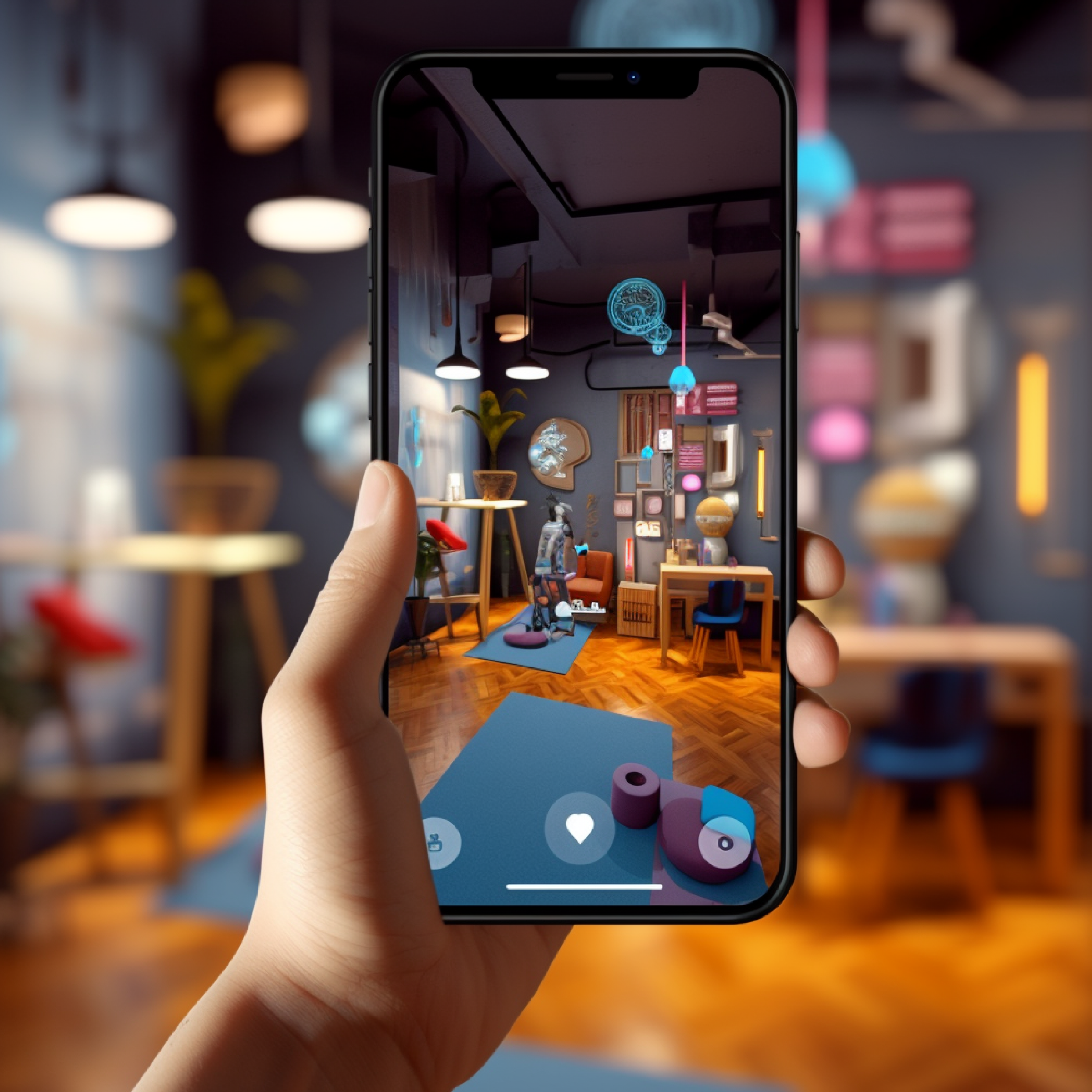
As a full-service digital product agency, we’re not only vested in building your software, we also tackle business and marketing strategy. Our experiences guide us in making design-oriented decisions that will best align with your goals and resonate with customers – while many clients have rational, appropriate designs in mind for their app, it’s not uncommon for some to come in with nonsequiturs they personally like but are too abstract to logically fit. For example, if you’re building a shipping business, our app design process would likely incorporate a roadway-themed color palette and icon set as well as a suitable logo. While you might thoroughly enjoy the image below, in good conscience, we’d ask you to pump the brakes if your idea somehow involves incorporating this as part of your design.
Hyperbole aside, it’s important to remember that your design ties in with messaging and branding. If you’re marketing clothing to cisgender, straight males, you probably wouldn’t want to use pink and purple as part of your color scheme: you’ll want to take a lesson from Wrangler jeans and hire Brett Favre.
The app design process at Blue Label Labs
We use the Design Sprint as a tool to examine the scope of a project between us and a client. During this five-day excursion, we start day one by first understanding the problem which allows us to derive concrete answers that we build into the design of our solution. Here, it’s not necessarily about turning over every stone right away, it’s about finding the right stones to uncover.
On day one of the Design Sprint, we mostly focus on the problem and solution. Once we have everything identified, we’re equipped for the first part of the app design process which begins to take shape on day two. In the afternoon, we take what we’ve discovered and begin to construct preliminary sketches of what we think the app should look like. This initial burst of creativity helps define the basis for how the app will look.
The preliminary sketches the team composes are put together on day three where we hone in on the solution to determine which sketch will best align with the solution. By leveraging our experience, we identify the strengths and weaknesses of the chosen design then adapt a storyboard using the sketch as an outline. Keeping the primary solution for the MVP in mind, we assemble a flow of eight to nine screens that demonstrate how the product will function. We typically use Visio which allows us to get close – and in some cases, spot on – to what the final product will look like.
Day four is when these designs are applied to a functional prototype using a mockup or prototype tool. This is where the app design process transforms into something that behaves like the actual app. A team of people assembles the prototype by working together to create the UI through stitching the mockup screens together which allows testers to get a feel for how the MVP will function, thus allowing the test unit to produce feedback. Some team members are tasked with more managerial roles, for example, prepping questions that will be presented to the user test group to gather constructive feedback on the UX.
During the final day, a small group of testers takes to the app, essentially using the software as the actual product is intended to be used. This day of validation is the summation of Design Sprint where everything about the UX is recorded for further analysis in addition to feedback collected from the test group. The goal is to uncover the strengths and weaknesses of the design and UX which will be adapted into the MVP.
The completion of the Design Sprint enables us to move forward with the app design process for the actual product. Provided we didn’t derail early on – a problem we’ve managed to avoid! – the design should only require small tweaks to the design. Once the design elements are solidified, the coding that brings the design to life can begin.
The Blue Label Labs app design process transforms ideas into successful products
It takes more than one bee to make honey – Blue Label Labs is a hive of creative problem solvers who work together to deliver results that delight. Our app design process is the foundation for building robust products that satisfy its target audience. Get in touch with us today to learn how our app design process will transform your idea into a profitable digital product.
