How To Mockup A Mobile App
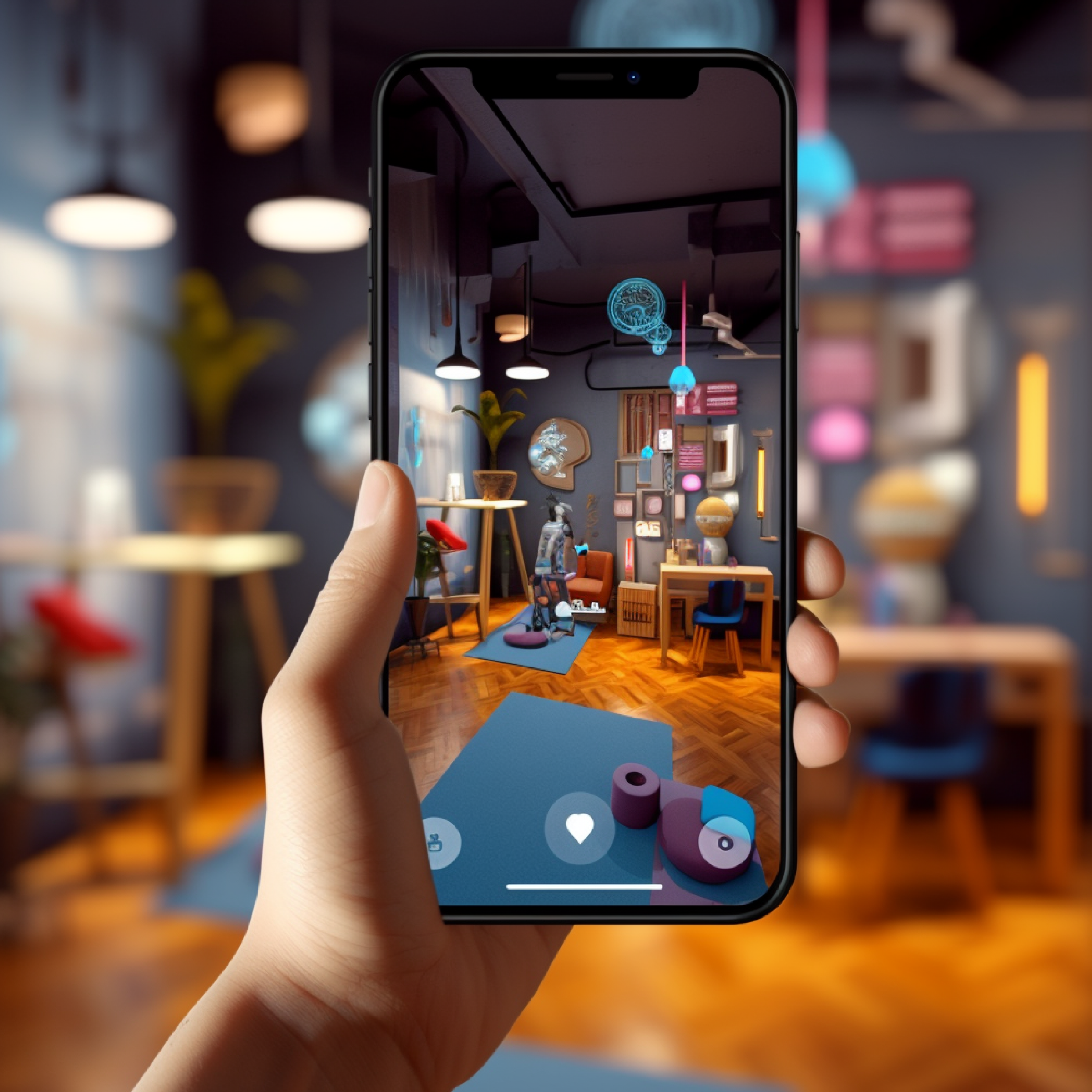
One of the biggest portions of the design sprint process is the mobile app mockup – or website mockup – that provides more than just a visual of the final product. Today, an app mockup is more than a simple tool to show investors, business cohorts and users what an app or site is supposed to look like.
At Blue Label Labs, we use mockups as a tool to also provide a feel for the final product. Today, more than ever, great mockup software crosses boundaries with mobile app prototyping tools that also serve to provide some level of functionality. So, let’s take a look at why it’s necessary to create a great mockup and how to do it properly, at least on the surface.
The history of the mobile app mockup and the modern process
Once upon a time, web and app designers would take to a piece of paper and draw out the app, plugging in elements and making scribbles (or lorem ipsum) where content is supposed to go. Much like the cover photo for this article, it wasn’t a technical process. It was more of just a tool for designers to convey the intended design and collect feedback.
For those in the visual arts realm, this is huge. One of the most difficult ideas for many people to convey is aesthetics, whether it’s structural or the “feel” a piece is supposed to convey. Artists who take commissioned jobs know this all too well.
One of my marketing people reached out to his friend in Indiana about the matter, Leah Fick, who works in graphic design and recently broke into tattooing. This is what she had to say:
“As a graphic designer and tattoo artist, I’ve found it hard sometimes to read clients. Usually it’s because they don’t have the language to express what image they want to be produced. That’s why I like to meet clients one-on-one, it’s easier to get a gist of their expectations, and requires less ‘mind-reading’ on my part.”
Constructing a creative, visual element that’s deemed acceptable by the client paying for the work can be tricky. The entirety of web design is much the same with certain visual elements turning into a potentially arduous back and forth process as implied above.
The nice part about the structural elements for a site or mobile app mockup is there are only so many ways that you can build an app that accommodates a good UX. In some cases, a novel design is welcome and great as we wouldn’t have the functional apps we know and love today without someone trying something new. However, we (i.e. mobile app users) have reached a certain degree of collective solvency with the ‘how’ we want apps to work so this makes this part a bit refined for prototyping and development.
This is why wireframing tools are so important despite the fact they often lack the frills of prototyping tools that allow a designer to produce something that more closely matches the look of a final product. Good wireframes show the bare bones of a site or mobile app which is truly more important than the color scheme or cute icons you’ll end up using in the final product.
The three most important elements of creating a great mobile app mockup
We recently covered some of the best mobile app mockup tools on the market. Aside from the features of these apps, there are other aspects of a mobile mockup that need to be discussed.
It works as the final product should. The first iteration of an app doesn’t – and shouldn’t! – act like the final product. Adding flair like animations and other modern design trends during mobile app mockup endeavors isn’t what sells. Your wireframe is the baseline for a site or app’s operation and a good prototype behaves as the product should.
Your clients need to have a basic understanding of how the app works and if it works. Decorative transitions aren’t selling points for the app – if this is your Hail Mary for the app you’re building, then you’ve already failed.
An app needs to work before “being pretty” comes into the mix. As such, it’s much like practicing a martial art – the most noteworthy people who study these disciplines will tell you that technique is the bedrock of everything. The ‘technique’ portion for a martial artist (or really, any artistic discipline) might seem like an aesthetic quality but it is the foundation for everything.
For a martial artist, this what they need to develop prior to speed and enhancing strength. For a visual artist, their technique determines the quality of their work prior to refining granular skills or improving on speed. It’s not so different from mobile app mockup as the way the app functions is like a kick or a drawing skill – the basics have to be in place prior to worrying about fancier elements.
Showcasing architecture and functionality. To build on the UX point, a major point that drives the underlying is the underlying architecture. Whether developing for Android or iOS (or whatever else) the way an app will function has a lot do with the backend setup.
There are many ways your app or site could be built – underlying technologies and frameworks will dictate the “how” the frontend of the app (i.e. regardless of whether it’s Android, iOS or another platform) will interact with different backend systems such as databases, storage systems and everything else.
While the mechanics on the backend aren’t important for first-round testers, it’s imperative that everything is well documented and explainable. For example, some driving enthusiasts take heavy interests in the mechanical portions of their vehicle while others simply care about using the vehicle for it’s intended purpose which is driving.
If you’re not the type to do all your own work on your vehicle, everything about the vehicle needs to be especially well documented when relying on shops to install mods, make repairs and sometimes just for standard maintenance. The same holds true with apps much the same as it becomes more difficult to augment the vehicle or perform a repair for a mechanic who dives under the hood blindly.
Parameters aren’t just for show, nor are the parts “under the hood” of your app. Your actual setup likely won’t matter to the average end-user but stakeholders, developers, support staff and others need to know this information. Some people will just be happy to drive a Porsche but anyone improving, repairing or financing the vehicle will need as many details as possible.
Determining UX effectiveness through prototyping. While slick visual elements are helpful, the most salient aspect of app design isn’t so much about how it looks, but how it acts which is determined through testing. This is the most critical part of app development as users (past, present, and future) won’t put up with a shitty design.
A few years ago, TechCrunch published some info on downloading habits and digital media consumptions. They don’t delve into the ‘why’ aspect but it’s not hard to find information floating around that clearly indicates we delete apps because of poor UX.
As such, this is where prototyping becomes a more viable method for creating an app’s base design over a mockup alone. A prototype results in a functional model that allows developers and designers to gain feedback which is significant for adapting an idea into a sellable product.
Blue Label Labs builds mockups that translate to functional products
An app for business is a crucial element to your digital footprint. Creating a viable mobile app mockup is one of the most pertinent elements to building a final product. Considering the architecture and the UX is what makes an app great – it has little to do with a neat transition between pages.
To learn more about how Blue Label Labs creates fantastic apps, get in touch with us. We will be more than happy to fill you in on the process of how we make functional apps for every industry imaginable.
Bobby Gill


