How We Helped Kung Fu Tea Build a Better Mobile App
Every good character needs an origin story – Kung Fu Tea was once just a growing bubble tea chain until we worked to help them develop the closest thing a QSR in the real world can get to a superpower: an awesome mobile app.
Here, we’re going to turn back time a bit to take a look at the old app and discuss how we worked together to produce a better app for their business.
You can download out their new apps on the Apple App Store and Google Play!
The Kung Fu Tea before meeting Blue Label Labs
The previous version of the Kung Fu Tea app wasn’t the worst thing out there but when stacked against high-performing products from other quick-service restaurant brands, it was noticeably lacking.
Like many businesses, Kung Fu Tea opted for a pre-built, one-size-fits-all, off-the-shelf solution which allowed them to easily get a product with baseline functionality to the market.
For many restaurants, this is a great way to get something simple to the market quickly however, there are many limitations of this design when stacked against a custom solution.
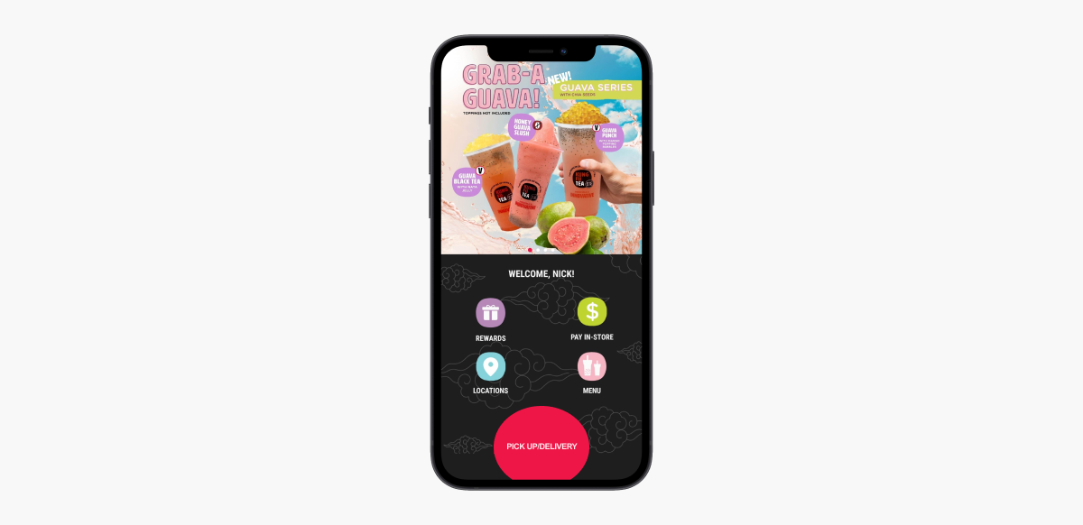
The design is functional but feels stiff and suffers lacking interactive approach throughout as well as poor optimization.
The home screen at least greets you with your name but there isn’t much going on besides the antiquated slider at the top of the screen. They don’t do anything – they’re just static images that are well done but too dense and move too quickly for a mobile format.
Once you move on, you’re likely to bump into some issues.
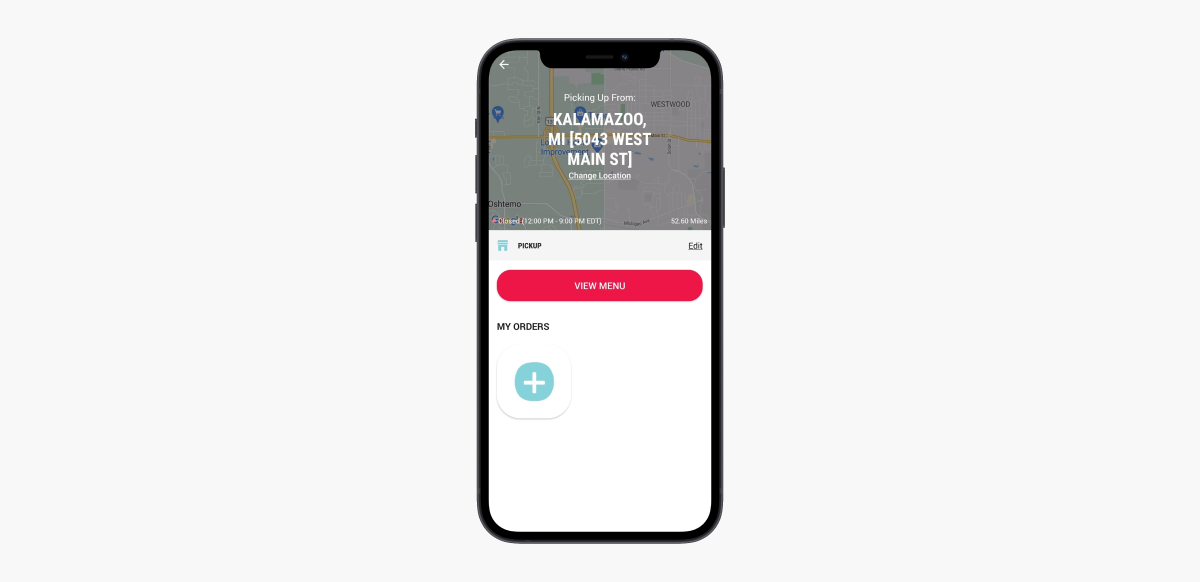
Getting to the point where you make an order feels like letting off the clutch without giving it enough gas.
Should you start from the Menu or Pick Up/Delivery sections, the process is cumbersome. It’s not optimized at all which drags the ordering experience out through more ho-hum screens than necessary.
You first need to select a location through an overly lengthy process where it’s not entirely clear that hitting an “Order” button that appears on the map screen will make the location “stick” and take you back to the menu screen.
Can it be the biggest size with all the bells and whistles?
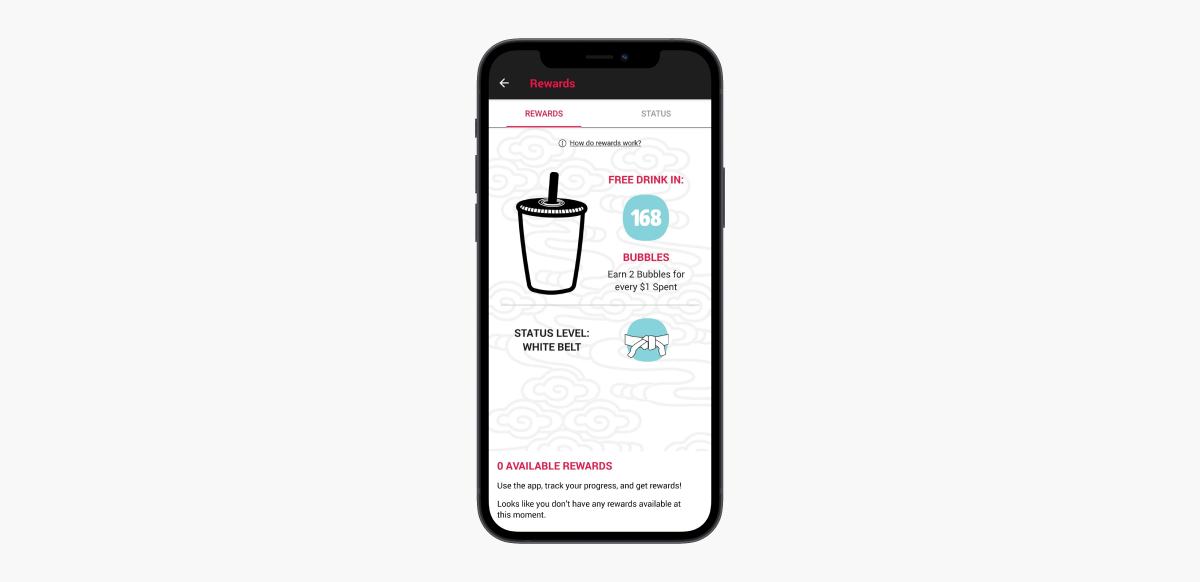
The loyalty section showcases some of Kung Fu Tea’s clever branding but some things like opportunities to earn extra bubbles are noticeably absent. There’s an explanation that you “Earn 2 bubbles for every $1 spent” but it leaves a bit to the imagination like, for example, the size and kind of the product.
It suggests as many questions as it answers.
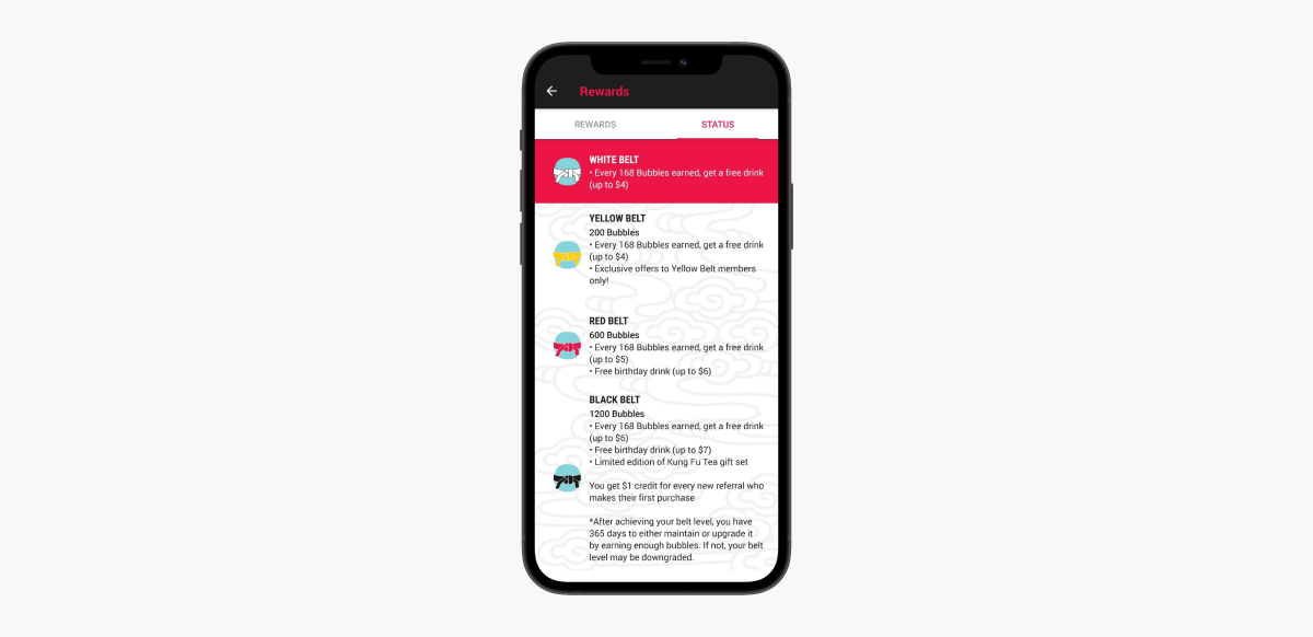
There’s also some kind of loyalty leveling system that uses a martial arts-style belt indicator for each tier.
However, the status screen that shows each tier doesn’t quite explain what benefits are, such as the one in the Yellow Belt section that promises exclusive rewards.
This would also suggest that each tier gets some kind of perk yet none of the others mention any kind of exclusive offering a la the Yellow Belt.
What?
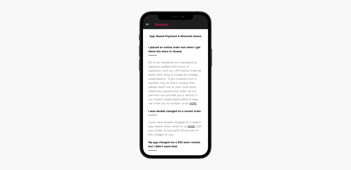
To add to the confusion, the link that reads “How do rewards work?” takes you to the above screen where it lists potential problems you might have with mobile orders.
While there are several other unpolished areas in the app, you probably get the gist at this point.
In addition to lacking features for users, there were virtually no tools on the backend that marketing could leverage to better understand their users, much less make the kind of changes needed to improve the app.
Becoming the bubble tea hero we all deserve
Using an out-of-the-box product is a great move for many growing restaurants as it allows them to get a basic solution to the market in short order that allows the business to accept mobile orders.
But these white-labeled options are often like the white belt of digital products for a restaurant.
To move up through the ranks in the world of digital products, you need to demonstrate mastery and understanding which starts with research.
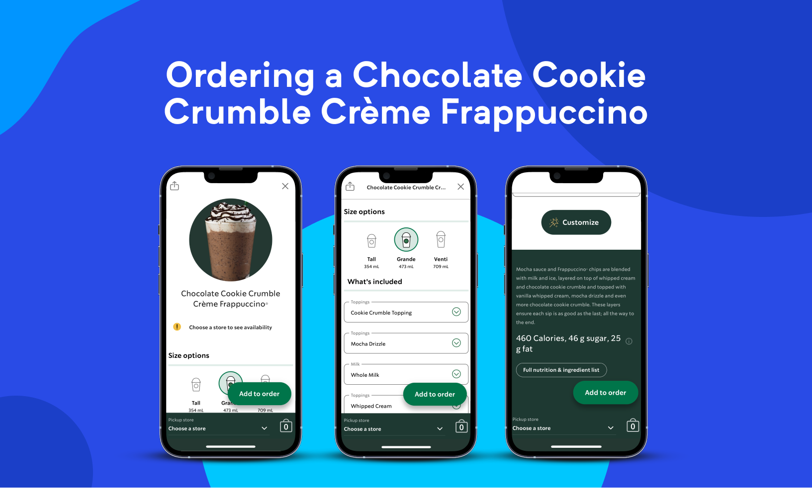
Starbucks offers an excellent example of mobile ordering for just about any QSR. | Discover here why we think that the Starbucks app is great.
For an app, this means kicking off with a deep-dive study of the competition. We worked with Kung Fu Tea to identify and understand what the competition was doing well and where they were falling short.
Not only do you need to “learn the moves,” you need to refine your technique and learn when to use them.
During our research efforts, we also gathered user feedback from existing users such as from their most loyal customers to understand their perspective, for example, things they liked about the existing app.
We used this knowledge when developing the prototype (and eventually, the beta) to make an app that would also appeal to new users and ultimately give Kung Fu Tea a product on par with the quality of digital products delivered by Starbucks, Dunkin’ Donuts, and Chipotle.
Because of the mass adoption of mobile technology for restaurants, we’ve seen a lot of innovation in a short time frame. This has set the bar quite high and thus, elevated the expectations of the average consumer which has made it more important than ever to get all the little details just right.
A look at the new Kung Fu Tea app
Before we look at some of the shiny new designs and features, we want to call attention to the analytics services functioning behind the scene.
Learning isn’t just something you do early on which is why we integrated Segment and Mixpanel to identify cohorts as well as track and analyze behavior. To get a better understanding of marketing campaign performance and collect user data from outside the app, we used AppsFlyer to measure performance while preserving customer privacy.
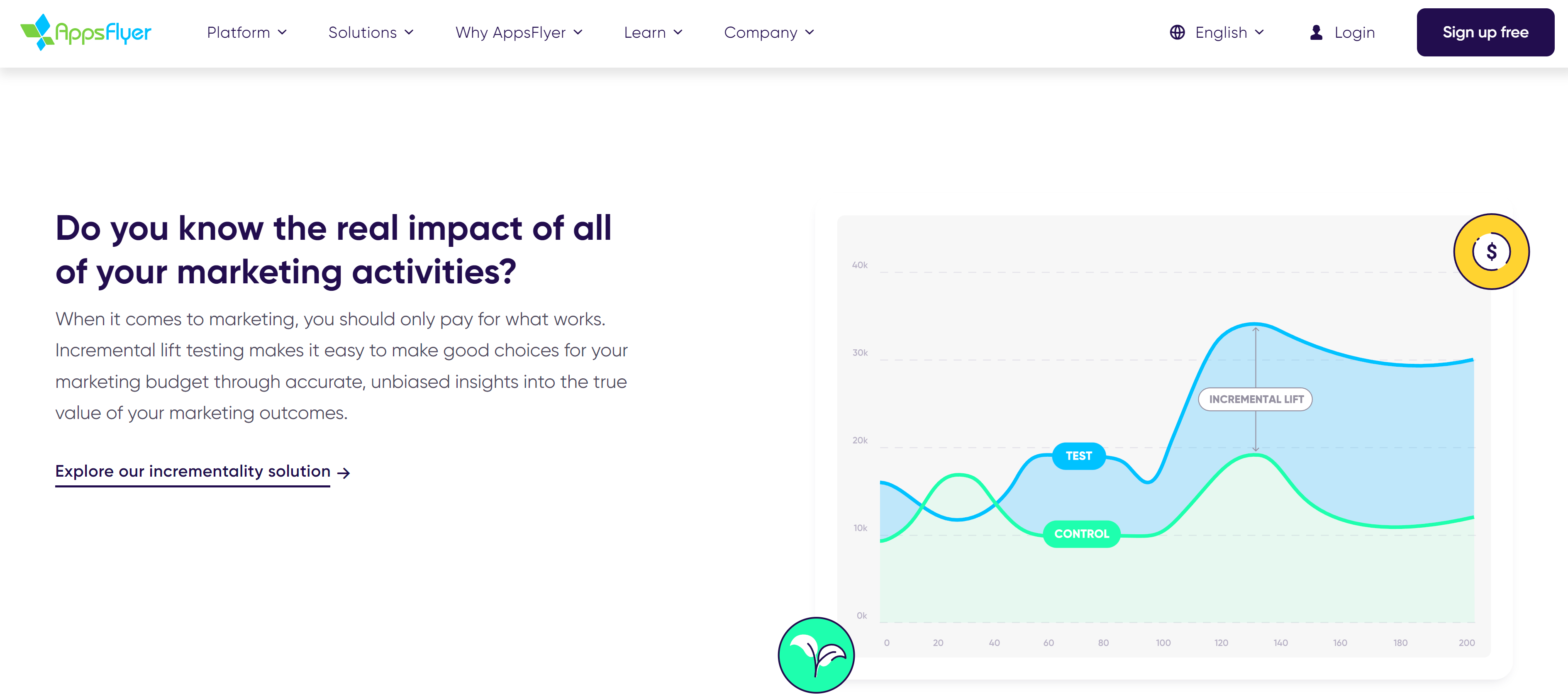
Tools like AppsFlyer allow you to collect and interpret data from campaigns and systems outside your app for a better understanding of performance.
The backend relies on GrubHub’s LevelUp API to power a loyalty rewards system but with far more customization and interoperability with third-party providers than their standalone, one-size-fits-all mobile app solutions.
Introducing new data-driven, customer-approved designs for the Kung Fu Tea app
Opening the old app produced a kind of let’s-get-this-over-with feeling, almost like you’re holding it up from a cigarette break.
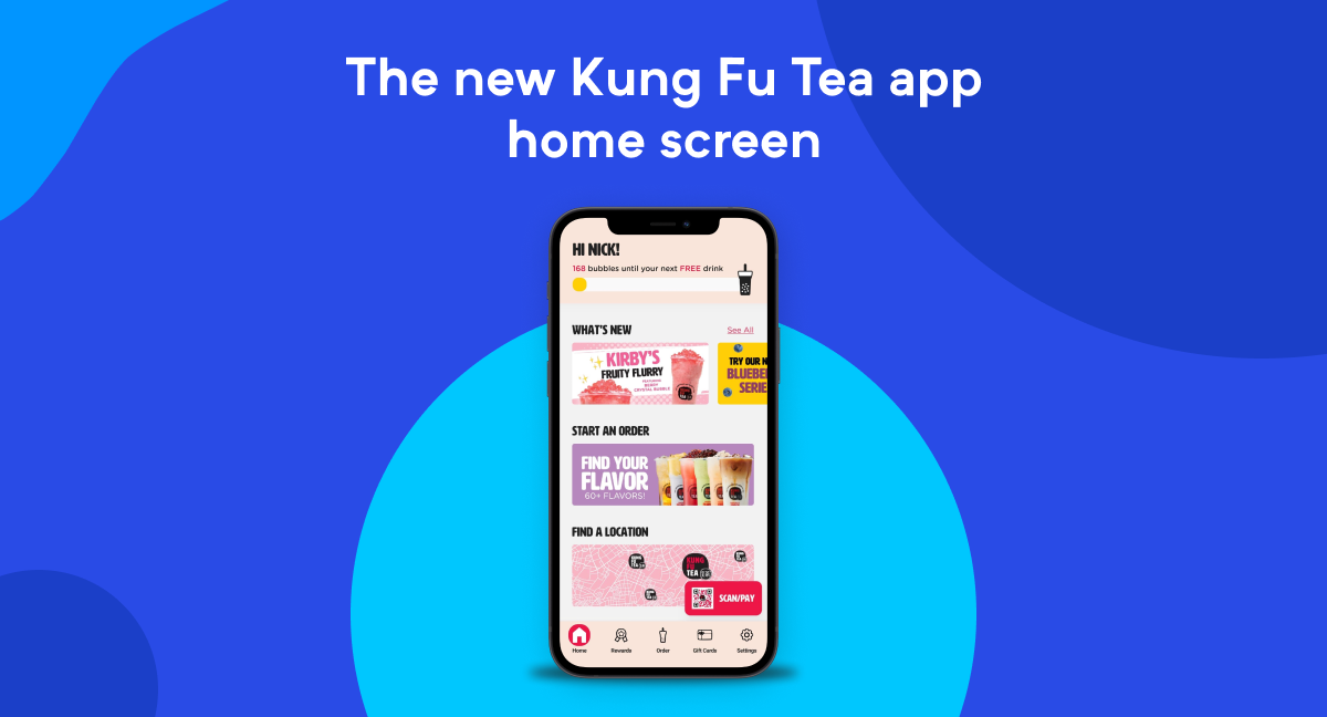
Much better, right?
The new app’s home screen is much more inviting and manages to arrange all the same elements (plus some found in the previous app’s menu) in a much cleaner fashion.
Rather than a headache-inducing deluge of static promo graphics, Kung Fu Tea now has a modular system in place that allows them to place more refined promotional links that customers can easily scroll through.
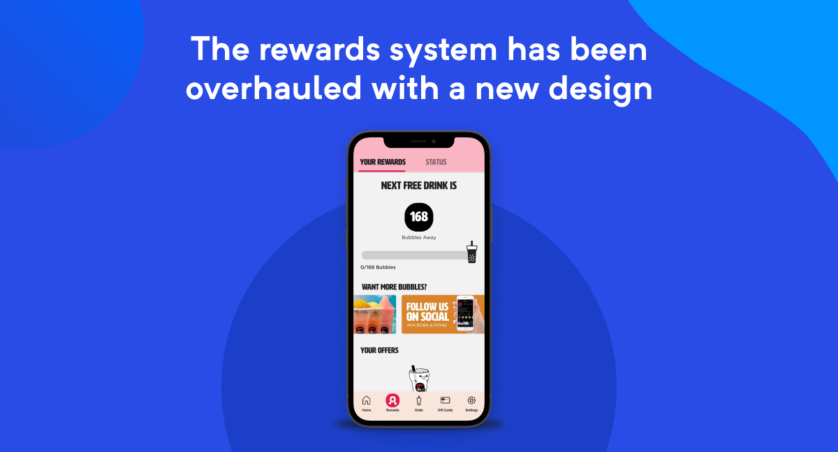
Not only is there now a cute Bubble Tea dude, but the loyalty system also makes sense.
The rewards system has been overhauled with a new design that lets you know where you stand but also allows you to easily scroll through items that allow you to increase your in-app currency, Bubbles, that can be exchanged for free items which populate below.
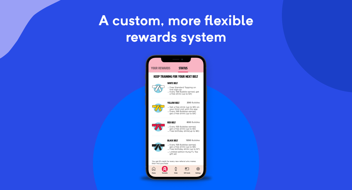
Who needs Tae Kwon Do when you got that boba onboard?
The rewards tiers system that uses “belts” to indicate a user rank has been overhauled with a better layout and clearer copy. Now powered by a custom, more flexible rewards system by tapping into the LevelUp API it works as it should, which should relieve some of the more established users 😃
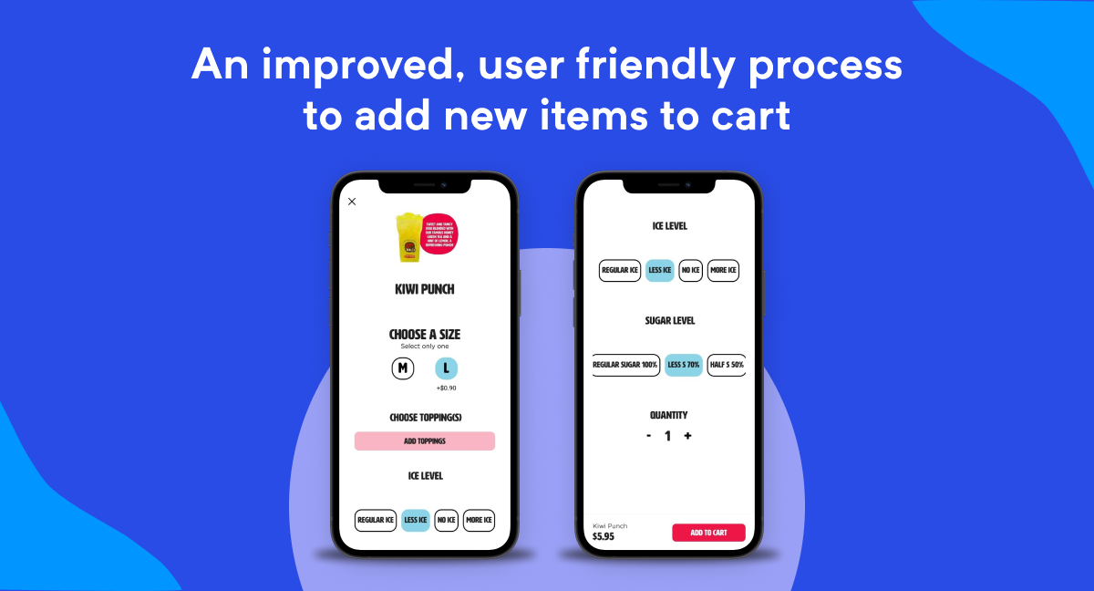
It’s a breeze to order and forgiving if you screw up.
The new design removes a couple of significant problems.
Most processes have fewer steps or have at least been condensed to a single screen such as when selecting a new location before beginning an order for either pickup or delivery.
The app is now much more friendly when users need to back up or change screens as the other would usually make you start over if you screwed up which often caused users to simply abandon their order and sometimes, the app altogether.
Now, Kung Fu Tea is equipped with a product that’s both satisfying for the users as well as more functional. The beta has already proved its worth by doubling the number of weekly average users (WAU) as well as increasing loyalty usage fivefold!
Check out their new apps on the Apple App Store and Google Play!
We build delightful mobile ordering experiences
Building for the restaurant industry is something we’ve refined and continually improve upon year after year, a must for the fast-paced world of food service.
With a strong analytics backbone and feedback-driven design approach, we build apps like Kung Fu Tea to succeed in the market.
