Our New Website Is Live! Here’s What’s New
Design paradigms change over time with everything from architecture to fashion, and virtually everything that’s considered digital.
We recently put a bunch of work into our own website to bring forth various improvements too, just because it’s nice to freshen up your style every so often.
A look at what’s new
We keep pretty busy, so we always have something in the works – though our former website was an effective tool, we found some opportunities to improve things.
After all, that’s much of what we do day in and out for our customers!
So, let’s take a quick look at a few of the new things we’re doing with our brand that you’ll see reflected on our site, through our communications, and social media.
We’re shortening how we refer to ourselves to just Blue Label
We are still Blue Label Labs, officially, but we’ve decided to drop the “Labs” from our name.
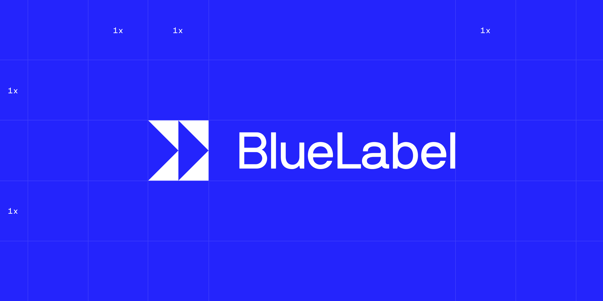
This shorter variant offers more flexibility, thanks to fewer characters in the text portion.
We recognize shorter rolls off the tongue a little easier, which is a bit easier to work with – this is something we’ve recognized for a while as this is what we use internally when we don’t abbreviate.
Now that we’re making several other changes, it was the perfect time to work this new moniker into the mix.
The logo gets a new symbol
It’s a good idea for most brands to have visual elements on the smaller side as you’ll see with the new “BB” symbol that’s attached to our new logo.
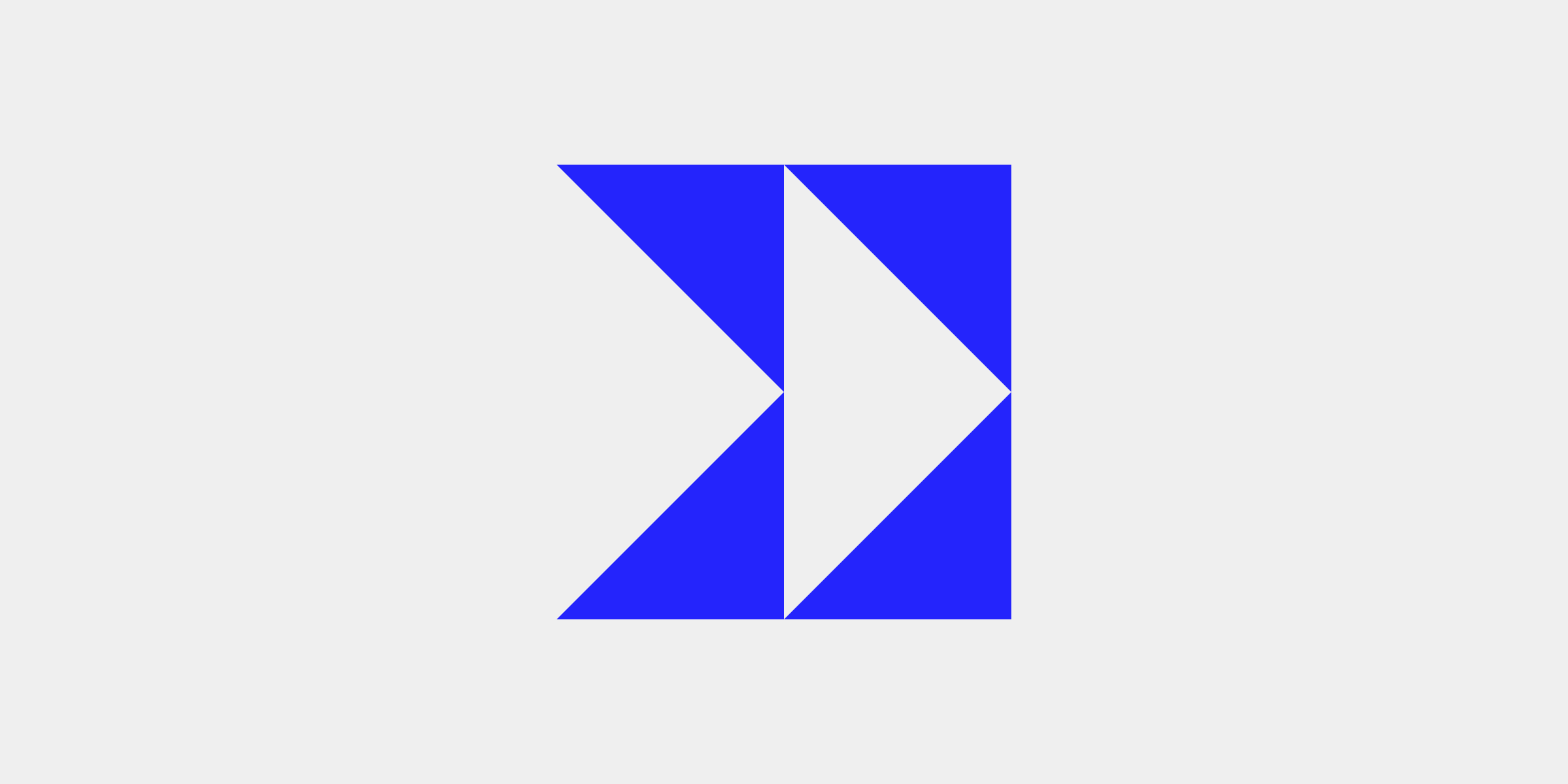
Our old tri-shaded “B” is still great, but our new symbol fits in snuggly with our other design changes.
These smaller items serve a variety of uses from a website favicon to an icon we can use at other relevant digital endpoints as well as with certain internal tools.
New fonts and splashes of yellow and black for contrast
At Blue Label, we have a lot of, well, the color blue tethered to our brand which will still be found throughout our website and much of our other material.
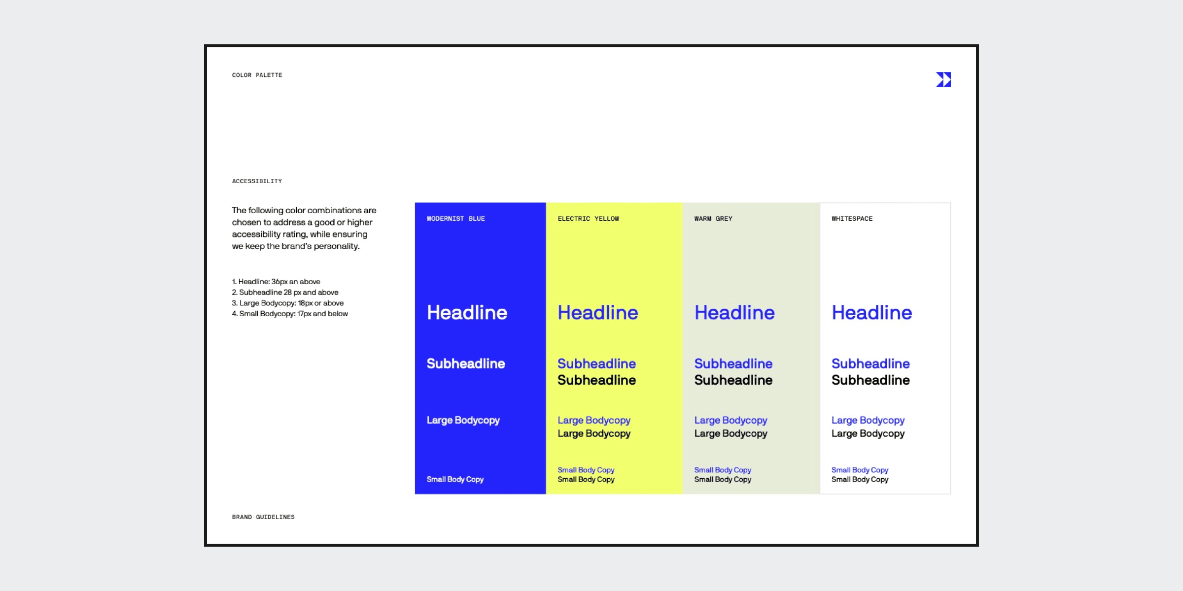
Across our site, you’ll find a few new colors added into the mix like new onyx and electric yellow accents.
Though we’ve added more color into the mix, it works with our layout and NB International Pro fonts to produce an approachable, minimalist feel.
A whole new look for our work showcase
Our case studies are not only fun to look at, but they also provide insightful content that highlights how we brought some of our projects to life.
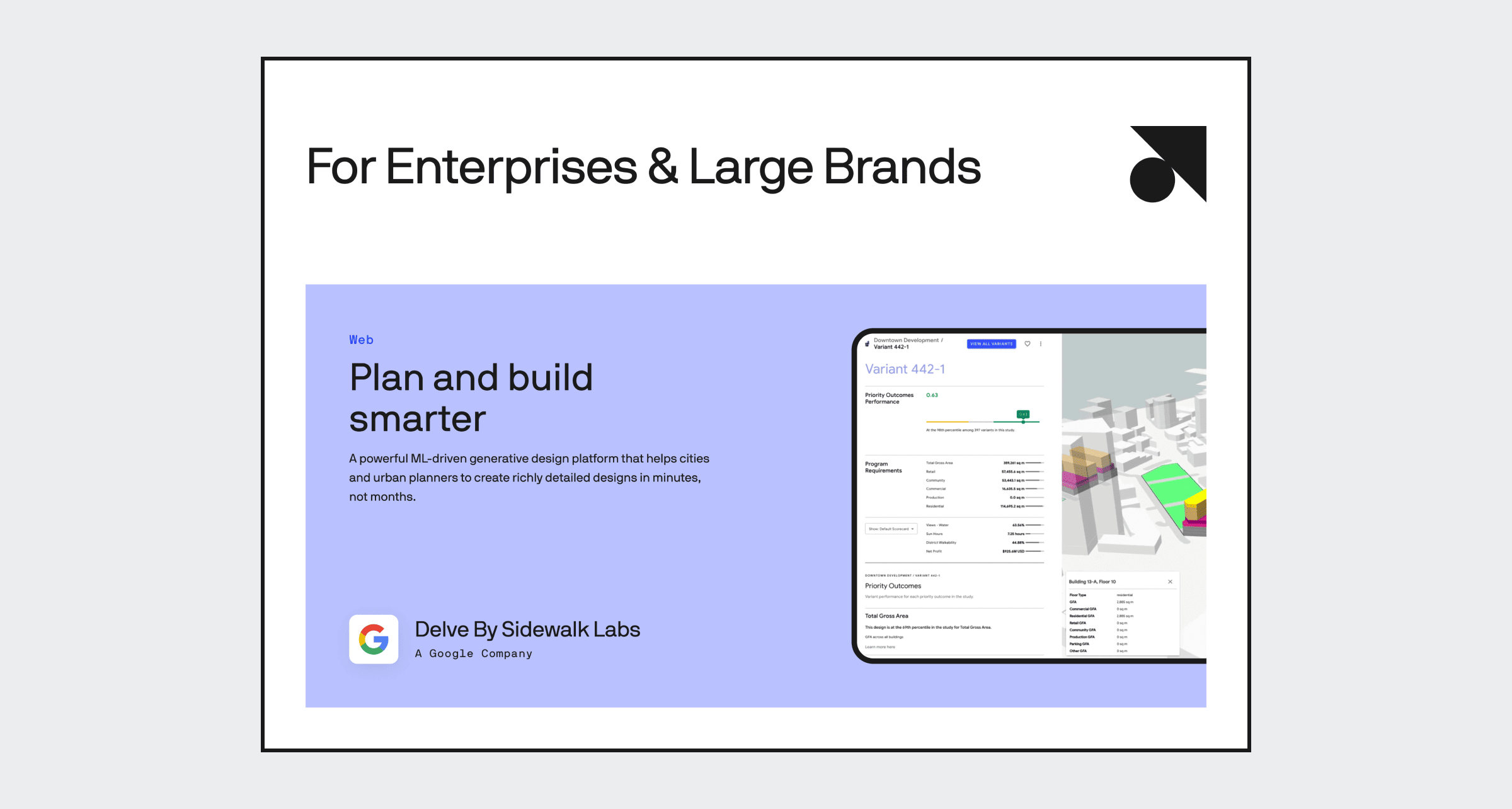
Each tile on this ever-growing page takes you to a highly-visual study with details about the process we used during each project as well as the technologies built into each product.
We have worked on a wide assortment of different projects for startups through enterprises which means you won’t have to look far to find relevant examples for all kinds of products.
A close look at what we do best on our specialty page
In addition to our new collection of focused case studies, we’ve also put together a more focused page that calls attention to our specialties.
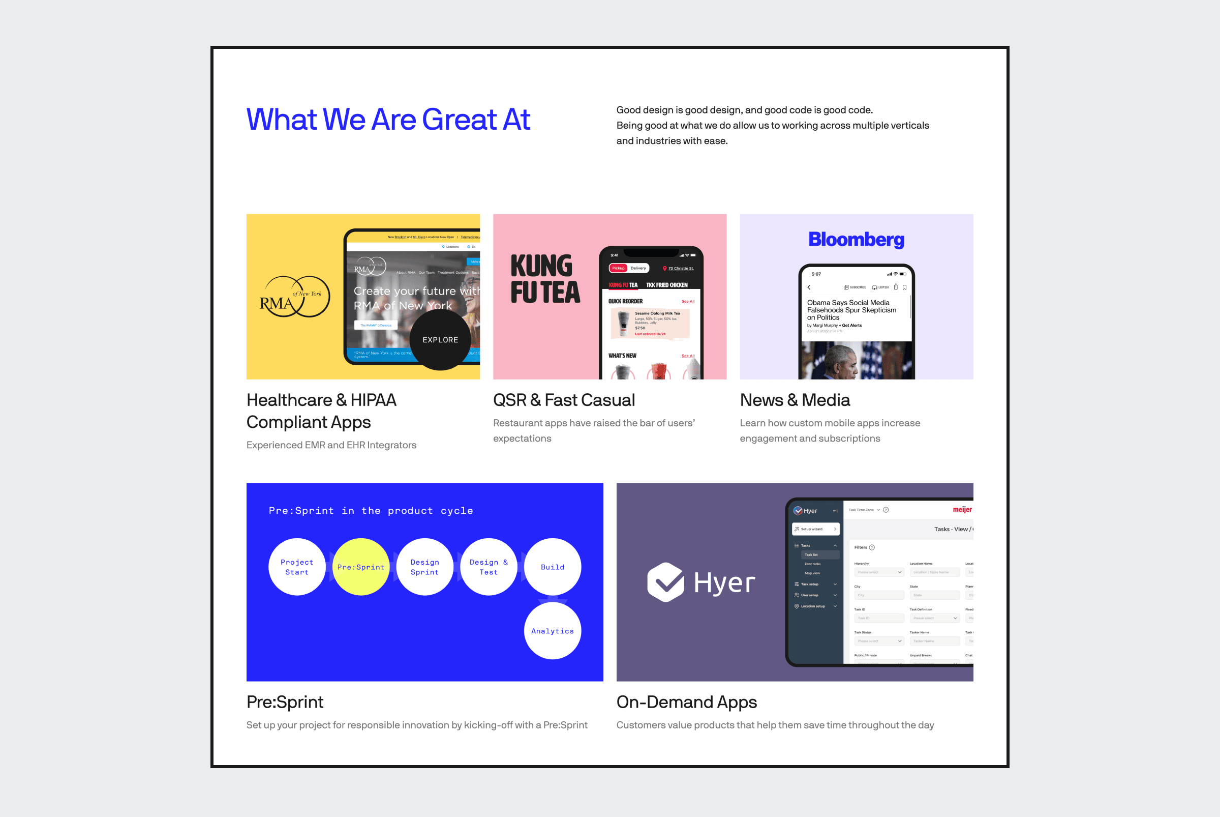
Here, we have projects, products, and services broken into categories that make it easier to find examples by their type.
On this page, you’ll be able to find some of our best examples from different categories which is helpful for those looking for seeking specific details about our past projects.
This allows us to better organize and show off some of our talents by grouping relevant projects in appropriate categories like healthcare and the QSR space.
A new, more organized blog layout
On our blog, we publish all kinds of content with some more focused on thought leadership while other pieces are much more technical.
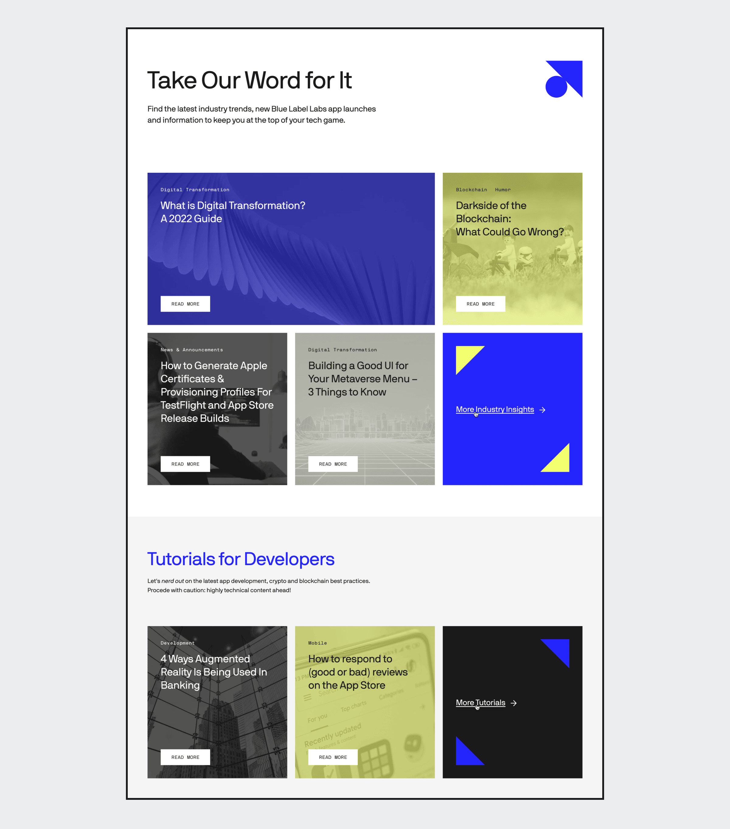
We realize we have a couple of different audiences we serve with our content so we’ve made it easier to find information through the new groupings Take Our Word For It where we have fun and cover today’s most relevant tech topics and Tutorials for Developers that will be kept up to date with useful information we will continue to produce for our technical readers.
Still the same Blue Label, just with an upgraded wardrobe
We love our new design and hope everyone likes the snazzy new look we’ve adopted. Feel free to take a look around and see all our content repackaged with a fresh, new look.
And if you’re in the market for a fresh, new look for your career, we invite you to check out our current openings!
And of course, if you’d like to discuss an idea for a digital product, then get in touch!
