Don’t Let Over Innovation Kill Your Project!
Innovation in design and under the hood of a digital product is wonderful but there are many times it can work against you, your product, and your users.
Here, I want to draw on some experiences I’ve banked over the last decade of running a digital product agency.
I’ll explain what happens when innovation goes too far, what it looks like and some of the psychology that comes with the territory, then wrap up with a bit of insight on how to prevent innovation from backfiring.
When innovation is cleverly-disguised as reinventing the wheel
The drive that people feel who go on to make apps is a little different for each individual.
- In some cases, ideas are mostly backend-focused where the prospective app owner(s) has come up with the baseline for some logic or process that will solve a problem but haven’t necessarily thought about what the interface looks like.
- Other times, people’s idea for an app is more presentation than anything else.
As a digital product agency, we see both kinds of ideas and everything in between.
Both novel apps that bring something completely unique to the world and those that spin existing formulas that intend to “do it better” which is great when things work out.
Though some of the features and design elements that are so commonplace today had to start somewhere, those who become a trendsetter in the app space are few and far between.
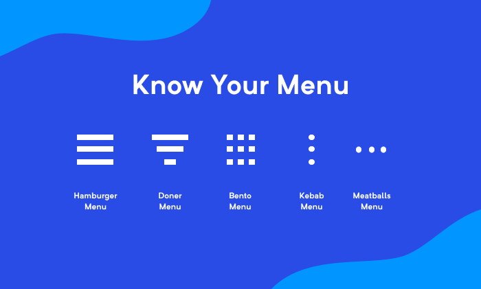
Source: Stack Exchange
For example, take these menu icons and their corresponding layouts – saying they’re “perfect” might be a stretch but you can’t deny that they’re tried, tested, and most importantly, familiar.
For today’s touch-heavy interfaces, design paradigms that have emerged around menus, the layout, and the icons that typically represent them solidified because of user testing over the years.
Putting spins on features like menus or doing something wild like maybe changing how a user scrolls through a site from side-to-side instead of top to bottom might make sense for your idea.
The bottom line is that these kinds of things need to be tested because if it doesn’t vibe with your testers for any number of reasons, such as slowing down navigation – a common denominator among unique ideas – it’s probably not going to fly in the real world.
By all means, don’t let that discourage you from letting your imagination run wild – there is a chance your idea might be just what your app needs and possibly, something that’s embraced by others as well.
If your innovative idea proves to work against the UX, you might have overdone it.
But that’s ok!
This is exactly why you test and test and test.
When it’s time to let go of your baby
One of the parts that no one likes to talk about is how it can make you feel and how this can dictate your actions.

Get comfy. (Source: Pexels)
For many entrepreneurs, the thought of building an app is exciting and if you’re working with the right people, you’ll start building a kind of momentum, even if you don’t realize it.
Especially in the earliest phases, a lot of things often come together quickly.
If you’re using the Google Venture Design Sprint model to validate your idea before moving on to your MVP, you’ll experience a lot of little wins in a short time.
Each time, your buddy dopamine comes out to pat you on the back and by the time you approach the end of the sprint where you test your prototype, your brain systems have helped you construct little biases that influence your intuition.
At this point, it can be a lot harder to overcome information and realities that contradict what our newly-informed intuition tells us.
Basically, just by virtue of the process, you get a little jaded.
The big problem this creates for some at this point is that they clutch the mindset that “this has to work.”
It’s compounded by the fact that there is often a strong emotional attachment to cool ideas you’ve muddled over for months or years and when these ideas have strong ties to the identity of the product, there’s usually a hard come down.
The problem is that some don’t. Unless that bias is acknowledged, you’re probably not going to design with the best interest of the UX in mind.
Virtually everything with a brain is subject to biases and if your hypothesis is “too wrong,” you’re likely going to tank the whole project.
Some advice to avoid over-innovating your digital product
Imagination is good but if it gets away from you, it’s bad for your product. Fortunately, just knowing that biases come into play in software development, just like everywhere else in life, is a big part of the battle.
The following tips should also help before you innovate to the point that your idea crashes and burns.
Tip 1 – People enjoy simplicity above all else
There are plenty of accounts that simplicity is the key to UX with everything.
You can find plenty of other accounts beyond the first page of Google results that corroborate this notion.
I’ve seen it myself in the ten-plus years in the hundreds of apps that we’ve worked on like some of our more recent projects like Bloomberg, the Major League Baseball Players Association (MLBPA) app, just to name a few.
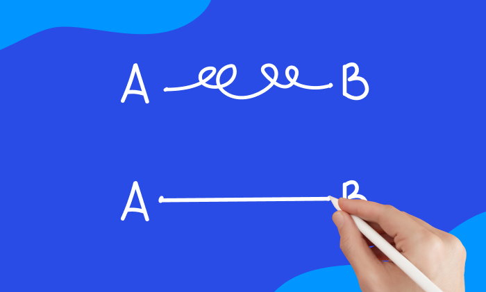
You could also just consider the fact that multiple food delivery services like DoorDash exist and thrive.
Bedazzling, elaborate animations are awesome in the right product like a video game but if your app is bogged down by lengthy animations, transitions, and awkward placement of elements, your genius will be overshadowed by the fact that you’re frustrating people.
To paraphrase what this guy said after his lengthy intro, “If you’re going to make a can opener, make it obvious how to use it to open a can.”
Tip 2 – Don’t mess with it if it isn’t broken
If you ever come across a design and development lab or a digital product agency that markets themselves with slick phrases like “design without boundaries” which sounds cool but… it’s bullshit.
And it’s also misleading.

Like the wheel that’s been going strong since 4000 BC. (Source: Unsplash)
Innovation does often come from people who manage to venture outside the box, you need to think about priorities.
Standardized and native UI elements are already familiar to most users, plus they’re quick to implement – if your app’s purpose isn’t centered on a unique visual experience, then you’re better off sticking inside the lines.
It’s kind of like how there’s no official dress code for going out in society (masks aside) but there is some kind of threshold on this hard-to-pinpoint boundary.
Otherwise, there wouldn’t be an ever-growing collection of sometimes mean-spirited Wal-Mart memes across the web.
Tip 3 – Pump the brakes but don’t stop researching, designing, and testing
If you plan to keep growing or sustaining your product until you’re on your deathbed, then this cycle will be a core part of your life to varying degrees.
Most products eventually stabilize and there’s a point where you won’t need to innovate any further.
I mean, you could, but most products get to a point where there are diminishing returns (if any) on new ideas, with the exception of those that work to truly improve a product or service’s core offerings.
For example, Netflix could add a Word Processor to their offerings and it might even do well if they market hard enough or on the off chance if Reed Hastings can best Satya Nadella in a fist fight.
It’s ok to slow down – in fact, it’s even recommended in most cases. Recall that when controversial leader Steve Jobs returned to Apple in 1997, he killed off just about everything to “focus on the 30%.”
He killed off many ideas and crushed the souls of many people around the company but after about a decade, fruits of labor came to fruition and Apple is now worth a jarring $3 trillion today.
It can also help prevent your Mazda from rolling over on winding, dangerous roads.
Your idea may never amount to trillions but if that anecdote wasn’t enough, consider the fact that no one who owns a Swiss Army knife actually uses all the tools.
In conclusion
I hope I was clear on the dangers of over innovation. Innovation is fine until the moment it compromises the usability of your product.
If you want to know more about how we think about innovative products at Blue Label Labs, hop on our monthly newsletter from the box below.
Bobby Gill
