Subtle (But Important!) Details Of User Psychology In UX Design
The way a user feels about something isn’t always related to a direct experience – effective psychology in UX design is instrumental for a variety of reasons as it’s responsible for shaping conversion as well as attitudes that can impact behavior in unexpected ways.
Like everything else, seemingly innocuous details can make a big difference in how users behave and thus, need to be tested and analyzed.
In the following, we’re going to discuss a couple of concepts responsible for driving user behavior then look at a few specific examples of features that subtly but significantly affect user perception.
Why the “Power of Price” and presentation are the bread and butter for most apps
We’ve discussed several app monetization strategies and tricks to grow your userbase over the years, discussing the value of the many different ways you can generate revenue with a digital product by using psychology in UX design to your advantage.
For example, one almost surefire way to get new users is by offering a discount when providing a less-common, pay-to-download app. And then there’s the freemium model which is used by a vast number of apps like Tinder, Zoom, Fortnite, and countless others. Either way, overall pricing strategies will look about the same.
The reason why sales (i.e., highly visible discounts) work so well is because we’re all basically suckers for a sweet deal and a pretty package, no matter how immune we think we are to conventional marketing.
In a piece from last year on the loyalty rewards portions of the Starbucks and Dunkin’ apps, we referenced a simple psychological “trick” discussed by the distinguished behavioral economist, Dan Ariely in his book Predictably Irrational. Much the same way as a good loyalty rewards program drives business, the same mechanics can be leveraged to drive purchases outside of a formal rewards system through discounts.
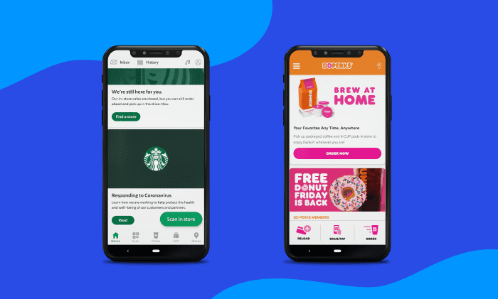
Source: Dunkin’ & Starbucks: Changing How We Look at Loyalty Rewards Apps
While the exact verbiage will vary between all the different flavors of apps, the same concept applies to IAP (In-app Purchases), IAS (In-app Subscriptions), and really, anything sold digitally: offer discounts when certain clearly-defined conditions are met and sometimes, just because.
By giving frequent fliers their miles – and actually allowing them to be used – you’ll most likely see more revenue and, unless you screwed up something in your pricing structure, better profits as well.
There’s also the matter of “looking” the part too. This essay that reflects on Ariely’s book talks about a small experiment from the book using coffee. Students were given free coffee every day if they agreed to provide feedback on the refreshments. They were served the same coffee every day, the only differences were how it was presented. As you can probably guess, the snazzier the experiment’s accouterments, the higher the satisfaction reported by the students.
Price and presentation are incredibly impactful because they’re processed (at least initially) by something referred to as our “system one thinking,” which is explained in great depth by the author who coined the concept, Daniel Kahneman, throughout his book Thinking Fast and Slow.
The gist of it is that we all have two distinct “systems” of thinking where system one (i.e., “fast thinking”) describes things we immediately process from our various sensory receptors. It’s almost instant, primitive, and super impactful as this process essentially primes the information before it goes to system two (i.e., “slow thinking) if it even gets there where our “processing power” becomes exponentially more powerful and complex.
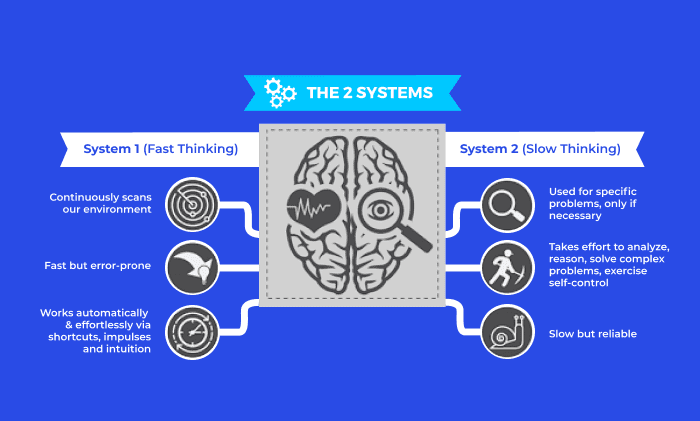
Source: Book Summary – Thinking, Fast and Slow by Daniel Kahneman
Starbucks nails psychology in UX design as we can see from the incredible numbers the app generates, not to mention the fact that they have cultivated their look so well that Starbucks merchandise generates its own little economy.
You can probably look around any room in your home and identify multiple things you bought because “it was a deal.” There’s also probably a part of you that, every time you see a car commercial around the holidays where the vehicle is adorned with a giant bow, you know in your heart that you need to experience either giving or receiving a vehicle in this manner at some point in your life, even if it is just a Kia.
So if you sell shoes – it could be real footwear or NFTs of digital shoe models for some niche market – this kind of tactic will be your bread and butter.
If your model allows it, you’ll get even better results if you can offer perks through a loyalty rewards system where you can fine-tune presentation for even better results.
But if you, say, design and develop digital products, your presentation will still be important but the entryway to your funnels will look a little different as these conversion scenarios rely on communication and understanding which rules out “system one” marketing.
Psychology in UX design: how rating and review features sway user influence
Of course, not every purchase is a knee-jerk, system one kind of purchase but it does attract attention and also conditions potential buyers for the decision they’ll make after further deliberation. So let’s look at a few other cases and some real-world examples of features that influence user opinion.
The 5-star method works well in most cases
The ability to gather insight from others who have (hopefully) used the product is especially helpful when you’re something unfamiliar – it could be a familiar item but from a different manufacturer or something completely novel to you. The reviews portion of the Amazon storefront is perhaps one of the most visible and well-known examples as almost everyone has at least visited the site or app, if not bought something.
Minus the OGs in the Bezos hating game, Amazon reviews have helped steer buyers either towards or away from products when the buyer needs a little more information. As such, it can seem like a double-edged sword but from the right perspective, reviews can be leveraged for QA.
While ethics should prevent you from knowingly selling trash to your customers, understand that if you don’t offer this option on your site, some Yelp user or Redditor will eviscerate you and it almost certainly will show up on Google’s first page where it will haunt you night and day.
Offer a review system for real (ideally, verified customers) to leave their feedback, for better or worse, and make sure it’s easy to navigate.
Think about how Amazon features a composite rating from all customers who reviewed the product as well as the ability to sort and dig into written reviews. For products or services where “nice packaging” and a cool discount aren’t enough (or shouldn’t be enough) to sell a product, reviews can help sway opinion, especially when users are considering a similar alternative to your product or service.
One thing to note is that this works well for eCommerce but as we’ll discuss next, a point-system isn’t ideal for every scenario.
An “approve or disapprove” can outshine a numbered rating system in some cases
Before Netflix allowed users to simply “like” or “dislike” a title, they used a 5-star system like Amazon; however, because of an unseen psychology in UX design phenomena, it was discovered this system was working against them.
There are a few reasons for this but it stems from human behavioral characteristics described in the mini-lecture from the first section about Kahneman’s two systems of thinking.
There are no universal standard criteria for a five-point system – while the same holds true for the simple “like or dislike” mechanic that we see in Netflix today (and Reddit, among others) it works comparatively better because picking a movie more or less relies on the first system to pull the trigger on a title when you’re just browsing.
Unless you methodically plan shows and movies to watch, you’ve likely spent an inordinate amount of time on streaming apps scrolling every which way before you select something.
The reason this works better (ignoring the impact on the algorithm) is because it’s simpler. When the rating is something of a factor for a user, more will watch something that is “liked” by 60% of the user base versus something that’s collectively rated at 3 out of 5 stars.
It’s arguably liked to the same degree but the expression from is simpler which essentially prevents it from going to system two, thus slowing down the decision-making process. Not only does this reduce decision-making time – and prevent people from going to Disney+ to rewatch X-Men – it also generates more interaction from users.
Of course, other factors can cause us to browse Netflix endlessly before rewatching something we’ve seen a thousand times (hint: it rhymes with society) but this seemingly simple tweak was enough to remove just enough complexity to get people to watch more content and most importantly (from the business perspective), interact with the rating system.
While it sounds almost counterintuitive for Netflix as more usage means more overhead, it helps with user retention in the big picture. Users who are more likely to consume a variety of content are more likely to keep their Netflix subscription versus those who feel lost when their favorite content is removed from the platform which results in canceled subscriptions.
Why you should probably avoid offering a “dislike” button
There’s a lot of speculation as to why Facebook doesn’t have a clear-cut dislike option. You can react with a 😡 when your conspiracy theorist uncle starts talking about immunology that he’s in no way qualified to discuss, or a 😥 when your friend posts about their goldfish dying. However, you can’t outright say “I dislike this.”
Sure, it’s a matter of semantics as an angry face gets the point across about the same as a specific dislike reaction (e.g. a “thumbs down”) but in this case, it’s important.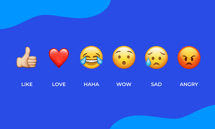
Source: Facebook
Facebook can be a negative place, just like any other social hub. While they didn’t outright say this is the case, their Chief Product Officer, Chris Cox, did express that the team felt such a reaction would be” too negative.”
Though many would be mostly unphased by a “dislike” showing up alongside other reactions, the problem is that people will, unfortunately, weaponize it. Reddit might have a downvote system but it’s also used quite differently than Facebook where a good chunk of users take advantage of the platform to connect with people they know or are at least somewhat close to their personal network.
Cyberbullying is already bad enough and the more personal manner in which people tend to use Facebook probably led to an increase in tragedies that we don’t need to spell out. While dislike reactions have their places, keeping your overall vibe as positive as possible should be the goal.
We know how users think
Understanding the finer points of psychology in UX design will help businesses make better design decisions that keep users engaged. As we discussed, even the seemingly miniscule differences in customer review or reaction mechanisms can have a profound effect on how users experience your product.
Though we haven’t built a mind-reading app just yet, but we have brought hundreds of successful products to life for the whole spectrum of businesses.
The way we research and iteratively develop our products through testing and feedback loops has given a good deal of insight on some of the more abstract matters in play surrounding the designs and features we build.
If you’re looking to refine your product or are in the market to bring something new to the market, reach out to us today to learn more.
