6 Features Your Restaurant App Needs to Have
Many will be quick to tell you what’s wrong with your restaurant app when it fails to meet expectations but the question can still remain: how do address these issues and what are the current design paradigms that truly engage with users?
The “here and now” of the digital restaurant space should serve as a guideline for how you plan to design your app.
We’ll explain why the following features that we identify make for the best possible UX – and if all goes well, they’ll make your life easier too.
6 features of an ideal restaurant app in the QSR space
Before we get into specifics, any product you develop needs to be responsive and reliable – it won’t matter how neat your features are if your product lags or constantly crashes. Ongoing iterative development that factors in user testing and feedback, as well as behavioral analytics, will be key to maintaining and growing your platform.
For a restaurant app, incorporating the following six concepts and features into your design will help you to better engage with your audience.
1. A lively home screen with interactive elements for promotions and beyond
It’s not enough anymore to merely plug in a set of new static images every month that will simply scroll across the user’s screen. While it is nice to have fresh graphics for every season and promotion, visuals need to be interactive. This means that you need to think just as much about layout and functionality – after all, the picture needs to be framed before you can hang it on the wall.
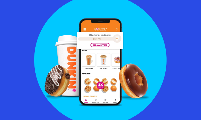
Take a look at the Dunkin’ Donuts app pictured above. Your loyalty points are clearly displayed at the top and you can tap for more details on their promotions like products that earn double and triple points.
Their flagship products appear next followed by promotions which take into account the user’s location. If I wanted to explore different items, the partially cut-off donut icon tells me that I can scroll these items horizontally to see other food categories.
As soon as you open the app, the average user should have no problem finding whatever it is they’re seeking. Personalization is another great feature to have here as you connect better when you incorporate the user’s name along with dynamic greetings that can do anything from acknowledge the time of day or the local weather.
2. A cart icon that’s visible on just about every screen
Some users will open your app and go buck wild, which is exactly what you want.
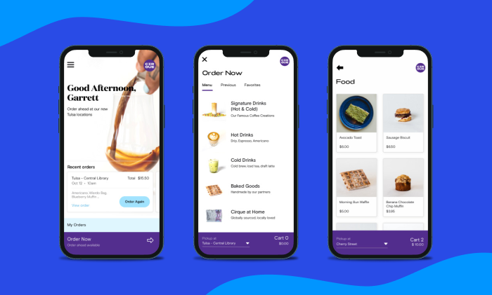
Most customers, however, will spend more deliberately, often spending within the confines of your loyalty rewards program or to satisfy the condition for some other perk like free delivery, an extra egg roll, etc. This is much easier for the customer when your restaurant app features a visible, updated total as they navigate your product like you see with Cirque Coffee in the example above or, in more detail here in our Cirque Coffee case study.
The most important part is that it’s easy for the user to see an updated total, whether it’s in the corner of every screen or an icon that can be tapped or dragged to access cart information without disrupting anything else.
Don’t make the user have to do anything extraneous like go through order creation or flip through several screens.
3. Visuals for everything, from your products to their ingredients
Beyond the home screen, everything else needs crisp, high-fidelity visuals.
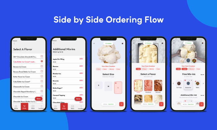
During our webinar that covered what’s wrong with the Cold Stone app, we provided this side-by-side example to demonstrate how much more enticing ordering ice cream is when you can actually see the product and the toppings. The left looks like the DoorDash app, which works on a fundamental level, but it doesn’t do much justice for ice cream, nor will it for that sandwich you named after a beloved local college football coach.
Go find someone who’s lactose intolerant and get them to focus on the screens on the right of the image. There’s a 95% chance you’ll see their wheels start to turn as they begin to rationalize the exchange of crippling pain for indulging in a delicious treat.
Further allowing a user to see their creation with ingredients they add or remove. With just a little extra work, you can make a custom visual that aligns with a user’s creation which is a lot more fun than checking boxes like you’re taking a survey made by a grad student in Google Forms.
It’s not ideal for some foods (e.g., an omelet) but you get the picture.
4. A clearly organized order flow
To build on the idea we mentioned in the first point, thinking in terms of layout and functionality needs to apply throughout the app.
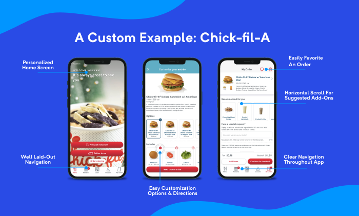
If you only offer some hair-brained way for people to order, you’re going to confuse and piss them off.
They won’t spend money and may even leave you a heartfelt review IN ALL CAPS, which you’ll deserve. You can avoid all of this if you remember that simplicity comes before bedazzling.
Don’t let less squash your creativity, at least entirely. For example, some have had the idea to offer an entirely visual builder where you can assemble a custom menu item with drag and drop visuals. Though something like this would be a lot of fun, it would be cumbersome enough for the average user to work against most QSR models.
In time, you can introduce unique ideas but you’ll need to test and always ensure they don’t detract from the app’s core mission: sell dope food quickly, reliably, and securely.
5. A loyalty rewards program & a robust notification system
These two aren’t mutually exclusive but the best restaurants will use them in conjunction to complement each other.
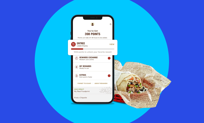
The Chipotle restaurant app is an excellent example in the QSR space as it does a stellar job at virtually everything. The reward system seen in the image above is a feature you would most likely build using one of the many popular third-party, loyalty rewards platforms.
By further integrating a notification system like Amplitude, Segment, One Signal, or Appsflyer, you’ll be able to notify users for deals using their rewards as well as for other reasons such as to notify users in a certain geofence of a nearby deal, contact customers when it’s “happy hour,” reach out to inactive users with a discount, and much more.
Remember to avoid annoying your users with notifications at all costs by giving them the option to control the kinds of notifications they receive and their frequencies.
6. Give users the ability to tweak everything
Most QSR restaurants thrive because they often give you meals that can be purchased as is or tweaked to the user’s liking. As such, make sure your technology affords them the same level of detail that they can get when they order in the restaurant.
You don’t need to facilitate a customer’s weird need to control things by giving them down-to-the-gram details on seasoning usage (but you could.) For things like ice cream toppings, tasty sauces, ice in a soft drink, etc., allow users to specify how much of something they want, within reason.
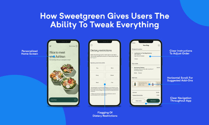
Finally, make sure you at least address allergens visibly as Sweetgreen does in the example above. Otherwise, you will have customers calling to ask you about contents and if they can be removed.
This is one of the reasons you have an app in the first place.
Make allergens visible and let people know when they can’t be safely avoided (like Cold Stone with dairy and nuts) and when you can’t (or won’t) modify something, for example, a chicken salad sandwich that’s prepared with pecans.
Most of us with food allergies understand that there are things we just can’t eat because that’s our lot in life – in short, don’t get bullied by a dramatic nut allergy sufferer when an item isn’t in the cards. We’re all adults who can make our own chicken salad sandwiches without death seeds.
***
Ultimately, your app needs to be as dynamic as possible which brings us back to the beginning. Make sure you have a clear understanding of the technology that’s going into your products. For more information or to discuss your idea for a product, get in touch!
