Rebuilding a Billion-Dollar Brand: How We Redesigned the WatchBox App
When you become the world’s largest anything – or close to it – your users will expect your website and apps to deliver an experience that aligns with your market position.
We recently completed work on the new WatchBox apps for iOS and Android. We’re going to look at decisions that helped redefine the product and highlight some of the changes we implemented to make a more customer-centric product.
What is WatchBox?
The team behind WatchBox is dedicated to their brand which seeks to provide the best possible experience in collecting luxury watches.
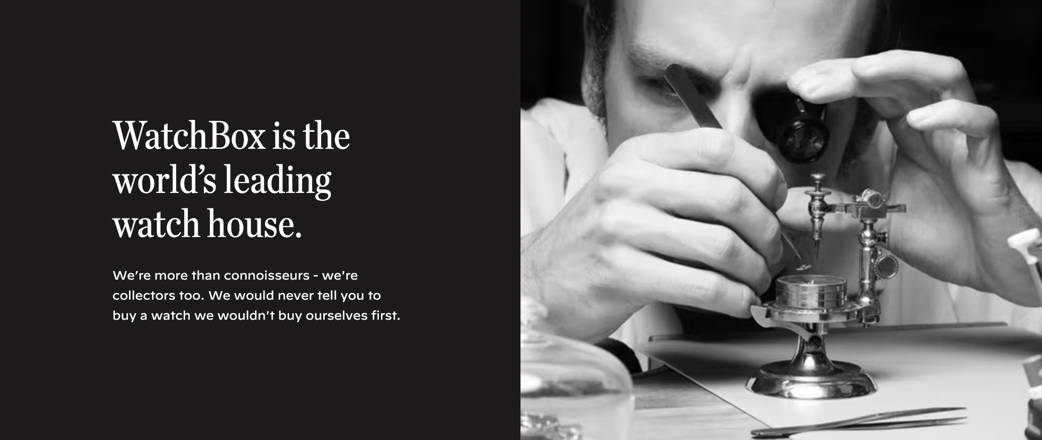
They’re particular about quality and ensure products are all authentic, among other things. | Source: WatchBox
This means that WatchBox is a blend of a few things, perhaps the most obvious being that they serve as the world’s largest secondhand dealer of luxury watches.
Though a merchant at its core, WatchBox is so much more than just a transactional platform– their focus is finely tuned toward delivering exceptional quality in an environment that offers collection management tools and a wealth of knowledge from a team of quality content creators.
Everything comes together to ensure that WatchBox is a place where you catalog your new collection and easily find new pieces to add from their curated collection.
Key factors & decisions that lead WatchBox to improve their brand
Buying used things inexpensively just for the sake of reselling them is very mechanical like the soulless entity that is GameStop.
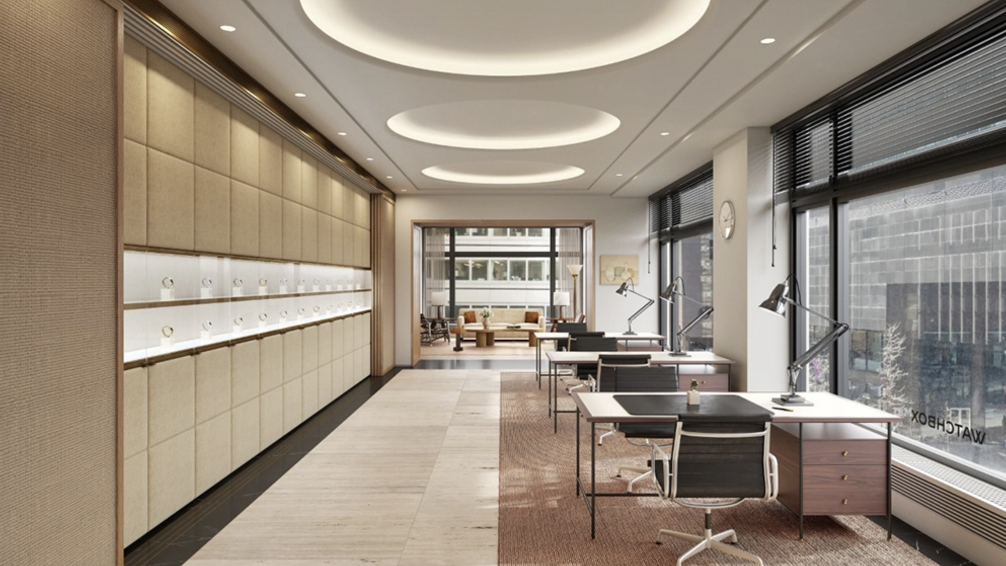
Here’s a rendering of what upcoming luxury lounges from WatchBox will look like. | Source: Robb Report
WatchBox isn’t about purveying some great deal to move high-quantities of possibly functional products and goddamn warranties.
They knew what was important to their customers and recognized that they needed help to deliver an experience befitting a luxury brand that would satisfy their biggest spenders and novices alike.
By working with new, high-profile stakeholders like Michael Jordan and Giannis Antetokounmpo, the company reached close to a $1 billion valuation which the company is using to fund efforts like opening high-end luxury lounges and of course, deliver an awesome digital experience.
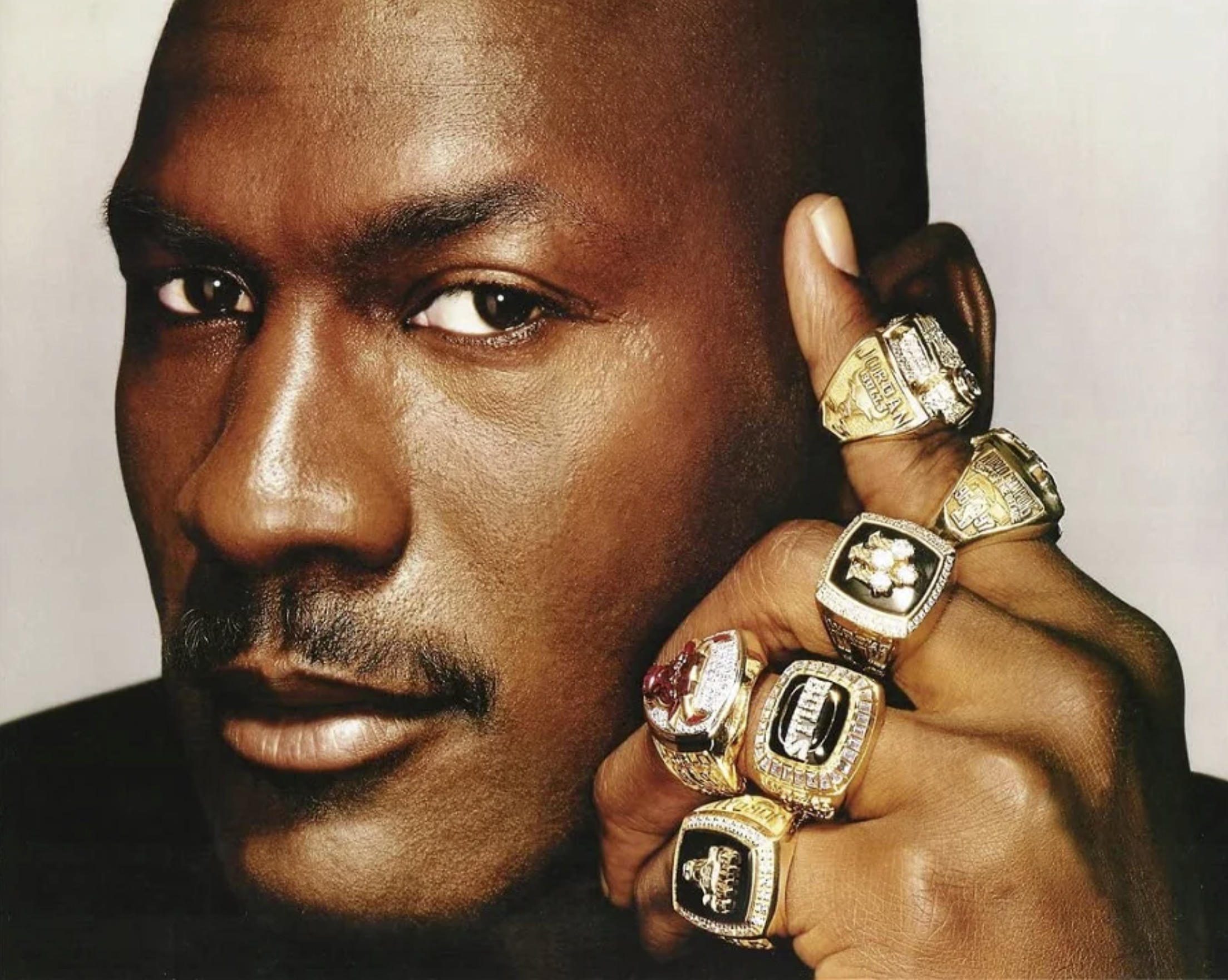
He was so good at basketball that he ran out of fingers so it seems the next logical progression is luxury watches. | Source: Essentially Sports
However, staffing changes left their existing teams supporting their digital products both shorthanded and short on knowledge – WatchBox needed help with strategy as well as the design and development portion of their project.
Their website is a solid product so they wanted to build it in a connected way that would complement their new growth and maximize engagement with their audience.
This led them to us and formed the foundation for how we’d begin our approach to figure out what needs to be done as well as what will and won’t work.
How we approached the design of the WatchBox apps
The WatchBox website was a fairly recent development that both captured their branding and delivered much of the functionality they intended to deliver.
The apps, on the other hand, were disjointed from the process – the iOS app wasn’t completely broken and had several features but it was outshined by the website. The existing Android app, however, didn’t quite get the same attention as the other platforms and had few users as a result.
Starting with the Design Sprint, we uncovered a lot of information we’d use to build the new products.
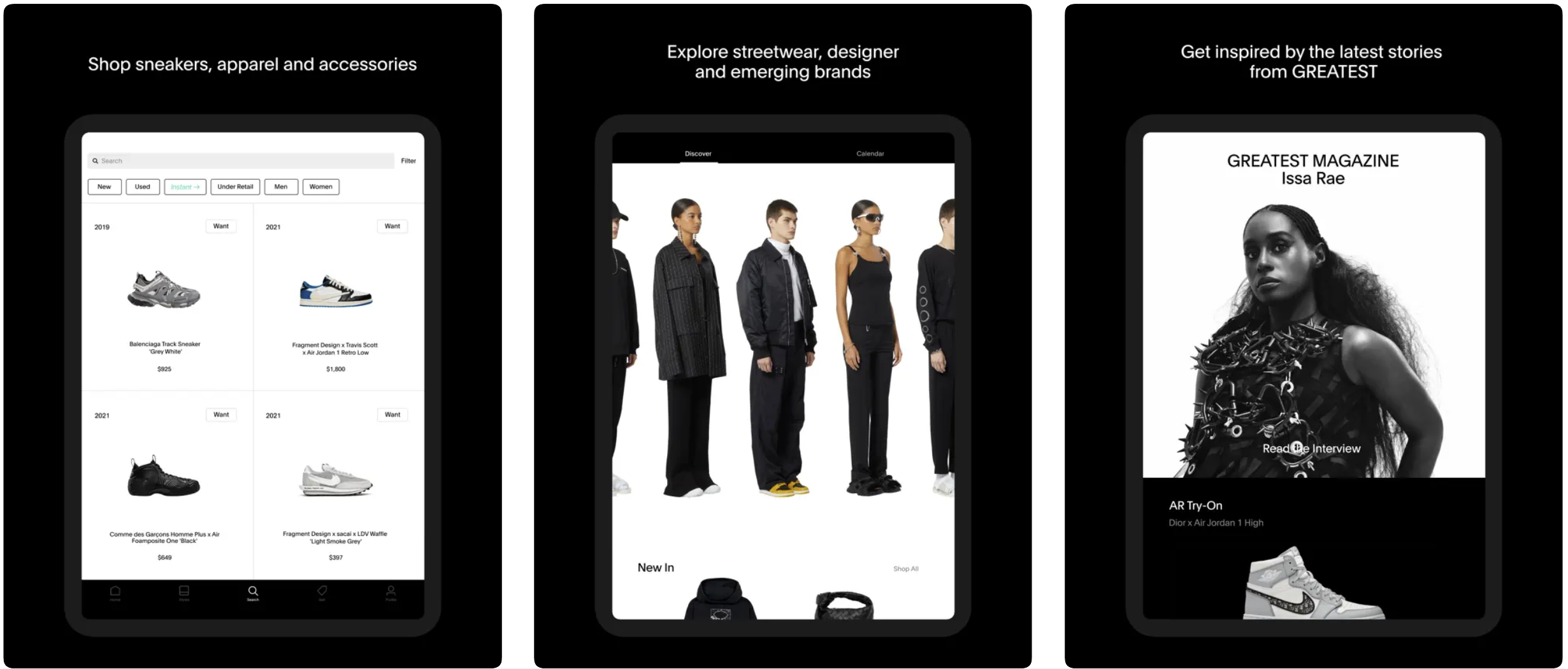
Of the many refined luxury products we analyzed, GOAT stood out above other luxury product apps like Gucci and Louis Vuitton. | Source: App Store
Ideas like the above came together with branding that also incorporated the look and feel of the existing website. These ideas combined to form the design foundation we tested and adjusted until we derived the product you now see on Android and iOS.
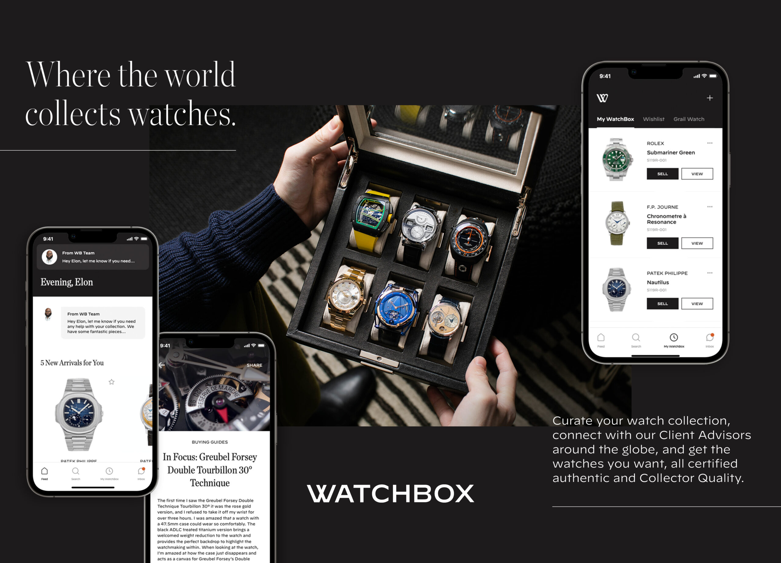
The design immediately resonated with stakeholders and also performed well with test users, especially against more colorful designs that some felt clashed with certain products.
To bring the design to life, React Native was selected for a few reasons, such as:
- It’s our preferred cross-platform framework – we can write one set of code that’s used for both Android and iOS which gets the product to the market on both platforms quickly.
- It uses JavaScript to provide a truly native experience which allows the apps to be responsive and function in a familiar way, with respect to each platform.
- Further, this allows us to easily integrate other required third-party systems such as Salesforce CRM, Adyen for payment processing, and Algolia for in-app searching.
Typically, we recommend most businesses avoid rewriting apps entirely from scratch for many reasons unless a product happens to be a truly lost cause (which is rare.)
Although we did create quite a bit from the ground up for WatchBox, we built such that we were able to continue using Firebase and Google Analytics for consistency’s sake as well as its ability to work alongside additional analytics that will likely be implemented at a later time.
This played a huge role in our relationship as WatchBox needed a data-driven team out the gate and we were able to both learn from existing data and open new channels for learning as we created the new product.
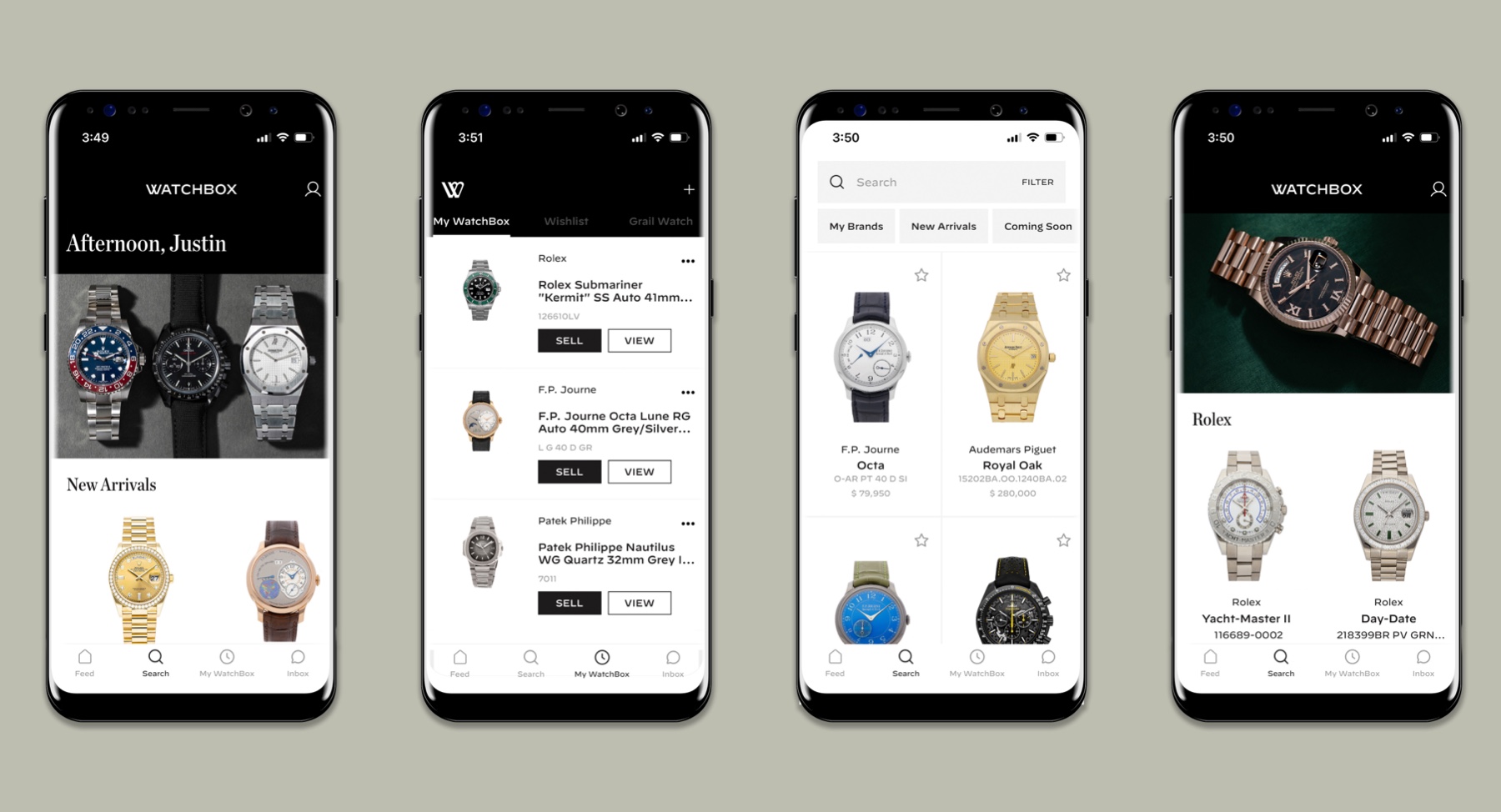
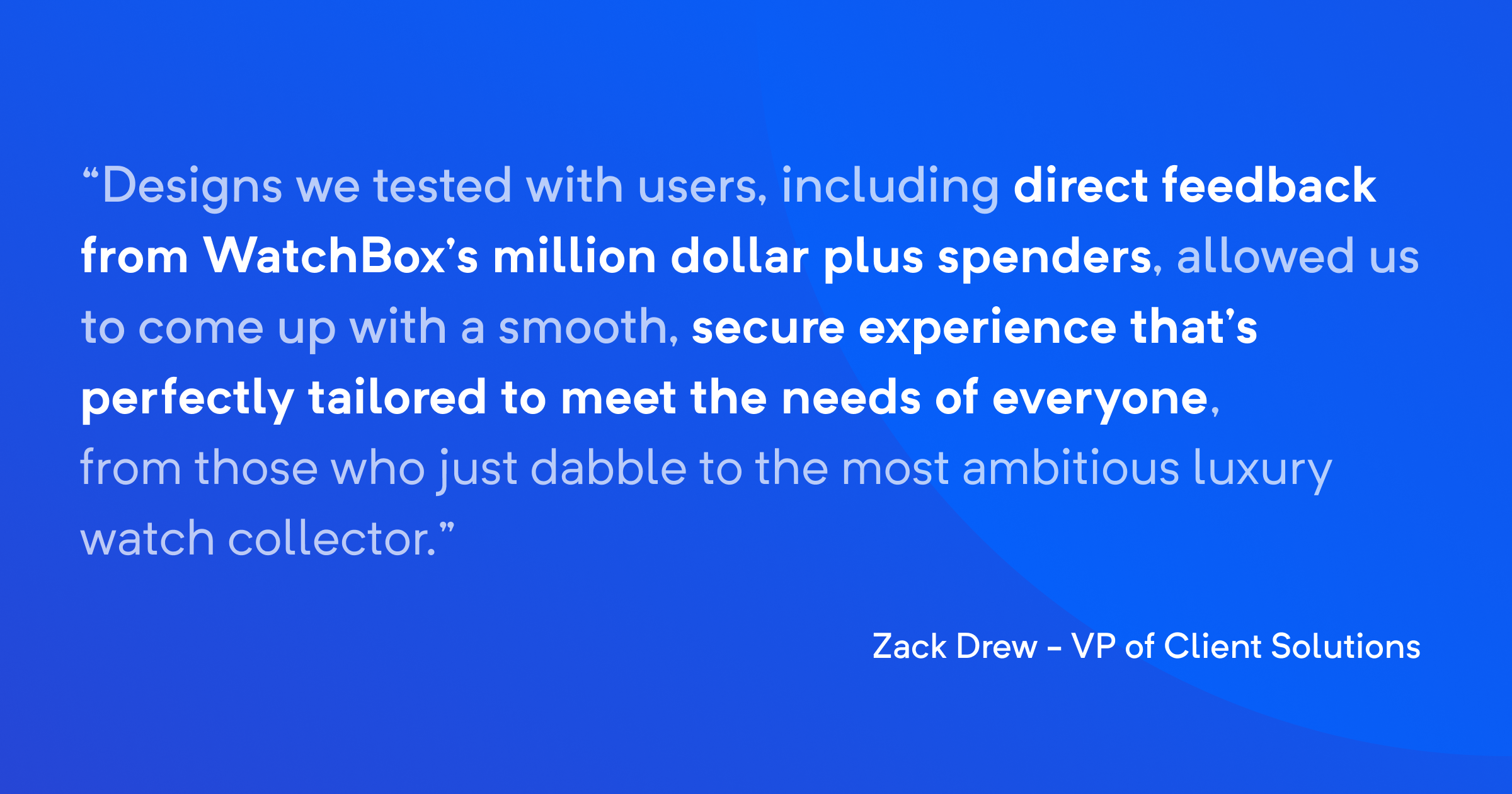
Testing with users, especially established “big spenders” who offered up a trove of valuable feedback, allowed us to hit the mark with the avid collectors. Through these insights, we were also to refine the system to appeal to interested parties who are completely unfamiliar with the scene.
Now that this leg of the project is wrapped up, the WatchBox product is live on the marketplaces. Time and data will continue to teach us about the product and its users so it can continually evolve around their needs.
What’s new with WatchBox?
Heavy app overhauls sometimes require deprecating certain functionality in the beginning, with respect to a previous version, for all kinds of reasons that can be temporary or permanent.
For example, if you’re already a WatchBox user you may notice the iOS version is a bit lighter than the last version – in time, the product will eventually evolve around users and incorporate new or improved feature sets.
Some things you will notice right now are:
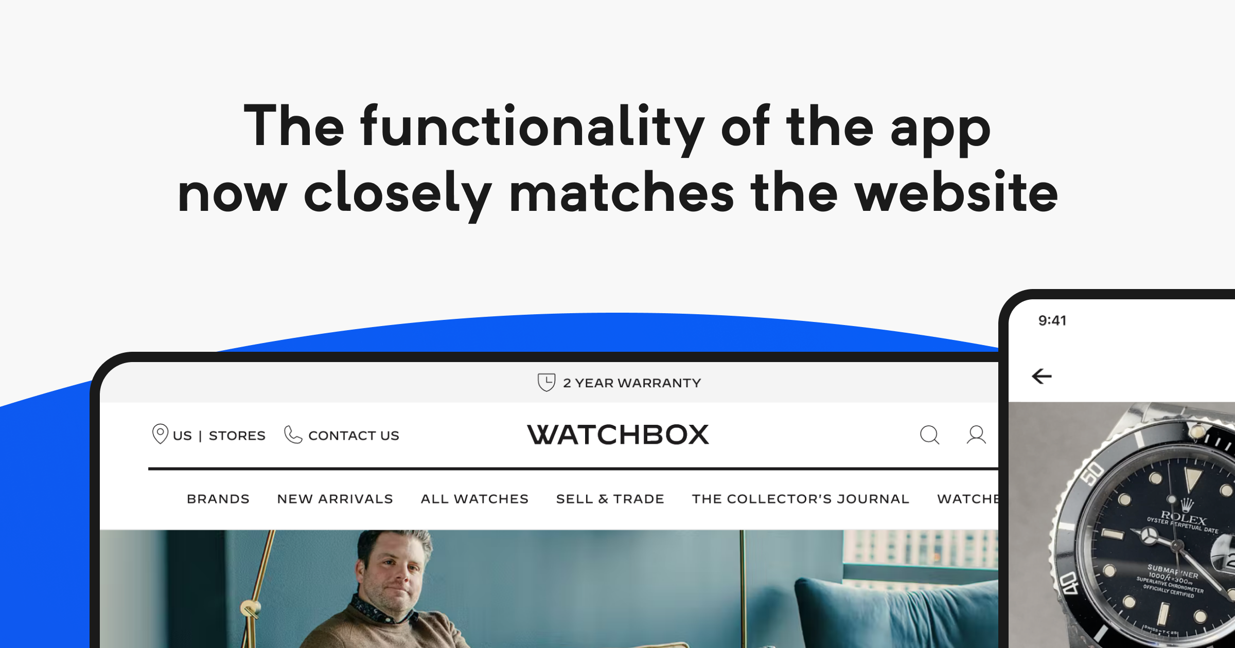
The functionality of the app now closely matches the website, offering a consistent, connected experience. The users can now complete their entire journey of buying, selling, browsing, and learning within the app.
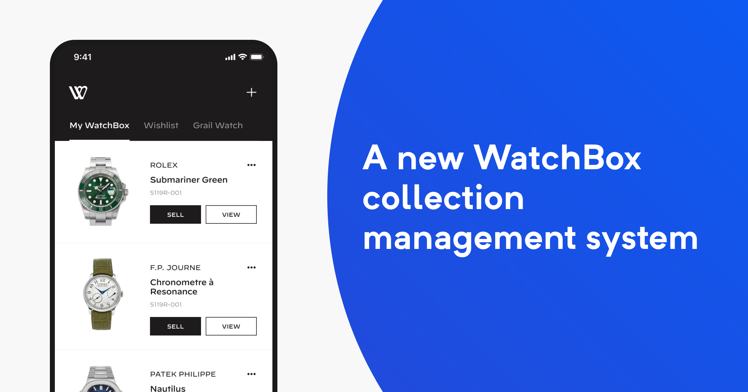
The WatchBox collection management system was overhauled with features that allow users to easily catalog their collection as it grows.
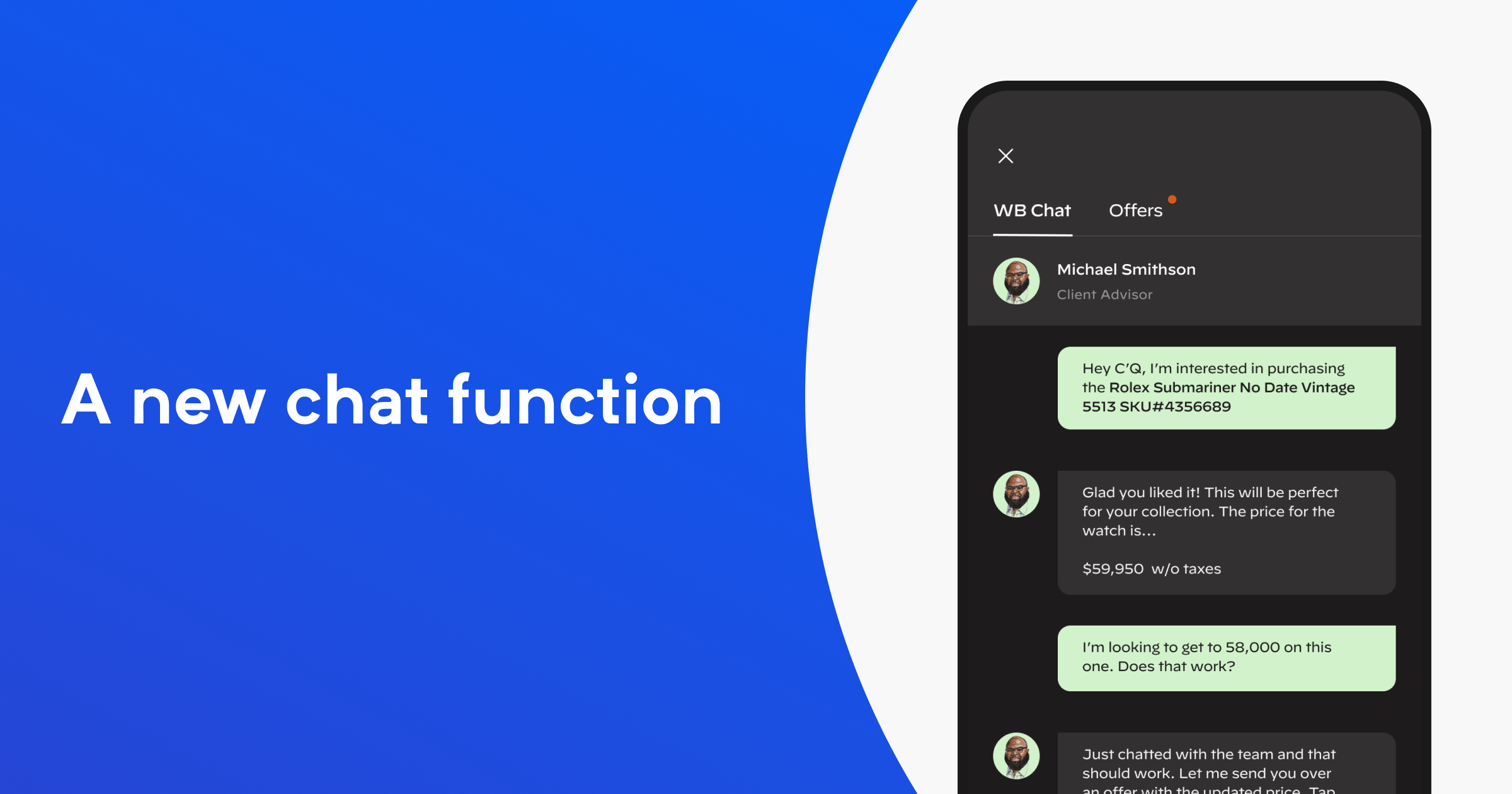
A new chat function was built around top customers who spend upwards of one million dollars on the platform, allowing users to quickly connect with client advisors.
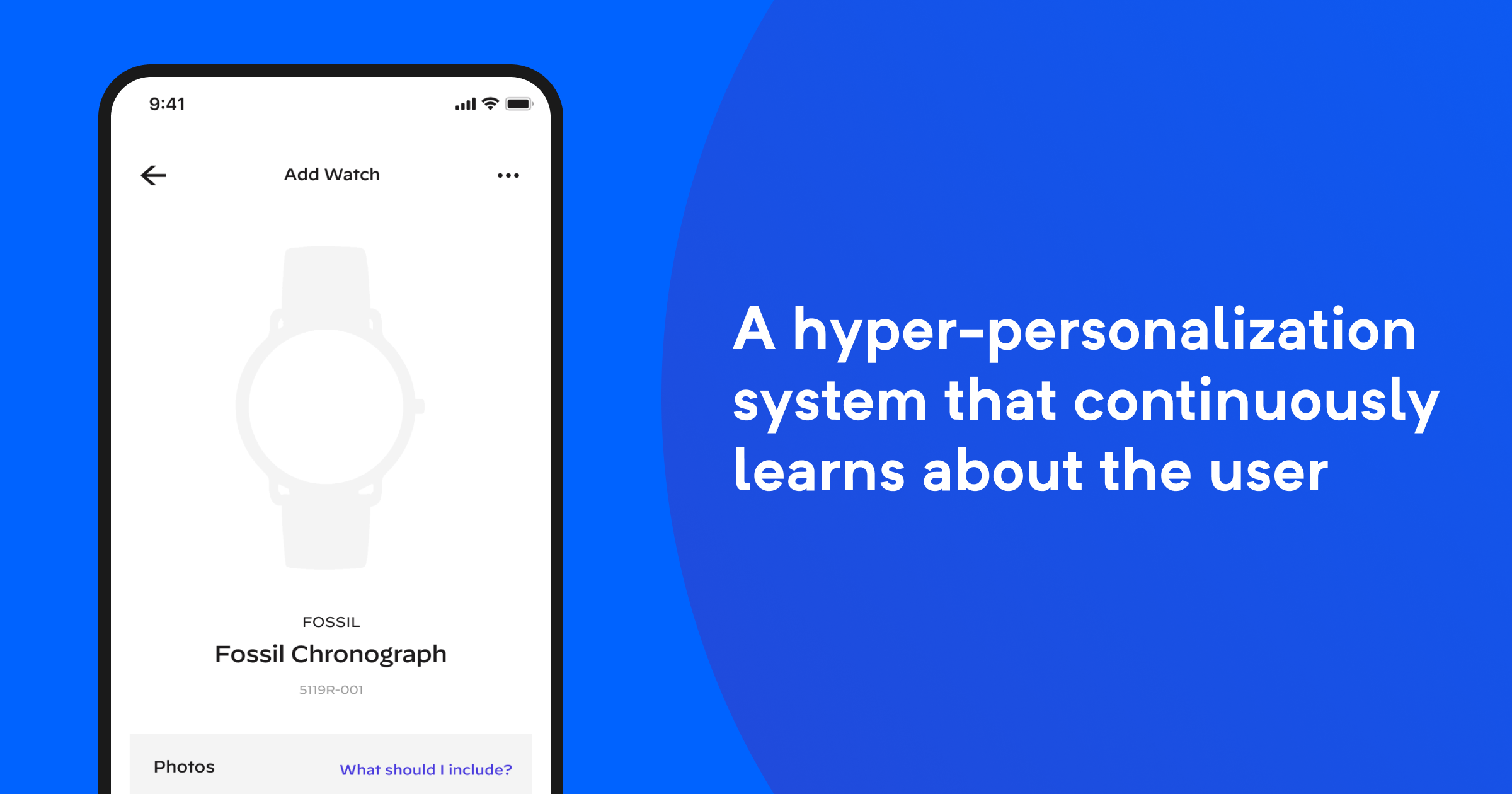
We included a hyper-personalization system that continuously learns about the user to provide fitting recommendations, such as sought-after watches as well as content recommendations from WatchBox’s world-class creators.
The same, great WatchBox experience is extended to Android as well.
We know how to deliver exceptional customer experiences
Brands like WatchBox offer rewarding challenges that allow us to learn about and design for unique user groups like the luxury watch collector.
Our experience with customer-centric design, eCommerce, and user testing allowed us to build a product that delivers an awesome experience that will only get better with time.
