Windows Phone App Studio: A User Interface Only Microsoft Could Design
Last week, I wrote about Microsoft Windows Phone App Studio, a DIY tool introduced created by Microsoft that’s meant to allow non-programmers to create native Windows Phone apps with a ‘simple’ drag and drop user interface.
It sounded very cool on paper, but then I tried to build an app with Windows Phone App Studio. My experience was well, a decidedly Microsoft like experience. While you don’t need to know how to write code to build an app with Windows Phone App Studio, Microsoft certainly does do its best to make you wish you did.
Be it Outlook or Windows, Microsoft software can never just work, it always has to have that extra dialog box, that extra bit of verbosity to needlessly complicate the user experience with technical jargon and programmer talk.
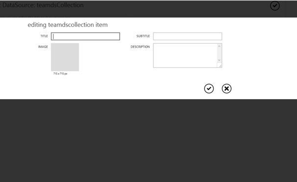
If Windows Phone App Studio is meant to be a tool to empower legions of business savy, non-programmer types to create their own apps, then why in the name of all things Sans Serif would you present them with a screen that looks like this?!
Seriously Microsoft, “servicedsCollection” and “teamdsCollection”?! Why use words and spaces when you can add a heaping full of complexity by introducing people to the concept of camel casing!
But wait, there’s more. If the non-programming crowd wasn’t already dazed and confused, surely the Pascal cased “DataSource” button should do the trick and set them firmly adrift in the Sea of Needless Compelxity.
At this point, why hold back at all Microsoft, why not go full bore and inject some Hungarian notation into this bad boy?
For a tool that is meant for non-programmers, Windows Phone App Studio can’t seem to stop speaking the language of programmers. Windows Phone App Studio isn’t a bad product, it does an admirable job of creating boilerplate apps, but its UI seems to be squarely aimed at that subset of the population that doesn’t know how to code but is clearly at home with things like camel casing and pascal casing.
Microsoft, stop letting your programmers design user interfaces, especially those that are meant for non-programmers! Simplicity and ease of use means more than just a Tahoma font with a dash of sky blue, think about who is using the tool and create an experience that speaks their language!
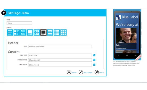
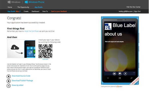
In the end, I was able to use Windows Phone App Studio to put together a simple app for Blue Label Labs, but I suspect my success was due more to my ability to parse the programmer lexicon sprinkled liberally throughout the app than Microsoft’s ability to design a breakthrough user experience.
You start by giving your app a name and a description.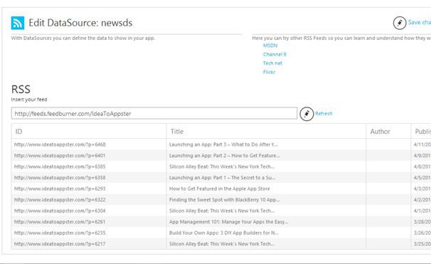
Bobby Gill
