The Client

HowUdish
Services
UX Design, UI Design & iPhone Development
A revolutionary iOS app integrating directly into menus of restaurants
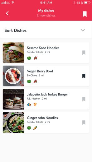
The HowUdish team set out with a simple goal: help people find dishes at restaurants nearby that not only suit their tastes, but also fits their nutritional lifestyle. In addition, the app enables people to connect with others who share those same tastes.
With this goal in mind, HowUdish partnered with BlueLabel to design, build and launch a revolutionary iOS app that integrates directly into the menus of restaurants across the country to provide personalized recommendations for meals–that fit the dietary needs of every day users.
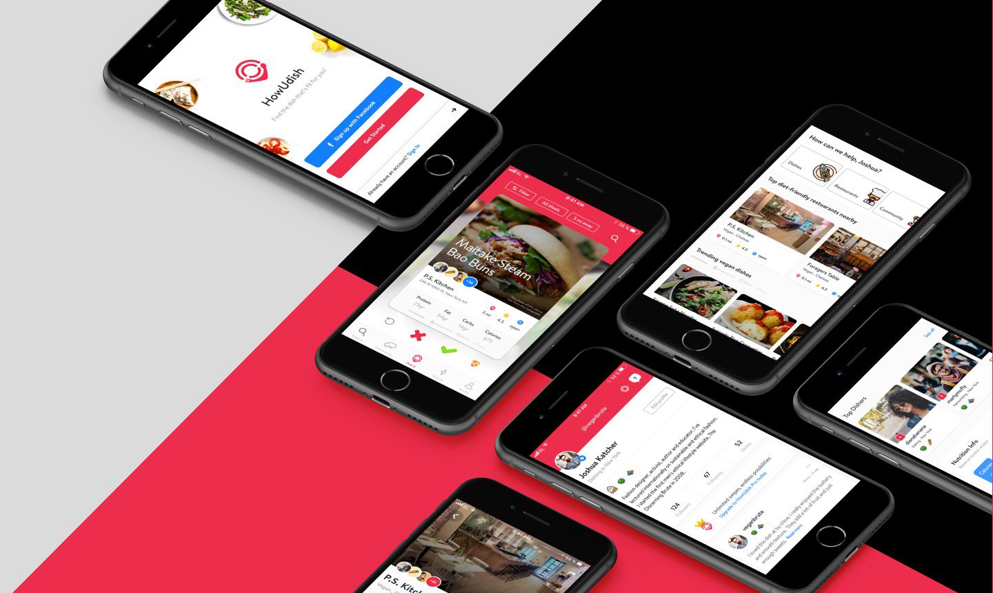
Design, Build and Deploy
Designing a fun, easy to use way to discover food and build a community
In working with the HowUdish team, the first challenge the BlueLabel team faced was how to design a user experience that met the two basic end user goals for the HowUdish team: providing a simple discovery tool to find dishes that were near to the user and creating a community within the app that fostered connections.
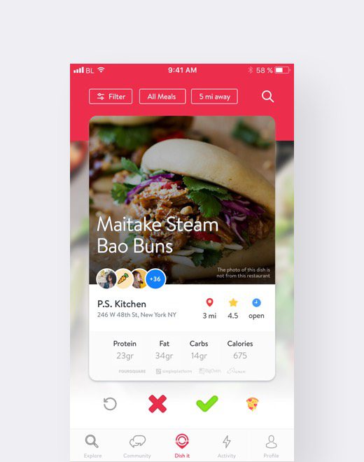
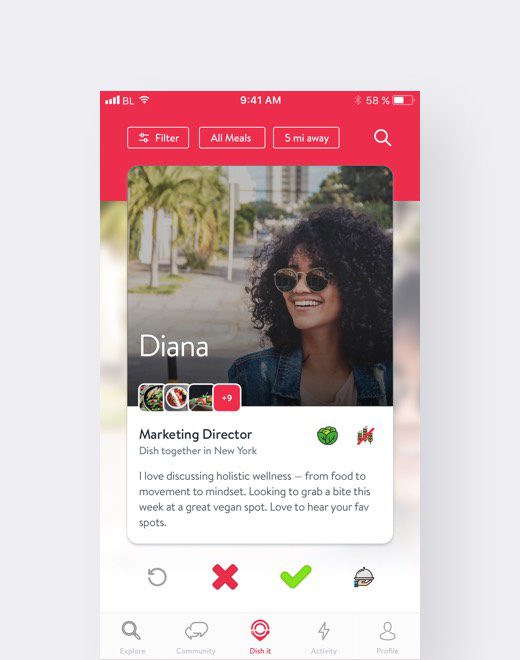
In attempting to solve the former, the BlueLabel team turned to the left-swipe/right-swipe mechanic that had been popularized in the dating genre with apps such as Tinder. Instead of swiping through potential mates, with HowUdish users would instead use the same mechanic to browse through nearby dishes–leveraging the left-swipe/right-swipe mechanic to indicate the user’s interest or disinterest in the dish being presented.
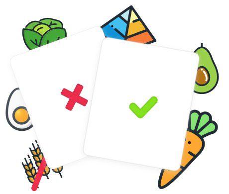
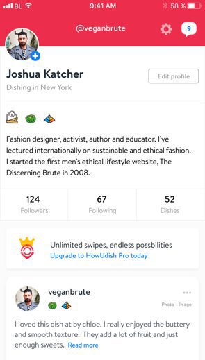
Around this basic mechanic, the BlueLabel team integrated community features that enriched the display of dishes: information on which other users enjoyed the same dishes and reviews of both the dish and the restaurant itself. Furthermore, a global feed was used to create a central meeting point in the app to foster a sense of community as users trade recipes, tips and other recommendations with each other.
Providing a simple discovery tool to find dishes that were near to the user
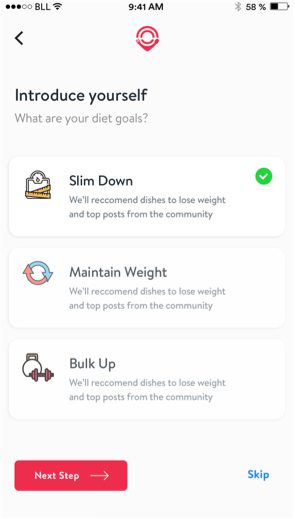
Login
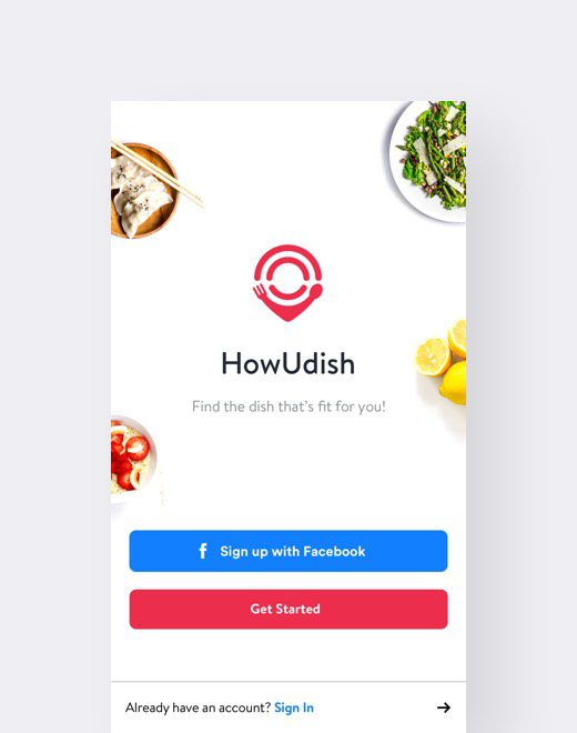
Dish Card
People Card

We wanted to created an interface that would surprise and delight users.Danny Deserto
Creative Director @ BlueLabel
Design and branding
Inspiration for the HowUdish brand and design
HowUdish sits at the cross-section of technology and lifestyle. We aimed for the brand to be conversational and authentic to not only promote communication and connection with users but between our users. We strive for the visual language to promote an approachable and informative atmosphere.
![]()
The HowUdish logo is easily recognizable and speaks to the foodie lifestyle and location-based spirit of the app.
Our primary palette consists of red, white and blue. Amaranth red was chosen as the primary color for HowUdish. It gives the app a bold, confident yet playful personality. This color’s name comes from the legend of an immortal amaranth plant that was believed to have grown on Mount Olympus.
Colors
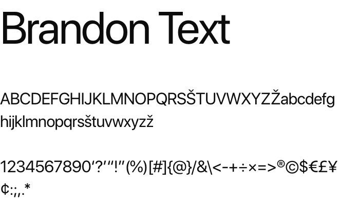
Typography
Patented Algorithms
Creating the HowUdish Recommendation Algorithm
While the design of HowUdish presented significant challenges to the team, the greatest challenge to overcome was in how to provide diet friendly recommendations to users based on their location? Solving this challenge was no easy feat and required BlueLabel to design a patent-pending algorithm that combined data from 4 external platforms: SinglePlatform, Edamam, BigOven and Foursquare.
This recommendation engine the parses dishes into Low-Calorie, Low-Fat, High-Fiber, Vegan and Vegetarian diets. While there are a number of APIs that provide restaurant information, menu information and nutritional information in isolation, there is no single data provider that combines all three.
The HowUdish recommendation engine uses proprietary logic developed by BlueLabel that leverages cutting edge big data and search algorithms to unite data that was, up until now, siloed within each of the above four data partners. The ultimate result of this endeavor is that HowUdish is able to now provide recommendations for dishes that match the dietary needs of each user in a way that is unmatched in the industry.
Recommendations for dishes that match the dietary needs of each user in a way that is unmatched in the industry.
The Visual Design
Subscriptions & In-App Payments
The HowUdish business model is built on the concept of “freemium” functionality. The basic functionality of the app is provided to the user for free; however, the number of dishes a user can swipe and the advanced search functionality of the app is restricted to paying users.
The HowUdish app leverages an In-App Subscription model that charges premium users a flat monthly fee in exchange for access to the functionality locked behind its pay-wall. To quickly and efficiently enable the HowUdish revenue model, the BlueLabel engineering team integrated directly with Apple’s In-App Subscription features. This enabled HowUdish to deploy all of the subscription features central to its business model with a minimum of effort, leveraging the rich subscription and payment feature set provided by Apple’s iOS platform.
BlueLabels’ expertise in working with Apple’s purchasing platform enabled the HowUdish team to minimize the investment necessary to build out their feature set without sacrificing any facet of the team’s revenue model.
Feature Highlights
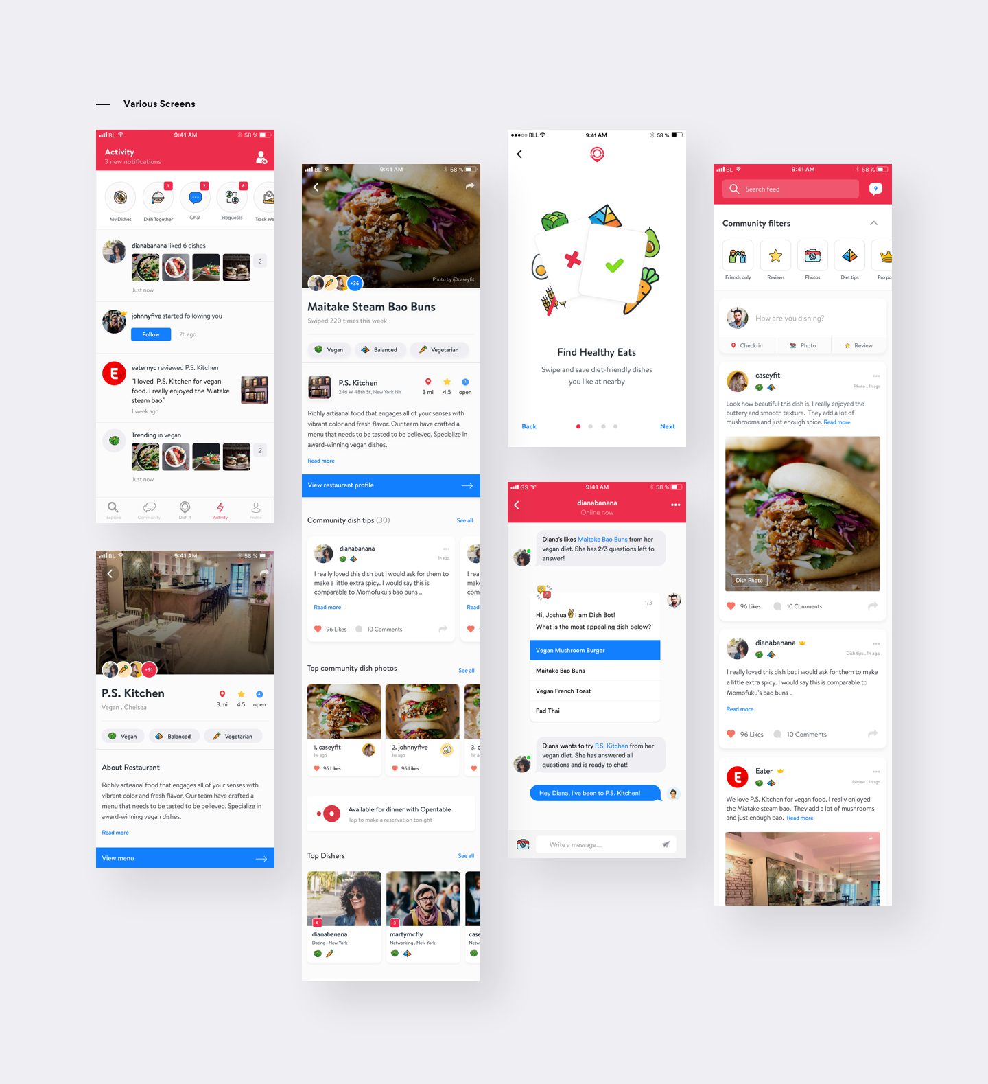
Swipe-based, dish discovery experience
Rich nutritional & diet information presented alongside each dish
Detailed restaurant information, including menus and reviews
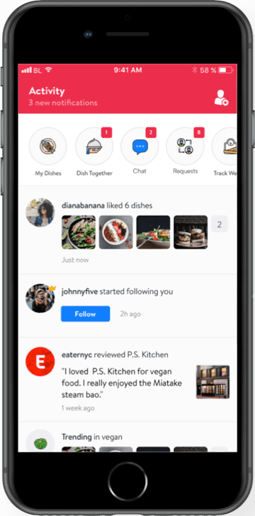
Community feed that supports sharing of text, image and links
Likes and Commenting-based community interaction model
Fully featured administrative portal to moderate community and customize nutritional and restaurant data set

The Results
After 6 months of design and development, the BlueLabel/ HowUdish team released the first version of HowUdish to the App Store in October 2017. Since then, the combined team has leveraged an Agile, sprint-based approach to add new features and enhance the app. In that time, the HowUdish app has received critical acclaim, having attained a 4.8 out 5 star App Store rating from over 1000 user submitted reviews.
Additionally the HowUdish community numbers in the tens of thousands of active users and has been featured in publications such as Men’s Health and Medical News Today. The HowUdish team continues to work with the BlueLabel team to bring to market a continued stream of ground-breaking features that will continue to cement HowUdish’s position as a market leader.
4.8 out 5 star App Store rating from over 1000 user submitted reviews.
Similar Case Studies

Magic Money
iOS, Android, Clover & Web

Muncheez
iOS, Android, & Web

HelloSitter
iOS & Web
We can build your story
Through the years we have partnered with great companies all over the world.
