BlueLabel Press Kit
The guidelines that follow will help you correctly make use
of our brand assets.

This is our logo. There are two versions to ensure optimum legibility.
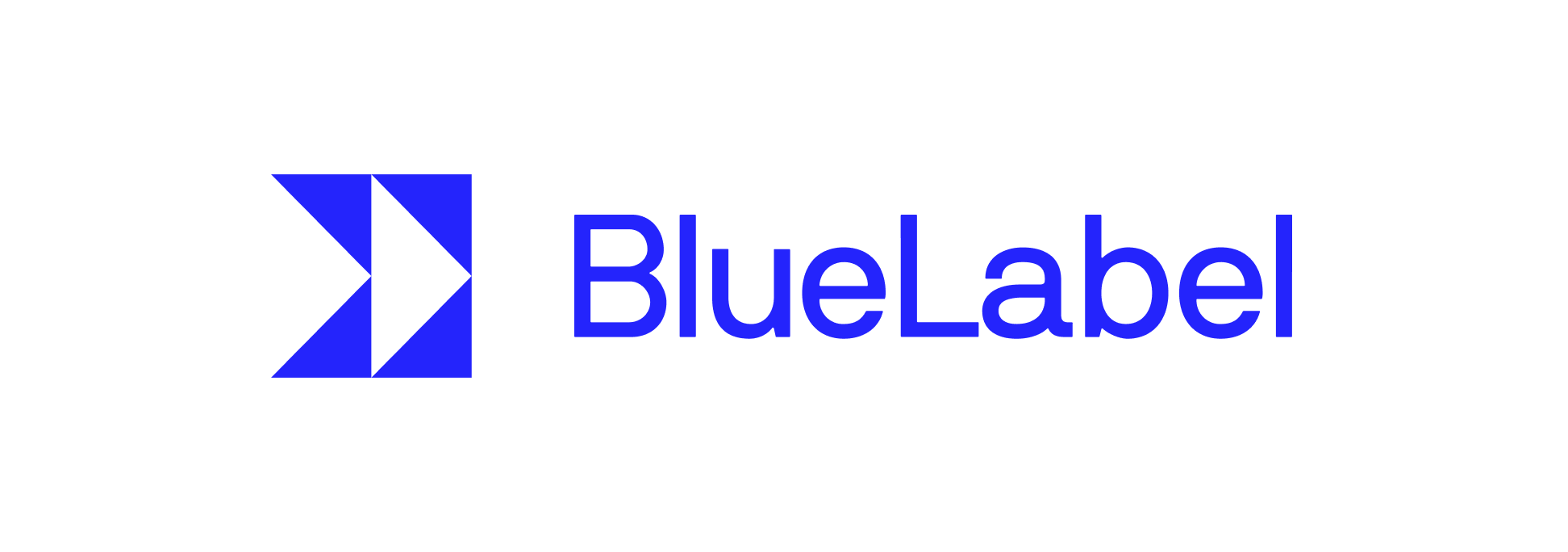
This is the main BlueLabel logo. It should be used in this form whenever possible.
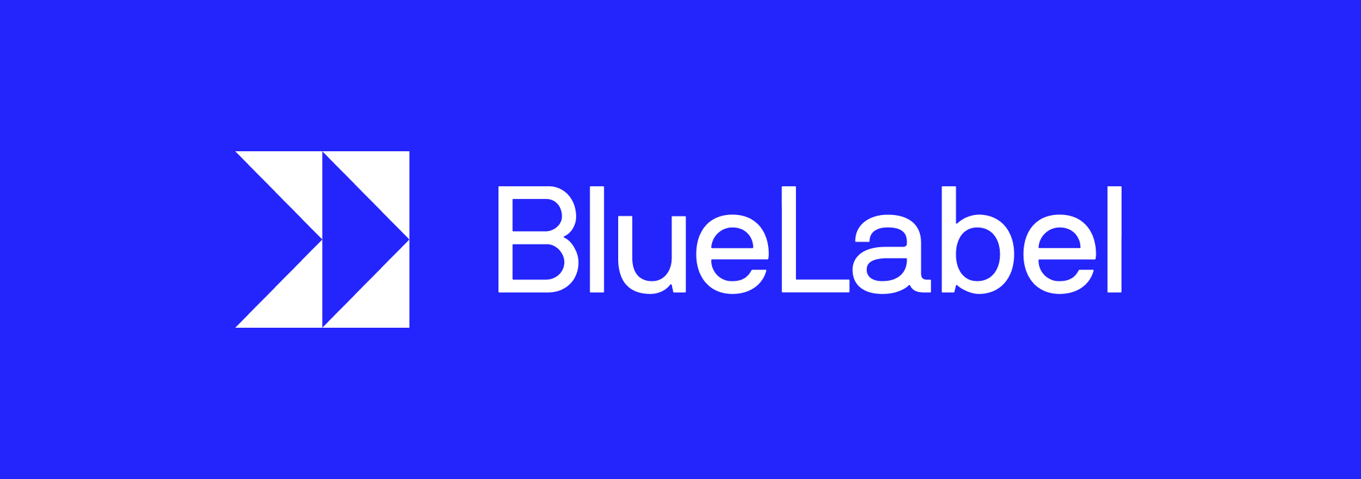
This version with the white wordmark works well
on dark and busy backgrounds.
This is our logo stripped of its wordmark. Use it only when and where space
is limited.
The main logo always comes first, however in certain situations where space
is tight, for instance when the logo has to be within a square or circle shape,
you can use our glyph.
We love our main logo, so that should always be used, if possible. This can be used as a substitute, only when absolutely necessary.
Questions
If you’re feeling unsure about proper use
of our logo, it’s always good to ask!
Send us an email at:
